playbook_ui 13.14.0.pre.alpha.play1120lintdatepicker1797 → 13.15.0.pre.alpha.PLAY10831873
Sign up to get free protection for your applications and to get access to all the features.
- checksums.yaml +4 -4
- data/app/pb_kits/playbook/pb_collapsible/docs/_collapsible_colors_swift.md +27 -0
- data/app/pb_kits/playbook/pb_collapsible/docs/_collapsible_default_swift.md +22 -0
- data/app/pb_kits/playbook/pb_collapsible/docs/_collapsible_props_table.md +8 -0
- data/app/pb_kits/playbook/pb_collapsible/docs/_collapsible_sizes_swift.md +26 -0
- data/app/pb_kits/playbook/pb_collapsible/docs/example.yml +6 -0
- data/app/pb_kits/playbook/pb_date_picker/date_picker_helper.ts +33 -40
- data/app/pb_kits/playbook/pb_date_picker/plugins/quickPick.tsx +4 -4
- data/app/pb_kits/playbook/pb_fixed_confirmation_toast/_fixed_confirmation_toast.tsx +44 -30
- data/app/pb_kits/playbook/pb_flex/_flex.tsx +4 -4
- data/app/pb_kits/playbook/pb_form_group/_form_group.tsx +3 -2
- data/app/pb_kits/playbook/pb_form_pill/_form_pill.tsx +7 -4
- data/app/pb_kits/playbook/pb_gauge/_gauge.tsx +10 -10
- data/app/pb_kits/playbook/pb_home_address_street/_home_address_street.tsx +10 -9
- data/app/pb_kits/playbook/pb_icon_stat_value/_icon_stat_value.tsx +3 -2
- data/app/pb_kits/playbook/pb_icon_value/_icon_value.tsx +3 -2
- data/app/pb_kits/playbook/pb_nav/docs/_nav_horizontal_bold_swift.md +17 -0
- data/app/pb_kits/playbook/pb_nav/docs/_nav_horizontal_default_swift.md +17 -0
- data/app/pb_kits/playbook/pb_nav/docs/_nav_horizontal_subtle_no_highlight_swift.md +18 -0
- data/app/pb_kits/playbook/pb_nav/docs/_nav_horizontal_subtle_swift.md +18 -0
- data/app/pb_kits/playbook/pb_nav/docs/_nav_props_swift.md +11 -0
- data/app/pb_kits/playbook/pb_nav/docs/_nav_vertical_bold_swift.md +18 -0
- data/app/pb_kits/playbook/pb_nav/docs/_nav_vertical_default_swift.md +18 -0
- data/app/pb_kits/playbook/pb_nav/docs/_nav_vertical_subtle_no_highlight_swift.md +19 -0
- data/app/pb_kits/playbook/pb_nav/docs/_nav_vertical_subtle_swift.md +17 -0
- data/app/pb_kits/playbook/pb_nav/docs/example.yml +17 -0
- data/dist/playbook-rails.js +2 -2
- data/lib/playbook/version.rb +2 -2
- metadata +15 -2
checksums.yaml
CHANGED
|
@@ -1,7 +1,7 @@
|
|
|
1
1
|
---
|
|
2
2
|
SHA256:
|
|
3
|
-
metadata.gz:
|
|
4
|
-
data.tar.gz:
|
|
3
|
+
metadata.gz: 5c792af7baba55e98e5f05e45c33104f369267fa1acfa30556f96fb650e21ce4
|
|
4
|
+
data.tar.gz: e05765a5b49f1c379dcf111ad9085ecaf012083f673776103489d6eef8674842
|
|
5
5
|
SHA512:
|
|
6
|
-
metadata.gz:
|
|
7
|
-
data.tar.gz:
|
|
6
|
+
metadata.gz: fe584e4c6307e81a122a08406fc7451e6edbd546e4d83677d0521ebe0b4a7b324b632971ecf1818a9a8886e56aeeaea8bb9ca89efc17079907fa4d3e64f4564e
|
|
7
|
+
data.tar.gz: f2552261c54ec7d511e0f007ef7067d681eb65345cc2cc442ba3b191067dfba335eabeede5d8cb42e83203c513b491aa3baa62469c40e695ae3a4cc7724b9c42
|
|
@@ -0,0 +1,27 @@
|
|
|
1
|
+

|
|
2
|
+
|
|
3
|
+
```swift
|
|
4
|
+
let iconSize: PBIcon.IconSize
|
|
5
|
+
let iconColor: CollapsibleIconColor
|
|
6
|
+
let text: String
|
|
7
|
+
@State private var isCollapsed = true
|
|
8
|
+
let lorem =
|
|
9
|
+
"
|
|
10
|
+
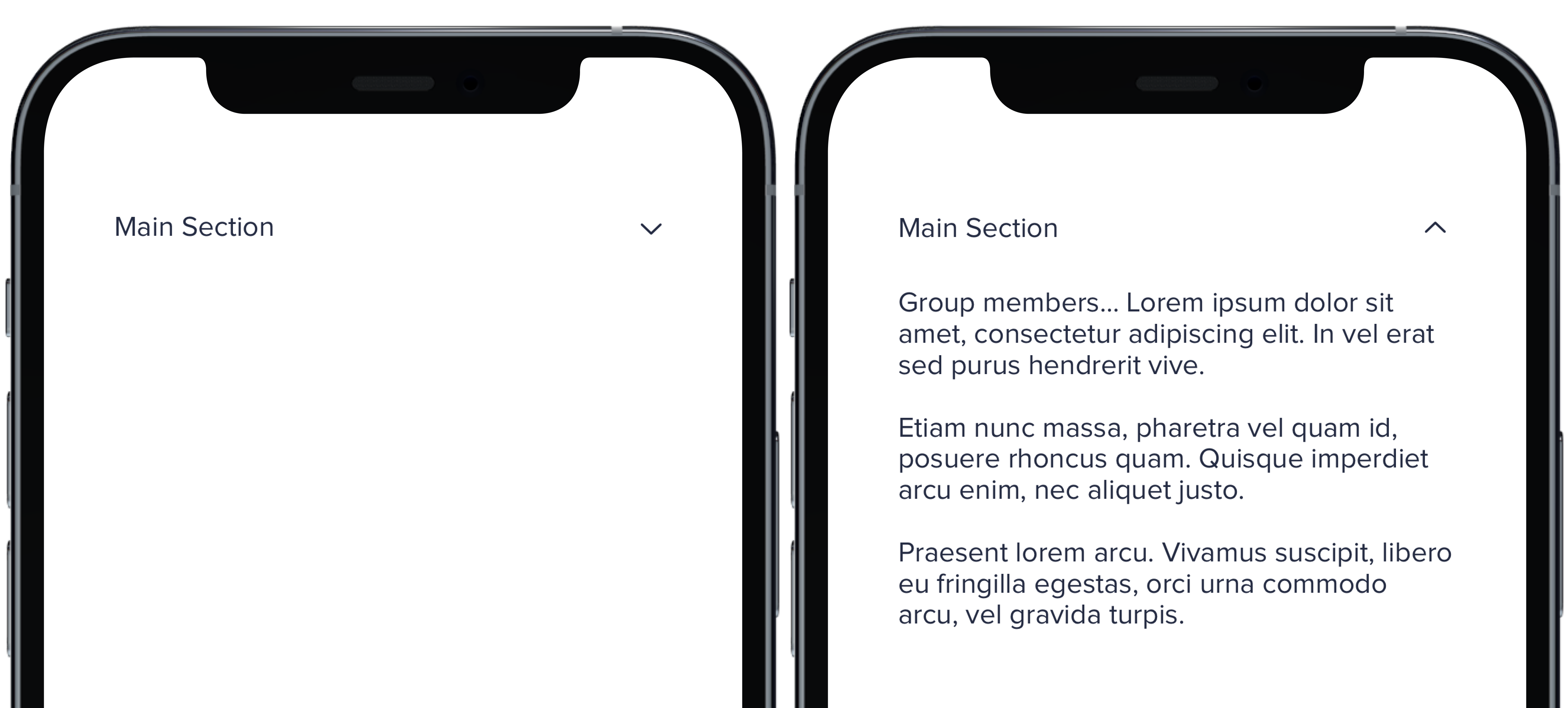
Group members... Lorem ipsum dolor sit amet, consectetur adipiscing elit. In vel erat sed purus hendrerit vive.
|
|
11
|
+
Etiam nunc massa, pharetra vel quam id, posuere rhoncus quam. Quisque imperdiet arcu enim, nec aliquet justo.
|
|
12
|
+
Praesent lorem arcu. Vivamus suscipit, libero eu fringilla egestas, orci urna commodo arcu, vel gravida turpis.
|
|
13
|
+
"
|
|
14
|
+
PBCollapsible(isCollapsed: $isCollapsed, iconSize: iconSize, iconColor: iconColor) {
|
|
15
|
+
VStack(spacing: Spacing.medium) {
|
|
16
|
+
CollapsibleDoc(iconColor: .default, text: "Default Section")
|
|
17
|
+
CollapsibleDoc(iconColor: .light, text: "Light Section")
|
|
18
|
+
CollapsibleDoc(iconColor: .lighter, text: "Lighter Section")
|
|
19
|
+
CollapsibleDoc(iconColor: .link, text: "Link Section")
|
|
20
|
+
CollapsibleDoc(iconColor: .error, text: "Error Section")
|
|
21
|
+
CollapsibleDoc(iconColor: .success, text: "Success Section")
|
|
22
|
+
}
|
|
23
|
+
} content: {
|
|
24
|
+
Text(lorem).pbFont(.body)
|
|
25
|
+
}
|
|
26
|
+
|
|
27
|
+
```
|
|
@@ -0,0 +1,22 @@
|
|
|
1
|
+
|
|
2
|
+
|
|
3
|
+
|
|
4
|
+
```swift
|
|
5
|
+
let iconSize: PBIcon.IconSize
|
|
6
|
+
let iconColor: CollapsibleIconColor
|
|
7
|
+
let text: String
|
|
8
|
+
@State private var isCollapsed = true
|
|
9
|
+
let lorem =
|
|
10
|
+
"
|
|
11
|
+
Group members... Lorem ipsum dolor sit amet, consectetur adipiscing elit. In vel erat sed purus hendrerit vive.
|
|
12
|
+
Etiam nunc massa, pharetra vel quam id, posuere rhoncus quam. Quisque imperdiet arcu enim, nec aliquet justo.
|
|
13
|
+
Praesent lorem arcu. Vivamus suscipit, libero eu fringilla egestas, orci urna commodo arcu, vel gravida turpis.
|
|
14
|
+
"
|
|
15
|
+
|
|
16
|
+
PBCollapsible(isCollapsed: $isCollapsed, iconSize: iconSize, iconColor: iconColor) {
|
|
17
|
+
CollapsibleDoc(text: "Main Section")
|
|
18
|
+
} content: {
|
|
19
|
+
Text(lorem).pbFont(.body)
|
|
20
|
+
}
|
|
21
|
+
|
|
22
|
+
```
|
|
@@ -0,0 +1,8 @@
|
|
|
1
|
+
### Props
|
|
2
|
+
| Name | Type | Description | Default | Values |
|
|
3
|
+
| --- | ----------- | --------- | --------- | --------- |
|
|
4
|
+
| **isCollapsed** | `Bool` | Value for whether or not the dropdown is closed or open | `false` | `true` `false` |
|
|
5
|
+
| **headerView** | `View` | Title of dropdown | | |
|
|
6
|
+
| **contentView** | `View` | Content of dropdown | | |
|
|
7
|
+
| **iconSize** | `PBIcon.IconSize` | Sets size of chevron icon | `.small` | `xSmall` `small` `large` `x1` `x2` `x3` `x4` `x5` `x6` `x7` `x8` `x9` `x10` |
|
|
8
|
+
| **iconColor** | `CollapsibleIconColor` | Sets color of chevron icon | `.default` | `default` `light` `lighter` `link` `error` `success` |
|
|
@@ -0,0 +1,26 @@
|
|
|
1
|
+

|
|
2
|
+
|
|
3
|
+
```swift
|
|
4
|
+
let iconSize: PBIcon.IconSize
|
|
5
|
+
let iconColor: CollapsibleIconColor
|
|
6
|
+
let text: String
|
|
7
|
+
@State private var isCollapsed = true
|
|
8
|
+
let lorem =
|
|
9
|
+
"
|
|
10
|
+
Group members... Lorem ipsum dolor sit amet, consectetur adipiscing elit. In vel erat sed purus hendrerit vive.
|
|
11
|
+
Etiam nunc massa, pharetra vel quam id, posuere rhoncus quam. Quisque imperdiet arcu enim, nec aliquet justo.
|
|
12
|
+
Praesent lorem arcu. Vivamus suscipit, libero eu fringilla egestas, orci urna commodo arcu, vel gravida turpis.
|
|
13
|
+
"
|
|
14
|
+
|
|
15
|
+
PBCollapsible(isCollapsed: $isCollapsed, iconSize: iconSize, iconColor: iconColor) {
|
|
16
|
+
VStack(spacing: Spacing.medium) {
|
|
17
|
+
CollapsibleDoc(iconSize: .xSmall, text: "Extra Small Section")
|
|
18
|
+
CollapsibleDoc(iconSize: .small, text: "Small Section")
|
|
19
|
+
CollapsibleDoc(text: "Default Section")
|
|
20
|
+
CollapsibleDoc(iconSize: .large, text: "Large Section")
|
|
21
|
+
}
|
|
22
|
+
} content: {
|
|
23
|
+
Text(lorem).pbFont(.body)
|
|
24
|
+
}
|
|
25
|
+
|
|
26
|
+
```
|
|
@@ -14,3 +14,9 @@ examples:
|
|
|
14
14
|
- collapsible_color: Icon Color
|
|
15
15
|
- collapsible_icons: Custom Icons
|
|
16
16
|
- collapsible_state: useCollapsible Hook
|
|
17
|
+
|
|
18
|
+
swift:
|
|
19
|
+
- collapsible_default_swift: Default
|
|
20
|
+
- collapsible_sizes_swift: Sizes
|
|
21
|
+
- collapsible_colors_swift: Colors
|
|
22
|
+
- collapsible_props_table: ""
|
|
@@ -32,10 +32,6 @@ type DatePickerConfig = {
|
|
|
32
32
|
} & Pick<BaseOptions, "allowInput" | "defaultDate" | "enableTime" | "maxDate" | "minDate" | "mode" | "plugins" | "position" | "positionElement" >
|
|
33
33
|
|
|
34
34
|
const datePickerHelper = (config: DatePickerConfig, scrollContainer: string | HTMLElement) => {
|
|
35
|
-
const noop = () => {
|
|
36
|
-
// intentionally left empty as a no-op placeholder
|
|
37
|
-
}
|
|
38
|
-
|
|
39
35
|
const {
|
|
40
36
|
allowInput,
|
|
41
37
|
closeOnSelect = true,
|
|
@@ -49,8 +45,8 @@ const datePickerHelper = (config: DatePickerConfig, scrollContainer: string | HT
|
|
|
49
45
|
maxDate,
|
|
50
46
|
minDate,
|
|
51
47
|
mode,
|
|
52
|
-
onChange =
|
|
53
|
-
onClose =
|
|
48
|
+
onChange = () => {},
|
|
49
|
+
onClose = () => {},
|
|
54
50
|
pickerId,
|
|
55
51
|
plugins,
|
|
56
52
|
position = "auto",
|
|
@@ -76,11 +72,20 @@ const datePickerHelper = (config: DatePickerConfig, scrollContainer: string | HT
|
|
|
76
72
|
return defaultDate
|
|
77
73
|
}
|
|
78
74
|
}
|
|
75
|
+
const disabledParser = () => {
|
|
76
|
+
const disabledArray=[]
|
|
77
|
+
|
|
78
|
+
disableDate && disableDate.length > 0 && disabledArray.push(...disableDate)
|
|
79
|
+
disableRange && disableRange.length > 0 && disabledArray.push(...disableRange)
|
|
80
|
+
disableWeekdays && disableWeekdays.length > 0 && disabledArray.push(...disabledWeekDays())
|
|
81
|
+
|
|
82
|
+
return disabledArray
|
|
83
|
+
}
|
|
79
84
|
|
|
80
85
|
const disabledWeekDays = () => {
|
|
81
86
|
return (
|
|
82
87
|
[
|
|
83
|
-
(date:
|
|
88
|
+
(date:any) => {
|
|
84
89
|
const weekdayObj: {
|
|
85
90
|
[day: string]: number
|
|
86
91
|
} = {
|
|
@@ -105,16 +110,6 @@ const datePickerHelper = (config: DatePickerConfig, scrollContainer: string | HT
|
|
|
105
110
|
]
|
|
106
111
|
)
|
|
107
112
|
}
|
|
108
|
-
|
|
109
|
-
const disabledParser = () => {
|
|
110
|
-
const disabledArray=[]
|
|
111
|
-
|
|
112
|
-
disableDate && disableDate.length > 0 && disabledArray.push(...disableDate)
|
|
113
|
-
disableRange && disableRange.length > 0 && disabledArray.push(...disableRange)
|
|
114
|
-
disableWeekdays && disableWeekdays.length > 0 && disabledArray.push(...disabledWeekDays())
|
|
115
|
-
|
|
116
|
-
return disabledArray
|
|
117
|
-
}
|
|
118
113
|
const calendarResizer = () => {
|
|
119
114
|
const cal = document.querySelector(`#cal-${pickerId}.open`) as HTMLElement
|
|
120
115
|
const parentInput = cal.parentElement
|
|
@@ -130,46 +125,28 @@ const datePickerHelper = (config: DatePickerConfig, scrollContainer: string | HT
|
|
|
130
125
|
|
|
131
126
|
const setPlugins = (thisRangesEndToday: boolean, customQuickPickDates: any) => {
|
|
132
127
|
const pluginList = []
|
|
133
|
-
|
|
128
|
+
|
|
134
129
|
// month and week selection
|
|
135
130
|
if (selectionType === "month" || plugins.length > 0) {
|
|
136
131
|
pluginList.push(monthSelectPlugin({ shorthand: true, dateFormat: 'F Y', altFormat: 'F Y' }))
|
|
137
132
|
} else if ( selectionType === "week") {
|
|
138
133
|
pluginList.push(weekSelect())
|
|
139
|
-
|
|
134
|
+
|
|
140
135
|
} else if (selectionType === "quickpick") {
|
|
141
136
|
//------- QUICKPICK VARIANT PLUGIN -------------//
|
|
142
137
|
pluginList.push(quickPickPlugin(thisRangesEndToday, customQuickPickDates))
|
|
143
138
|
}
|
|
144
|
-
|
|
139
|
+
|
|
145
140
|
// time selection
|
|
146
141
|
if (enableTime) pluginList.push(timeSelectPlugin({ caption: timeCaption, showTimezone: showTimezone}))
|
|
147
|
-
|
|
142
|
+
|
|
148
143
|
return pluginList
|
|
149
144
|
}
|
|
150
|
-
|
|
145
|
+
|
|
151
146
|
const getDateFormat = () => {
|
|
152
147
|
return enableTime ? `${format} ${timeFormat}` : format
|
|
153
148
|
}
|
|
154
149
|
|
|
155
|
-
// Attach / detach to / from scroll events
|
|
156
|
-
const initialPicker = document.querySelector<HTMLElement & { [x: string]: any }>(`#${pickerId}`)._flatpickr
|
|
157
|
-
const scrollEvent = () => {
|
|
158
|
-
initialPicker._positionCalendar()
|
|
159
|
-
}
|
|
160
|
-
function attachToScroll(scrollParent: string | HTMLElement) {
|
|
161
|
-
document.querySelectorAll(scrollParent as string)[0]?.addEventListener("scroll", scrollEvent, { passive: true })
|
|
162
|
-
}
|
|
163
|
-
function detachFromScroll(scrollParent: string | HTMLElement = document.body) {
|
|
164
|
-
document.querySelectorAll(scrollParent as string)[0]?.removeEventListener("scroll", scrollEvent)
|
|
165
|
-
}
|
|
166
|
-
|
|
167
|
-
// two way binding
|
|
168
|
-
const initialDropdown = document.querySelector<HTMLElement & { [x: string]: any }>(`#year-${pickerId}`)
|
|
169
|
-
const yearChangeHook = () => {
|
|
170
|
-
initialDropdown.value = initialPicker.currentYear
|
|
171
|
-
}
|
|
172
|
-
|
|
173
150
|
// ===========================================================
|
|
174
151
|
// | Flatpickr initializer w/ config |
|
|
175
152
|
// ===========================================================
|
|
@@ -216,6 +193,17 @@ const datePickerHelper = (config: DatePickerConfig, scrollContainer: string | HT
|
|
|
216
193
|
const picker = document.querySelector<HTMLElement & { [x: string]: any }>(`#${pickerId}`)._flatpickr
|
|
217
194
|
picker.innerContainer.parentElement.id = `cal-${pickerId}`
|
|
218
195
|
|
|
196
|
+
// Attach / detach to / from scroll events
|
|
197
|
+
const scrollEvent = () => {
|
|
198
|
+
picker._positionCalendar()
|
|
199
|
+
}
|
|
200
|
+
function attachToScroll(scrollParent: string | HTMLElement) {
|
|
201
|
+
document.querySelectorAll(scrollParent as string)[0]?.addEventListener("scroll", scrollEvent, { passive: true })
|
|
202
|
+
}
|
|
203
|
+
function detachFromScroll(scrollParent: string | HTMLElement = document.body) {
|
|
204
|
+
document.querySelectorAll(scrollParent as string)[0]?.removeEventListener("scroll", scrollEvent)
|
|
205
|
+
}
|
|
206
|
+
|
|
219
207
|
// replace year selector with dropdown
|
|
220
208
|
picker.yearElements[0].parentElement.innerHTML = `<select class="numInput cur-year" type="number" tabIndex="-1" aria-label="Year" id="year-${pickerId}"></select>`
|
|
221
209
|
|
|
@@ -254,6 +242,11 @@ const datePickerHelper = (config: DatePickerConfig, scrollContainer: string | HT
|
|
|
254
242
|
})
|
|
255
243
|
}
|
|
256
244
|
|
|
245
|
+
// two way binding
|
|
246
|
+
const yearChangeHook = () => {
|
|
247
|
+
dropdown.value = picker.currentYear
|
|
248
|
+
}
|
|
249
|
+
|
|
257
250
|
// Adding dropdown icons to year and month selects
|
|
258
251
|
dropdown.insertAdjacentHTML('afterend', '<i class="far fa-angle-down year-dropdown-icon" id="test-id"></i>')
|
|
259
252
|
if (picker.monthElements[0].parentElement) {
|
|
@@ -53,8 +53,8 @@ const quickPickPlugin = (thisRangesEndToday: boolean, customQuickPickDates: cust
|
|
|
53
53
|
|
|
54
54
|
const calculateDateRange = (timePeriod: string, amount: number): Date[] => {
|
|
55
55
|
const endDate = new Date();
|
|
56
|
-
|
|
57
|
-
|
|
56
|
+
let startDate = new Date();
|
|
57
|
+
|
|
58
58
|
switch (timePeriod) {
|
|
59
59
|
case 'days':
|
|
60
60
|
startDate.setDate(endDate.getDate() - amount);
|
|
@@ -76,7 +76,7 @@ const quickPickPlugin = (thisRangesEndToday: boolean, customQuickPickDates: cust
|
|
|
76
76
|
}
|
|
77
77
|
return [startDate, endDate];
|
|
78
78
|
};
|
|
79
|
-
|
|
79
|
+
|
|
80
80
|
|
|
81
81
|
type rangesType = {
|
|
82
82
|
[key: string]: Date[]
|
|
@@ -95,7 +95,7 @@ const quickPickPlugin = (thisRangesEndToday: boolean, customQuickPickDates: cust
|
|
|
95
95
|
'Last year': [lastYearStartDate, lastYearEndDate]
|
|
96
96
|
};
|
|
97
97
|
|
|
98
|
-
|
|
98
|
+
|
|
99
99
|
if (customQuickPickDates && Object.keys(customQuickPickDates).length !== 0) {
|
|
100
100
|
if (customQuickPickDates.dates.length && customQuickPickDates.override === false) {
|
|
101
101
|
customQuickPickDates.dates.forEach((item) => {
|
|
@@ -2,7 +2,8 @@ import React, { useEffect, useState } from "react";
|
|
|
2
2
|
import classnames from "classnames";
|
|
3
3
|
|
|
4
4
|
import { globalProps } from "../utilities/globalProps";
|
|
5
|
-
import { buildHtmlProps } from
|
|
5
|
+
import { buildHtmlProps } from "../utilities/props";
|
|
6
|
+
import { VoidCallback } from "../types";
|
|
6
7
|
|
|
7
8
|
import Icon from "../pb_icon/_icon";
|
|
8
9
|
import Title from "../pb_title/_title";
|
|
@@ -15,23 +16,23 @@ const iconMap = {
|
|
|
15
16
|
};
|
|
16
17
|
|
|
17
18
|
type FixedConfirmationToastProps = {
|
|
18
|
-
autoClose?: number
|
|
19
|
-
children?: React.ReactChild[] | React.ReactChild
|
|
20
|
-
className?: string
|
|
21
|
-
closeable?: boolean
|
|
22
|
-
data?: string
|
|
23
|
-
horizontal?: "right" | "left" | "center"
|
|
24
|
-
htmlOptions?: {[key: string]: string | number | boolean | (
|
|
25
|
-
id?: string
|
|
26
|
-
multiLine?: boolean
|
|
27
|
-
onClose?:
|
|
28
|
-
open?: boolean
|
|
29
|
-
status?: "success" | "error" | "neutral" | "tip"
|
|
30
|
-
text?: string
|
|
31
|
-
vertical?: "top" | "bottom"
|
|
32
|
-
}
|
|
19
|
+
autoClose?: number;
|
|
20
|
+
children?: React.ReactChild[] | React.ReactChild;
|
|
21
|
+
className?: string;
|
|
22
|
+
closeable?: boolean;
|
|
23
|
+
data?: string;
|
|
24
|
+
horizontal?: "right" | "left" | "center";
|
|
25
|
+
htmlOptions?: { [key: string]: string | number | boolean | (VoidCallback) };
|
|
26
|
+
id?: string;
|
|
27
|
+
multiLine?: boolean;
|
|
28
|
+
onClose?: VoidCallback;
|
|
29
|
+
open?: boolean;
|
|
30
|
+
status?: "success" | "error" | "neutral" | "tip";
|
|
31
|
+
text?: string;
|
|
32
|
+
vertical?: "top" | "bottom";
|
|
33
|
+
};
|
|
33
34
|
|
|
34
|
-
const FixedConfirmationToast = (props: FixedConfirmationToastProps) => {
|
|
35
|
+
const FixedConfirmationToast = (props: FixedConfirmationToastProps): React.ReactElement => {
|
|
35
36
|
const [showToast, toggleToast] = useState(true);
|
|
36
37
|
const {
|
|
37
38
|
autoClose = 0,
|
|
@@ -41,7 +42,7 @@ const FixedConfirmationToast = (props: FixedConfirmationToastProps) => {
|
|
|
41
42
|
horizontal,
|
|
42
43
|
htmlOptions = {},
|
|
43
44
|
multiLine = false,
|
|
44
|
-
onClose = () =>
|
|
45
|
+
onClose = () => undefined,
|
|
45
46
|
open = true,
|
|
46
47
|
status = "neutral",
|
|
47
48
|
text,
|
|
@@ -65,7 +66,7 @@ const FixedConfirmationToast = (props: FixedConfirmationToastProps) => {
|
|
|
65
66
|
onClose();
|
|
66
67
|
}, autoClose);
|
|
67
68
|
}
|
|
68
|
-
}
|
|
69
|
+
};
|
|
69
70
|
|
|
70
71
|
useEffect(() => {
|
|
71
72
|
toggleToast(open);
|
|
@@ -80,22 +81,35 @@ const FixedConfirmationToast = (props: FixedConfirmationToastProps) => {
|
|
|
80
81
|
return (
|
|
81
82
|
<>
|
|
82
83
|
{showToast && (
|
|
83
|
-
<div
|
|
84
|
-
|
|
84
|
+
<div
|
|
85
|
+
className={css}
|
|
86
|
+
onClick={handleClick}
|
|
87
|
+
{...htmlProps}
|
|
88
|
+
>
|
|
89
|
+
{icon && (
|
|
90
|
+
<Icon
|
|
91
|
+
className="pb_icon"
|
|
92
|
+
fixedWidth
|
|
93
|
+
icon={icon}
|
|
94
|
+
/>
|
|
95
|
+
)}
|
|
85
96
|
|
|
86
|
-
{
|
|
87
|
-
|
|
88
|
-
text && (
|
|
97
|
+
{(children && children) ||
|
|
98
|
+
(text && (
|
|
89
99
|
<Title
|
|
90
|
-
|
|
91
|
-
|
|
92
|
-
|
|
100
|
+
className="pb_fixed_confirmation_toast_text"
|
|
101
|
+
size={4}
|
|
102
|
+
text={text}
|
|
93
103
|
/>
|
|
94
|
-
)
|
|
95
|
-
}
|
|
104
|
+
))}
|
|
96
105
|
|
|
97
106
|
{closeable && (
|
|
98
|
-
<Icon
|
|
107
|
+
<Icon
|
|
108
|
+
className="pb_icon"
|
|
109
|
+
cursor="pointer"
|
|
110
|
+
fixedWidth={false}
|
|
111
|
+
icon="times"
|
|
112
|
+
/>
|
|
99
113
|
)}
|
|
100
114
|
</div>
|
|
101
115
|
)}
|
|
@@ -2,12 +2,12 @@ import React from 'react'
|
|
|
2
2
|
import classnames from 'classnames'
|
|
3
3
|
import { buildCss, buildDataProps, buildHtmlProps } from '../utilities/props'
|
|
4
4
|
import { GlobalProps, globalProps } from '../utilities/globalProps'
|
|
5
|
-
import { Sizes } from '../types'
|
|
5
|
+
import { GenericObject, Sizes } from '../types'
|
|
6
6
|
|
|
7
7
|
type FlexProps = {
|
|
8
8
|
children: React.ReactChild[] | React.ReactNode,
|
|
9
9
|
className?: string,
|
|
10
|
-
data?:
|
|
10
|
+
data?: GenericObject,
|
|
11
11
|
horizontal?: "left" | "center" | "right" | "stretch" | "none",
|
|
12
12
|
justify?: "start" | "center" | "end" | "around" | "between" | "evenly" | "none",
|
|
13
13
|
htmlOptions?: {[key: string]: string | number | boolean | (() => void)},
|
|
@@ -25,7 +25,7 @@ type FlexProps = {
|
|
|
25
25
|
alignSelf?: "start" | "end" | "center" | "stretch" | "none"
|
|
26
26
|
} & GlobalProps
|
|
27
27
|
|
|
28
|
-
const Flex = (props: FlexProps) => {
|
|
28
|
+
const Flex = (props: FlexProps): React.ReactElement => {
|
|
29
29
|
const {
|
|
30
30
|
align = 'none',
|
|
31
31
|
children,
|
|
@@ -45,7 +45,7 @@ const Flex = (props: FlexProps) => {
|
|
|
45
45
|
wrap = false,
|
|
46
46
|
alignSelf = 'none',
|
|
47
47
|
} = props
|
|
48
|
-
|
|
48
|
+
|
|
49
49
|
const orientationClass =
|
|
50
50
|
orientation !== undefined ? `orientation_${orientation}` : ''
|
|
51
51
|
const justifyClass =
|
|
@@ -2,18 +2,19 @@ import React from 'react'
|
|
|
2
2
|
import classnames from 'classnames'
|
|
3
3
|
import { buildAriaProps, buildCss, buildDataProps, buildHtmlProps } from '../utilities/props'
|
|
4
4
|
import { globalProps } from '../utilities/globalProps'
|
|
5
|
+
import { GenericObject } from '../types'
|
|
5
6
|
|
|
6
7
|
type FormGroupProps = {
|
|
7
8
|
aria?: {[key: string]: string},
|
|
8
9
|
children?: Node,
|
|
9
10
|
className?: string,
|
|
10
|
-
data?:
|
|
11
|
+
data?: GenericObject,
|
|
11
12
|
fullWidth?: boolean,
|
|
12
13
|
htmlOptions?: {[key: string]: string | number | boolean | (() => void)},
|
|
13
14
|
id?: string,
|
|
14
15
|
}
|
|
15
16
|
|
|
16
|
-
const FormGroup = (props: FormGroupProps) => {
|
|
17
|
+
const FormGroup = (props: FormGroupProps): React.ReactElement => {
|
|
17
18
|
const {
|
|
18
19
|
aria = {},
|
|
19
20
|
className,
|
|
@@ -22,16 +22,16 @@ type FormPillProps = {
|
|
|
22
22
|
onClick?: React.MouseEventHandler<HTMLSpanElement>,
|
|
23
23
|
onMouseDown?: React.MouseEventHandler<HTMLSpanElement>,
|
|
24
24
|
onTouchEnd?: React.TouchEventHandler<HTMLSpanElement>,
|
|
25
|
-
},
|
|
25
|
+
},
|
|
26
26
|
} & GlobalProps
|
|
27
|
-
const FormPill = (props: FormPillProps) => {
|
|
27
|
+
const FormPill = (props: FormPillProps): React.ReactElement => {
|
|
28
28
|
const {
|
|
29
29
|
className,
|
|
30
30
|
htmlOptions = {},
|
|
31
31
|
id,
|
|
32
32
|
text,
|
|
33
33
|
name,
|
|
34
|
-
onClick = () =>
|
|
34
|
+
onClick = () => undefined,
|
|
35
35
|
avatarUrl,
|
|
36
36
|
closeProps = {},
|
|
37
37
|
size = '',
|
|
@@ -48,7 +48,10 @@ const FormPill = (props: FormPillProps) => {
|
|
|
48
48
|
const htmlProps = buildHtmlProps(htmlOptions)
|
|
49
49
|
|
|
50
50
|
return (
|
|
51
|
-
<div className={css}
|
|
51
|
+
<div className={css}
|
|
52
|
+
id={id}
|
|
53
|
+
{...htmlProps}
|
|
54
|
+
>
|
|
52
55
|
{name &&
|
|
53
56
|
<>
|
|
54
57
|
<Avatar
|
|
@@ -12,12 +12,13 @@ import typography from "../tokens/exports/_typography.scss";
|
|
|
12
12
|
|
|
13
13
|
import { buildAriaProps, buildCss, buildDataProps, buildHtmlProps } from "../utilities/props";
|
|
14
14
|
import { globalProps } from "../utilities/globalProps";
|
|
15
|
+
import { GenericObject } from "../types";
|
|
15
16
|
|
|
16
17
|
type GaugeProps = {
|
|
17
18
|
aria: { [key: string]: string };
|
|
18
19
|
className?: string;
|
|
19
20
|
chartData?: { name: string; value: number[] | number }[];
|
|
20
|
-
dark?:
|
|
21
|
+
dark?: boolean;
|
|
21
22
|
data?: { [key: string]: string };
|
|
22
23
|
disableAnimation?: boolean;
|
|
23
24
|
fullCircle?: boolean;
|
|
@@ -33,13 +34,12 @@ type GaugeProps = {
|
|
|
33
34
|
title?: string;
|
|
34
35
|
tooltipHtml?: string;
|
|
35
36
|
colors: string[];
|
|
36
|
-
minorTickInterval
|
|
37
|
+
minorTickInterval?: number;
|
|
37
38
|
circumference: number[];
|
|
38
39
|
};
|
|
39
40
|
|
|
40
41
|
const Gauge = ({
|
|
41
42
|
aria = {},
|
|
42
|
-
className,
|
|
43
43
|
chartData,
|
|
44
44
|
dark = false,
|
|
45
45
|
data = {},
|
|
@@ -61,9 +61,9 @@ const Gauge = ({
|
|
|
61
61
|
minorTickInterval = null,
|
|
62
62
|
circumference = fullCircle ? [0, 360] : [-100, 100],
|
|
63
63
|
...props
|
|
64
|
-
}: GaugeProps) => {
|
|
64
|
+
}: GaugeProps): React.ReactElement => {
|
|
65
65
|
const ariaProps = buildAriaProps(aria);
|
|
66
|
-
|
|
66
|
+
const dataProps = buildDataProps(data)
|
|
67
67
|
const htmlProps = buildHtmlProps(htmlOptions);
|
|
68
68
|
highchartsMore(Highcharts);
|
|
69
69
|
solidGauge(Highcharts);
|
|
@@ -89,7 +89,7 @@ const Gauge = ({
|
|
|
89
89
|
const [options, setOptions] = useState({});
|
|
90
90
|
|
|
91
91
|
useEffect(() => {
|
|
92
|
-
const formattedChartData = chartData.map((obj:
|
|
92
|
+
const formattedChartData = chartData.map((obj: GenericObject) => {
|
|
93
93
|
obj.y = obj.value;
|
|
94
94
|
delete obj.value;
|
|
95
95
|
return obj;
|
|
@@ -185,20 +185,20 @@ const Gauge = ({
|
|
|
185
185
|
.querySelectorAll(".fix")
|
|
186
186
|
.forEach((fix) => fix.setAttribute("y", "38"));
|
|
187
187
|
}
|
|
188
|
-
|
|
188
|
+
// eslint-disable-next-line react-hooks/exhaustive-deps
|
|
189
189
|
}, [chartData]);
|
|
190
190
|
|
|
191
191
|
return (
|
|
192
192
|
<HighchartsReact
|
|
193
|
-
|
|
193
|
+
containerProps={{
|
|
194
194
|
className: classnames(css, globalProps(props)),
|
|
195
195
|
id: id,
|
|
196
196
|
...ariaProps,
|
|
197
197
|
...dataProps,
|
|
198
198
|
...htmlProps,
|
|
199
199
|
}}
|
|
200
|
-
|
|
201
|
-
|
|
200
|
+
highcharts={Highcharts}
|
|
201
|
+
options={options}
|
|
202
202
|
/>
|
|
203
203
|
);
|
|
204
204
|
};
|
|
@@ -8,6 +8,7 @@ import Body from '../pb_body/_body'
|
|
|
8
8
|
import Hashtag from '../pb_hashtag/_hashtag'
|
|
9
9
|
import Title from '../pb_title/_title'
|
|
10
10
|
import { buildAriaProps, buildDataProps, buildHtmlProps } from '../utilities/props'
|
|
11
|
+
import { GenericObject } from '../types'
|
|
11
12
|
|
|
12
13
|
type HomeAddressStreetProps = {
|
|
13
14
|
aria?: { [key: string]: string },
|
|
@@ -28,7 +29,7 @@ type HomeAddressStreetProps = {
|
|
|
28
29
|
territory: string,
|
|
29
30
|
}
|
|
30
31
|
|
|
31
|
-
const HomeAddressStreet = (props: HomeAddressStreetProps) => {
|
|
32
|
+
const HomeAddressStreet = (props: HomeAddressStreetProps): React.ReactElement => {
|
|
32
33
|
const {
|
|
33
34
|
address,
|
|
34
35
|
addressCont,
|
|
@@ -58,17 +59,17 @@ const HomeAddressStreet = (props: HomeAddressStreetProps) => {
|
|
|
58
59
|
className
|
|
59
60
|
)
|
|
60
61
|
|
|
61
|
-
const dataProps:
|
|
62
|
-
const ariaProps:
|
|
62
|
+
const dataProps: GenericObject = buildDataProps(data)
|
|
63
|
+
const ariaProps: GenericObject = buildAriaProps(aria)
|
|
63
64
|
const htmlProps = buildHtmlProps(htmlOptions)
|
|
64
65
|
return (
|
|
65
|
-
<div
|
|
66
|
-
|
|
67
|
-
|
|
68
|
-
|
|
69
|
-
|
|
66
|
+
<div
|
|
67
|
+
className={classes(className, dark)}
|
|
68
|
+
{...ariaProps}
|
|
69
|
+
{...dataProps}
|
|
70
|
+
{...htmlProps}
|
|
70
71
|
>
|
|
71
|
-
{emphasis == 'street' &&
|
|
72
|
+
{emphasis == 'street' &&
|
|
72
73
|
<div>
|
|
73
74
|
<Title
|
|
74
75
|
className="pb_home_address_street_address"
|
|
@@ -9,11 +9,12 @@ import Caption from '../pb_caption/_caption'
|
|
|
9
9
|
import Flex from '../pb_flex/_flex'
|
|
10
10
|
import IconCircle from '../pb_icon_circle/_icon_circle'
|
|
11
11
|
import Title from '../pb_title/_title'
|
|
12
|
+
import { GenericObject } from '../types'
|
|
12
13
|
|
|
13
14
|
type IconStatValueProps = {
|
|
14
15
|
aria?: { [key: string]: string },
|
|
15
16
|
className?: string,
|
|
16
|
-
data?:
|
|
17
|
+
data?: GenericObject,
|
|
17
18
|
dark?: boolean,
|
|
18
19
|
icon: string,
|
|
19
20
|
htmlOptions?: {[key: string]: string | number | boolean | (() => void)},
|
|
@@ -34,7 +35,7 @@ type IconStatValueProps = {
|
|
|
34
35
|
| "green",
|
|
35
36
|
}
|
|
36
37
|
|
|
37
|
-
const IconStatValue = (props: IconStatValueProps) => {
|
|
38
|
+
const IconStatValue = (props: IconStatValueProps): React.ReactElement => {
|
|
38
39
|
const {
|
|
39
40
|
aria = {},
|
|
40
41
|
className,
|
|
@@ -6,20 +6,21 @@ import { globalProps } from '../utilities/globalProps'
|
|
|
6
6
|
|
|
7
7
|
import Body from '../pb_body/_body'
|
|
8
8
|
import Icon from '../pb_icon/_icon'
|
|
9
|
+
import { GenericObject } from '../types'
|
|
9
10
|
|
|
10
11
|
type IconValueProps = {
|
|
11
12
|
align?: "left" | "center" | "right",
|
|
12
13
|
aria?: { [key: string]: string; },
|
|
13
14
|
className?: string,
|
|
14
15
|
dark?: boolean,
|
|
15
|
-
data?:
|
|
16
|
+
data?: GenericObject,
|
|
16
17
|
icon: string,
|
|
17
18
|
htmlOptions?: {[key: string]: string | number | boolean | (() => void)},
|
|
18
19
|
id?: string,
|
|
19
20
|
text: string,
|
|
20
21
|
}
|
|
21
22
|
|
|
22
|
-
const IconValue = (props: IconValueProps) => {
|
|
23
|
+
const IconValue = (props: IconValueProps): React.ReactElement => {
|
|
23
24
|
const {
|
|
24
25
|
align = 'left',
|
|
25
26
|
aria = {},
|
|
@@ -0,0 +1,17 @@
|
|
|
1
|
+
|
|
2
|
+
|
|
3
|
+
```swift
|
|
4
|
+
@State private var selectedHBold: Int = 1
|
|
5
|
+
|
|
6
|
+
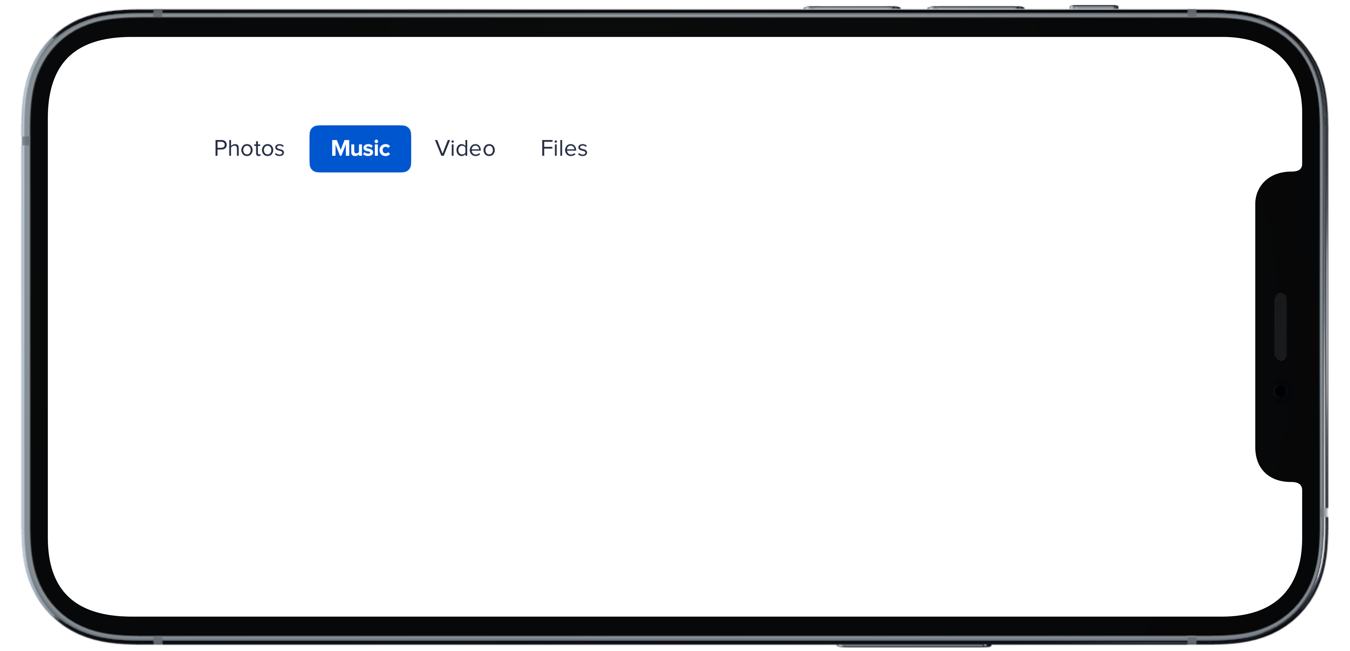
PBNav(
|
|
7
|
+
selected: $selectedHBold,
|
|
8
|
+
variant: .bold,
|
|
9
|
+
orientation: .horizontal,
|
|
10
|
+
borders: false
|
|
11
|
+
) {
|
|
12
|
+
PBNavItem("Photos")
|
|
13
|
+
PBNavItem("Music")
|
|
14
|
+
PBNavItem("Video")
|
|
15
|
+
PBNavItem("Files")
|
|
16
|
+
}
|
|
17
|
+
```
|