playbook_ui 13.10.0.pre.alpha.PLAY1046multilevelsingleselectphase21365 → 13.10.0.pre.alpha.PLAY1051removinghighchartsdependency1465
This diff represents the content of publicly available package versions that have been released to one of the supported registries. The information contained in this diff is provided for informational purposes only and reflects changes between package versions as they appear in their respective public registries.
- checksums.yaml +4 -4
- data/app/pb_kits/playbook/pb_bar_graph/_bar_graph.tsx +36 -32
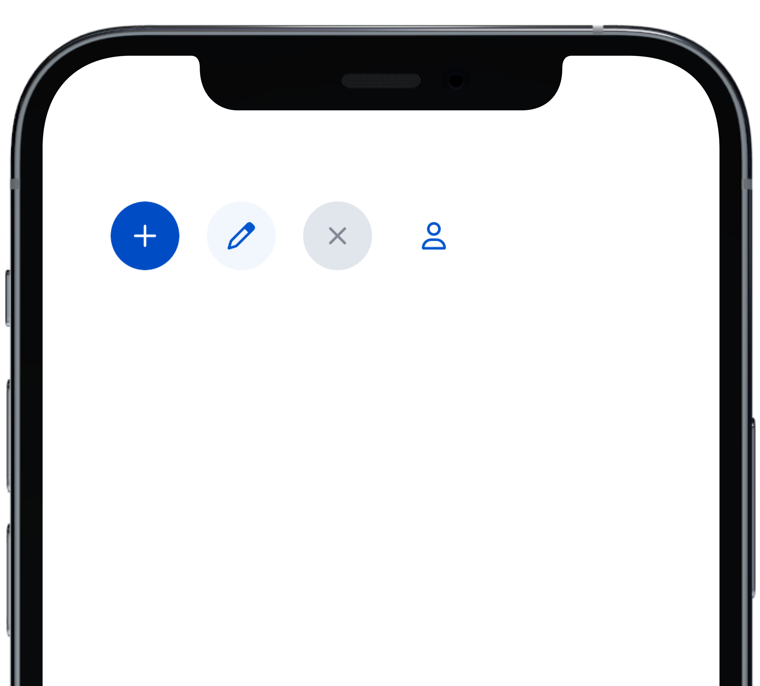
- data/app/pb_kits/playbook/pb_button/docs/_button_circle_swift.md +28 -0
- data/app/pb_kits/playbook/pb_button/docs/_button_default_swift.md +23 -0
- data/app/pb_kits/playbook/pb_button/docs/_button_full_width_swift.md +9 -0
- data/app/pb_kits/playbook/pb_button/docs/_button_icon_options_swift.md +18 -0
- data/app/pb_kits/playbook/pb_button/docs/_button_props_swift.md +11 -0
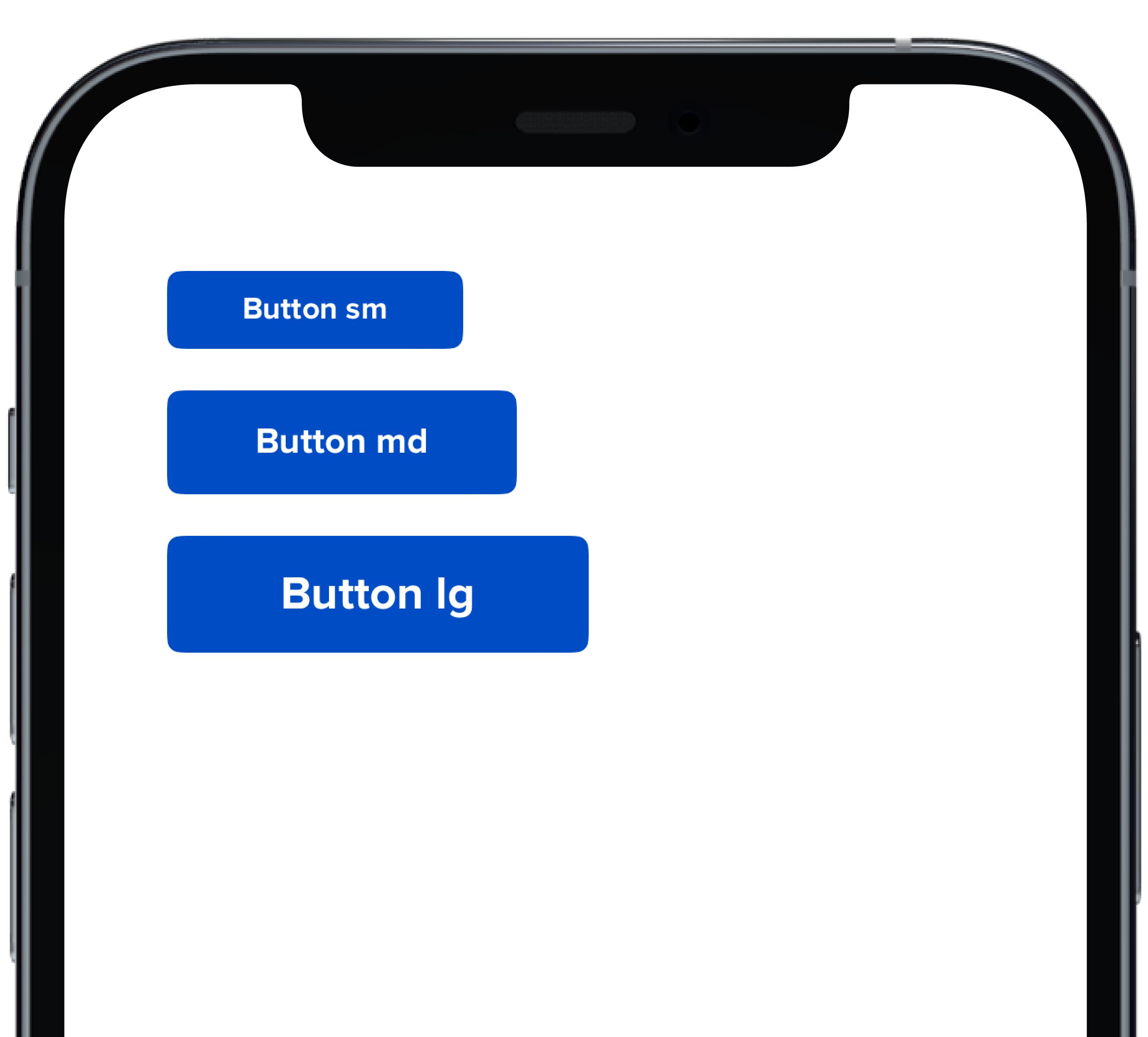
- data/app/pb_kits/playbook/pb_button/docs/_button_size_swift.md +20 -0
- data/app/pb_kits/playbook/pb_button/docs/example.yml +8 -0
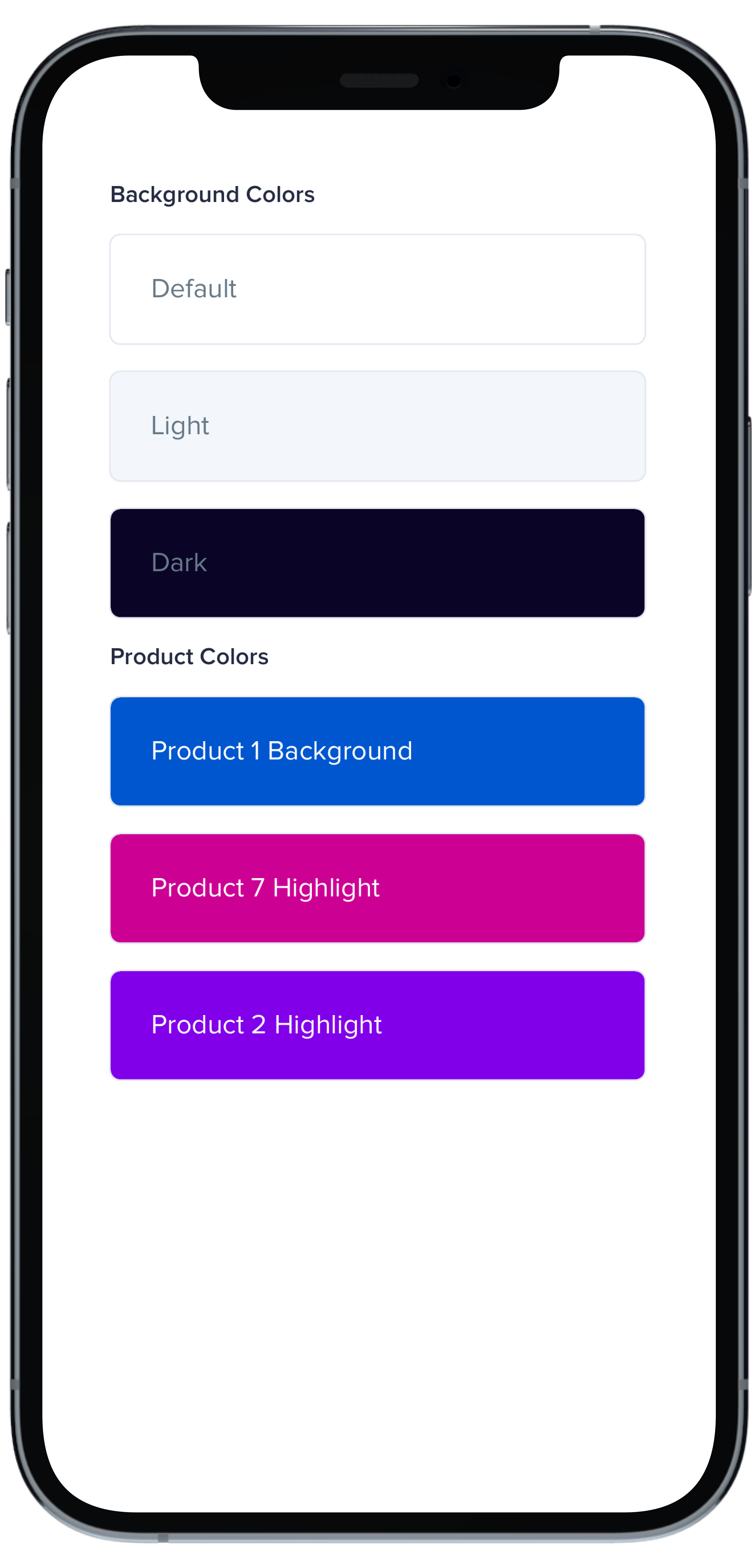
- data/app/pb_kits/playbook/pb_card/docs/_card_background_swift.md +29 -0
- data/app/pb_kits/playbook/pb_card/docs/_card_border_none_swift.md +7 -0
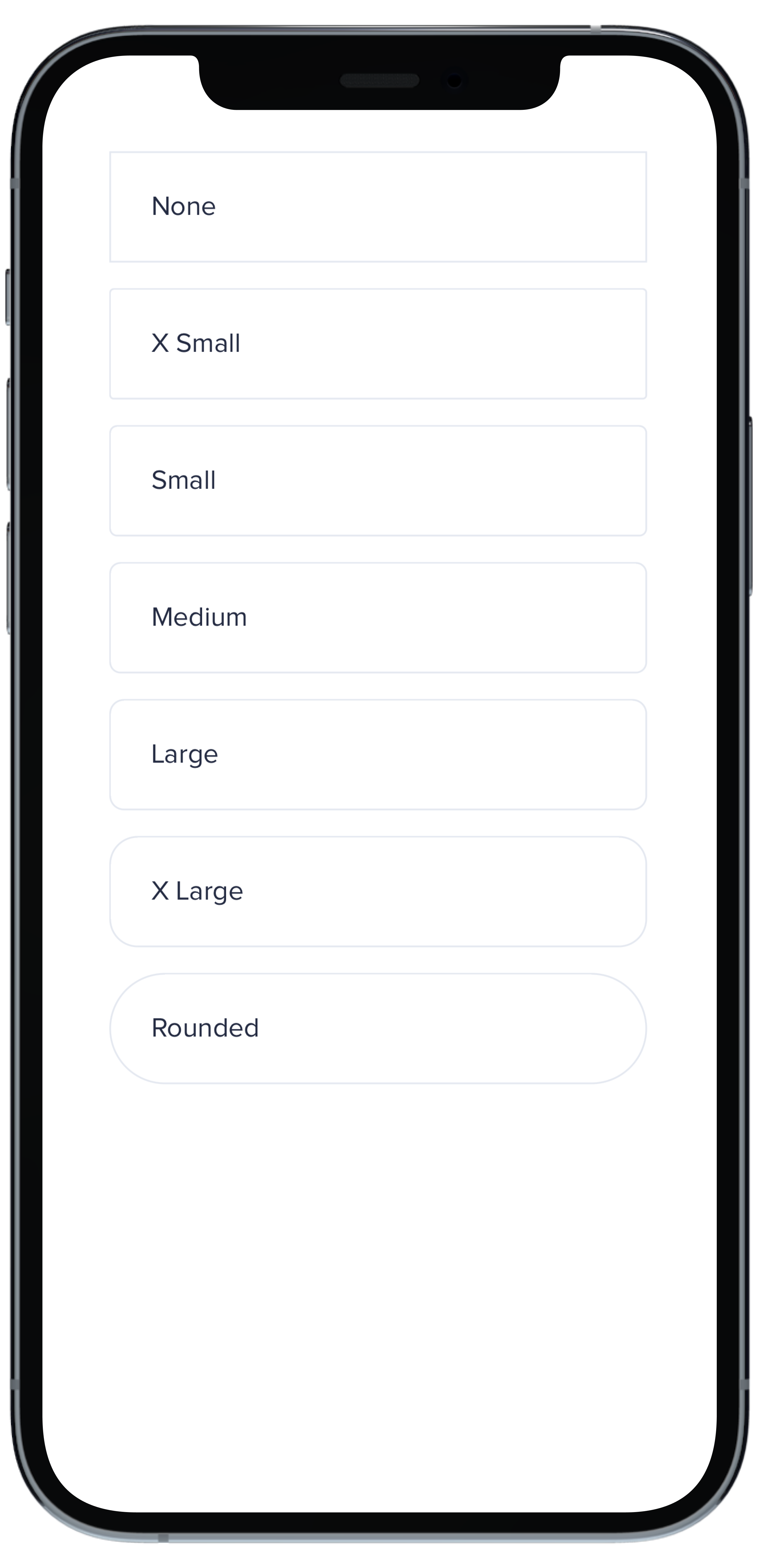
- data/app/pb_kits/playbook/pb_card/docs/_card_border_radius_swift.md +33 -0
- data/app/pb_kits/playbook/pb_card/docs/_card_header_swift.md +33 -0
- data/app/pb_kits/playbook/pb_card/docs/_card_highlight_swift.md +17 -0
- data/app/pb_kits/playbook/pb_card/docs/_card_light_swift.md +7 -0
- data/app/pb_kits/playbook/pb_card/docs/_card_padding_swift.md +33 -0
- data/app/pb_kits/playbook/pb_card/docs/_card_props_swift.md +10 -0
- data/app/pb_kits/playbook/pb_card/docs/_card_selected_swift.md +0 -0
- data/app/pb_kits/playbook/pb_card/docs/_card_separator_swift.md +11 -0
- data/app/pb_kits/playbook/pb_card/docs/_card_shadow_swift.md +21 -0
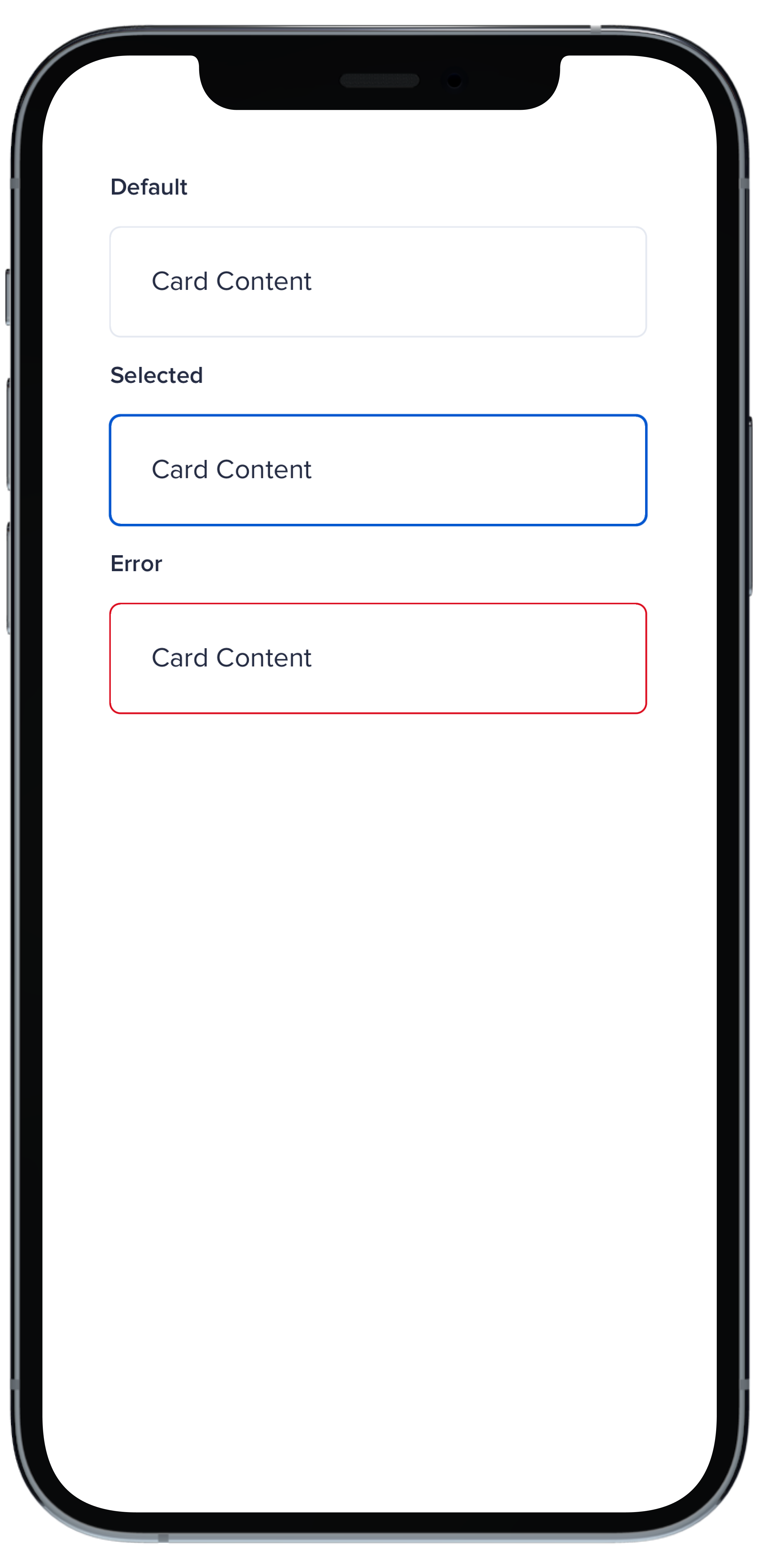
- data/app/pb_kits/playbook/pb_card/docs/_card_styles_swift.md +17 -0
- data/app/pb_kits/playbook/pb_card/docs/_card_tag_swift.md +0 -0
- data/app/pb_kits/playbook/pb_card/docs/example.yml +12 -0
- data/app/pb_kits/playbook/pb_checkbox/docs/_checkbox_default_swift.md +10 -0
- data/app/pb_kits/playbook/pb_checkbox/docs/_checkbox_error_swift.md +12 -0
- data/app/pb_kits/playbook/pb_checkbox/docs/_checkbox_indeterminate_swift.md +12 -0
- data/app/pb_kits/playbook/pb_checkbox/docs/_checkbox_props_swift.md +7 -0
- data/app/pb_kits/playbook/pb_checkbox/docs/example.yml +7 -0
- data/app/pb_kits/playbook/pb_circle_chart/_circle_chart.tsx +67 -63
- data/app/pb_kits/playbook/pb_gauge/_gauge.tsx +57 -46
- data/app/pb_kits/playbook/pb_icon_circle/docs/_icon_circle_color_props.md +6 -0
- data/app/pb_kits/playbook/pb_icon_circle/docs/_icon_circle_color_swift.md +16 -0
- data/app/pb_kits/playbook/pb_icon_circle/docs/_icon_circle_defaul_swift.md +7 -0
- data/app/pb_kits/playbook/pb_icon_circle/docs/_icon_circle_sizes_swift.md +11 -0
- data/app/pb_kits/playbook/pb_icon_circle/docs/example.yml +7 -0
- data/app/pb_kits/playbook/pb_line_graph/_line_graph.tsx +39 -34
- data/app/pb_kits/playbook/pb_multi_level_select/_multi_level_select.tsx +19 -24
- data/app/pb_kits/playbook/pb_multi_level_select/docs/_multi_level_select_selected_ids.html.erb +1 -0
- data/app/pb_kits/playbook/pb_multi_level_select/docs/_multi_level_select_single.html.erb +45 -104
- data/app/pb_kits/playbook/pb_multi_level_select/docs/_multi_level_select_single.jsx +43 -100
- data/app/pb_kits/playbook/pb_multi_level_select/docs/example.yml +0 -2
- data/app/pb_kits/playbook/pb_multi_level_select/docs/index.js +0 -1
- data/app/pb_kits/playbook/pb_multi_level_select/multi_level_select.rb +0 -3
- data/app/pb_kits/playbook/pb_table/docs/_table_header.html.erb +47 -31
- data/app/pb_kits/playbook/pb_table/docs/_table_header.md +5 -0
- data/app/pb_kits/playbook/pb_table/table_header.html.erb +1 -1
- data/app/pb_kits/playbook/pb_treemap_chart/_treemap_chart.tsx +33 -28
- data/dist/playbook-rails.js +7 -7
- data/lib/playbook/version.rb +1 -1
- metadata +29 -4
- data/app/pb_kits/playbook/pb_multi_level_select/docs/_multi_level_select_single_children_only.html.erb +0 -139
- data/app/pb_kits/playbook/pb_multi_level_select/docs/_multi_level_select_single_children_only.jsx +0 -151
checksums.yaml
CHANGED
|
@@ -1,7 +1,7 @@
|
|
|
1
1
|
---
|
|
2
2
|
SHA256:
|
|
3
|
-
metadata.gz:
|
|
4
|
-
data.tar.gz:
|
|
3
|
+
metadata.gz: c72234133b0283ebe8474358ad92eede36295609498c2780f4673e8b1534193e
|
|
4
|
+
data.tar.gz: b44d188793f168af643425de2883eb81efeeb3f9a0a04fd7af76a60b21c5b2c6
|
|
5
5
|
SHA512:
|
|
6
|
-
metadata.gz:
|
|
7
|
-
data.tar.gz:
|
|
6
|
+
metadata.gz: a38b30f0ed86046de9ea6b21d3e80f45b51c32577ddcf5a205e519b5838e7c2448f5eb6295275fa7730e6d380cfbf527d4004db2a51607b1bacf68f2be2d1a2f
|
|
7
|
+
data.tar.gz: a0136098d09bec449774ae8f54c950ec5005b03b3bb509b2fefc65e1df7ab0b411aaa221a3e98dcde033bd02c3753d59774e2b43dd894d43ecaf88615bf47f33
|
|
@@ -3,7 +3,6 @@ import { globalProps } from "../utilities/globalProps";
|
|
|
3
3
|
import { buildAriaProps, buildDataProps } from "../utilities/props";
|
|
4
4
|
|
|
5
5
|
import HighchartsReact from "highcharts-react-official";
|
|
6
|
-
import Highcharts from "highcharts";
|
|
7
6
|
import { highchartsTheme } from "../pb_dashboard/pbChartsLightTheme";
|
|
8
7
|
import { highchartsDarkTheme } from "../pb_dashboard/pbChartsDarkTheme";
|
|
9
8
|
import mapColors from "../pb_dashboard/pbChartsColorsHelper";
|
|
@@ -11,32 +10,31 @@ import mapColors from "../pb_dashboard/pbChartsColorsHelper";
|
|
|
11
10
|
import classnames from "classnames";
|
|
12
11
|
|
|
13
12
|
type BarGraphProps = {
|
|
14
|
-
align?: "left" | "right" | "center"
|
|
15
|
-
axisTitle: string
|
|
16
|
-
dark?: boolean
|
|
17
|
-
xAxisCategories: []
|
|
18
|
-
yAxisMin: number
|
|
19
|
-
yAxisMax: number
|
|
20
|
-
chartData: { name: string
|
|
21
|
-
className?: string
|
|
22
|
-
id: any
|
|
23
|
-
pointStart: number | any
|
|
24
|
-
subTitle?: string
|
|
25
|
-
title: string
|
|
26
|
-
type?: string
|
|
27
|
-
legend?: boolean
|
|
28
|
-
toggleLegendClick?: boolean
|
|
29
|
-
height?: string
|
|
30
|
-
colors: string[]
|
|
31
|
-
layout?: "horizontal" | "vertical" | "proximate"
|
|
32
|
-
verticalAlign?: "top" | "middle" | "bottom"
|
|
33
|
-
x?: number
|
|
34
|
-
y?: number
|
|
35
|
-
aria?: { [key: string]: string }
|
|
36
|
-
data?: { [key: string]: string }
|
|
13
|
+
align?: "left" | "right" | "center",
|
|
14
|
+
axisTitle: string,
|
|
15
|
+
dark?: boolean,
|
|
16
|
+
xAxisCategories: [],
|
|
17
|
+
yAxisMin: number,
|
|
18
|
+
yAxisMax: number,
|
|
19
|
+
chartData: { name: string, data: number[] }[],
|
|
20
|
+
className?: string,
|
|
21
|
+
id: any,
|
|
22
|
+
pointStart: number | any,
|
|
23
|
+
subTitle?: string,
|
|
24
|
+
title: string,
|
|
25
|
+
type?: string,
|
|
26
|
+
legend?: boolean,
|
|
27
|
+
toggleLegendClick?: boolean,
|
|
28
|
+
height?: string,
|
|
29
|
+
colors: string[],
|
|
30
|
+
layout?: "horizontal" | "vertical" | "proximate",
|
|
31
|
+
verticalAlign?: "top" | "middle" | "bottom",
|
|
32
|
+
x?: number,
|
|
33
|
+
y?: number,
|
|
34
|
+
aria?: { [key: string]: string },
|
|
35
|
+
data?: { [key: string]: string },
|
|
37
36
|
};
|
|
38
37
|
|
|
39
|
-
|
|
40
38
|
const BarGraph = ({
|
|
41
39
|
aria = {},
|
|
42
40
|
data = {},
|
|
@@ -65,12 +63,6 @@ const BarGraph = ({
|
|
|
65
63
|
}: BarGraphProps): React.ReactElement => {
|
|
66
64
|
const ariaProps = buildAriaProps(aria);
|
|
67
65
|
const dataProps = buildDataProps(data);
|
|
68
|
-
const setupTheme = () => {
|
|
69
|
-
dark
|
|
70
|
-
? Highcharts.setOptions(highchartsDarkTheme)
|
|
71
|
-
: Highcharts.setOptions(highchartsTheme);
|
|
72
|
-
};
|
|
73
|
-
setupTheme();
|
|
74
66
|
|
|
75
67
|
const staticOptions = {
|
|
76
68
|
title: {
|
|
@@ -123,12 +115,24 @@ const BarGraph = ({
|
|
|
123
115
|
}
|
|
124
116
|
|
|
125
117
|
const [options, setOptions] = useState({});
|
|
118
|
+
const [isHighchartsLoaded, setIsHighchartsLoaded] = useState(false)
|
|
126
119
|
|
|
127
120
|
useEffect(() => {
|
|
128
121
|
setOptions({ ...staticOptions });
|
|
122
|
+
|
|
123
|
+
const interval = setInterval(() => {
|
|
124
|
+
if (window.Highcharts) {
|
|
125
|
+
clearInterval(interval)
|
|
126
|
+
dark
|
|
127
|
+
? window.Highcharts.setOptions(highchartsDarkTheme)
|
|
128
|
+
: window.Highcharts.setOptions(highchartsTheme)
|
|
129
|
+
setIsHighchartsLoaded(true)
|
|
130
|
+
}
|
|
131
|
+
}, 0)
|
|
129
132
|
}, [chartData]);
|
|
130
133
|
|
|
131
134
|
return (
|
|
135
|
+
isHighchartsLoaded &&
|
|
132
136
|
<HighchartsReact
|
|
133
137
|
containerProps={{
|
|
134
138
|
className: classnames(globalProps(props), className),
|
|
@@ -136,7 +140,7 @@ const BarGraph = ({
|
|
|
136
140
|
...ariaProps,
|
|
137
141
|
...dataProps,
|
|
138
142
|
}}
|
|
139
|
-
highcharts={Highcharts}
|
|
143
|
+
highcharts={window.Highcharts}
|
|
140
144
|
options={options}
|
|
141
145
|
/>
|
|
142
146
|
);
|
|
@@ -0,0 +1,28 @@
|
|
|
1
|
+
|
|
2
|
+
|
|
3
|
+
```swift
|
|
4
|
+
VStack(alignment: .leading, spacing: Spacing.small) {
|
|
5
|
+
PBButton(
|
|
6
|
+
shape: .circle,
|
|
7
|
+
icon: PBIcon.fontAwesome(.plus, size: .x1),
|
|
8
|
+
action: {}
|
|
9
|
+
)
|
|
10
|
+
PBButton(
|
|
11
|
+
variant: .secondary,
|
|
12
|
+
shape: .circle,
|
|
13
|
+
icon: PBIcon.fontAwesome(.pen, size: .x1),
|
|
14
|
+
action: {}
|
|
15
|
+
)
|
|
16
|
+
PBButton(
|
|
17
|
+
variant: .disabled,
|
|
18
|
+
shape: .circle,
|
|
19
|
+
icon: PBIcon.fontAwesome(.times, size: .x1)
|
|
20
|
+
)
|
|
21
|
+
PBButton(
|
|
22
|
+
variant: .link,
|
|
23
|
+
shape: .circle,
|
|
24
|
+
icon: PBIcon.fontAwesome(.user, size: .x1),
|
|
25
|
+
action: {}
|
|
26
|
+
)
|
|
27
|
+
}
|
|
28
|
+
```
|
|
@@ -0,0 +1,23 @@
|
|
|
1
|
+

|
|
2
|
+
|
|
3
|
+
```swift
|
|
4
|
+
VStack(alignment: .leading, spacing: Spacing.small) {
|
|
5
|
+
PBButton(
|
|
6
|
+
title: "Button Primary",
|
|
7
|
+
action: {}
|
|
8
|
+
)
|
|
9
|
+
PBButton(
|
|
10
|
+
variant: .secondary,
|
|
11
|
+
title: "Button Secondary",
|
|
12
|
+
action: {})
|
|
13
|
+
PBButton(
|
|
14
|
+
variant: .link,
|
|
15
|
+
title: "Button Link",
|
|
16
|
+
action: {}
|
|
17
|
+
)
|
|
18
|
+
PBButton(
|
|
19
|
+
variant: .disabled,
|
|
20
|
+
title: "Button Disabled"
|
|
21
|
+
)
|
|
22
|
+
}
|
|
23
|
+
```
|
|
@@ -0,0 +1,18 @@
|
|
|
1
|
+

|
|
2
|
+
|
|
3
|
+
|
|
4
|
+
```swift
|
|
5
|
+
VStack(alignment: .leading, spacing: Spacing.small) {
|
|
6
|
+
PBButton(
|
|
7
|
+
title: "Button with Icon on Left",
|
|
8
|
+
icon: PBIcon.fontAwesome(.user, size: .x1),
|
|
9
|
+
action: {}
|
|
10
|
+
)
|
|
11
|
+
PBButton(
|
|
12
|
+
title: "Button with Icon on Right",
|
|
13
|
+
icon: PBIcon.fontAwesome(.user, size: .x1),
|
|
14
|
+
iconPosition: .right,
|
|
15
|
+
action: {}
|
|
16
|
+
)
|
|
17
|
+
}
|
|
18
|
+
```
|
|
@@ -0,0 +1,11 @@
|
|
|
1
|
+
### Props
|
|
2
|
+
| Name | Type | Description | Default | Values |
|
|
3
|
+
| --- | ----------- | --------- | --------- | --------- |
|
|
4
|
+
| **Full Width** | `Bool` | Sets Button to full width | `false` | `true` `false` |
|
|
5
|
+
| **Variant** | `PBButtonVariant` | Changes the color of the Button | ` .primary` | `.primary` `.secondary` `.link` `.disabled` |
|
|
6
|
+
| **Size** | `Size` | Adjusts Button size | `.medium` | `.small` `.medium` `.large` |
|
|
7
|
+
| **Shape** | `Shape` | Changes the shape of the Button | `.primary` | `.primary` `.circle` |
|
|
8
|
+
| **Title** | `String` | Sets Button text | `nil` | |
|
|
9
|
+
| **Icon** | `PBIcon` | Adds an icon to the Button | `nil` | |
|
|
10
|
+
| **Icon Position** | `IconPosition` | Adjusts the icon's position | `.left` | `.left` `.right` |
|
|
11
|
+
| **Action** | `(() -> Void)` | Adds an action for the Button to perform | `{}` | |
|
|
@@ -0,0 +1,20 @@
|
|
|
1
|
+
|
|
2
|
+
|
|
3
|
+
```swift
|
|
4
|
+
VStack(alignment: .leading, spacing: Spacing.small) {
|
|
5
|
+
PBButton(
|
|
6
|
+
size: .small,
|
|
7
|
+
title: "Button sm",
|
|
8
|
+
action: {}
|
|
9
|
+
)
|
|
10
|
+
PBButton(
|
|
11
|
+
title: "Button md",
|
|
12
|
+
action: {}
|
|
13
|
+
)
|
|
14
|
+
PBButton(
|
|
15
|
+
size: .large,
|
|
16
|
+
title: "Button lg",
|
|
17
|
+
action: {}
|
|
18
|
+
)
|
|
19
|
+
}
|
|
20
|
+
```
|
|
@@ -25,3 +25,11 @@ examples:
|
|
|
25
25
|
- button_size: Button Size
|
|
26
26
|
- button_form: Button Form Attribute
|
|
27
27
|
- button_hover: Button Hover
|
|
28
|
+
|
|
29
|
+
swift:
|
|
30
|
+
- button_default_swift: Button Variants
|
|
31
|
+
- button_full_width_swift: Button Full Width
|
|
32
|
+
- button_icon_options_swift: Button Icon Options
|
|
33
|
+
- button_circle_swift: Circle Button
|
|
34
|
+
- button_size_swift: Button Size
|
|
35
|
+
- button_props_swift: ""
|
|
@@ -0,0 +1,29 @@
|
|
|
1
|
+
|
|
2
|
+
|
|
3
|
+
```swift
|
|
4
|
+
VStack(alignment: .leading, spacing: Spacing.small) {
|
|
5
|
+
PBCard {
|
|
6
|
+
Text(text).pbFont(.body)
|
|
7
|
+
}
|
|
8
|
+
|
|
9
|
+
PBCard(backgroundColor: .background(.light)) {
|
|
10
|
+
Text("Light").pbFont(.body, color: .text(.light))
|
|
11
|
+
}
|
|
12
|
+
|
|
13
|
+
PBCard(backgroundColor: .background(.dark)) {
|
|
14
|
+
Text("Dark").pbFont(.body, color: .text(.light))
|
|
15
|
+
}
|
|
16
|
+
|
|
17
|
+
PBCard(backgroundColor: .product(.product1, category: .background)) {
|
|
18
|
+
Text("Product 1 Background").pbFont(.body, color: .white)
|
|
19
|
+
}
|
|
20
|
+
|
|
21
|
+
PBCard(backgroundColor: .product(.product7, category: .highlight)) {
|
|
22
|
+
Text("Product 7 Highlight").pbFont(.body, color: .white)
|
|
23
|
+
}
|
|
24
|
+
|
|
25
|
+
PBCard(backgroundColor: .product(.product2, category: .highlight)) {
|
|
26
|
+
Text("Product 2 Highlight").pbFont(.body, color: .white)
|
|
27
|
+
}
|
|
28
|
+
}
|
|
29
|
+
```
|
|
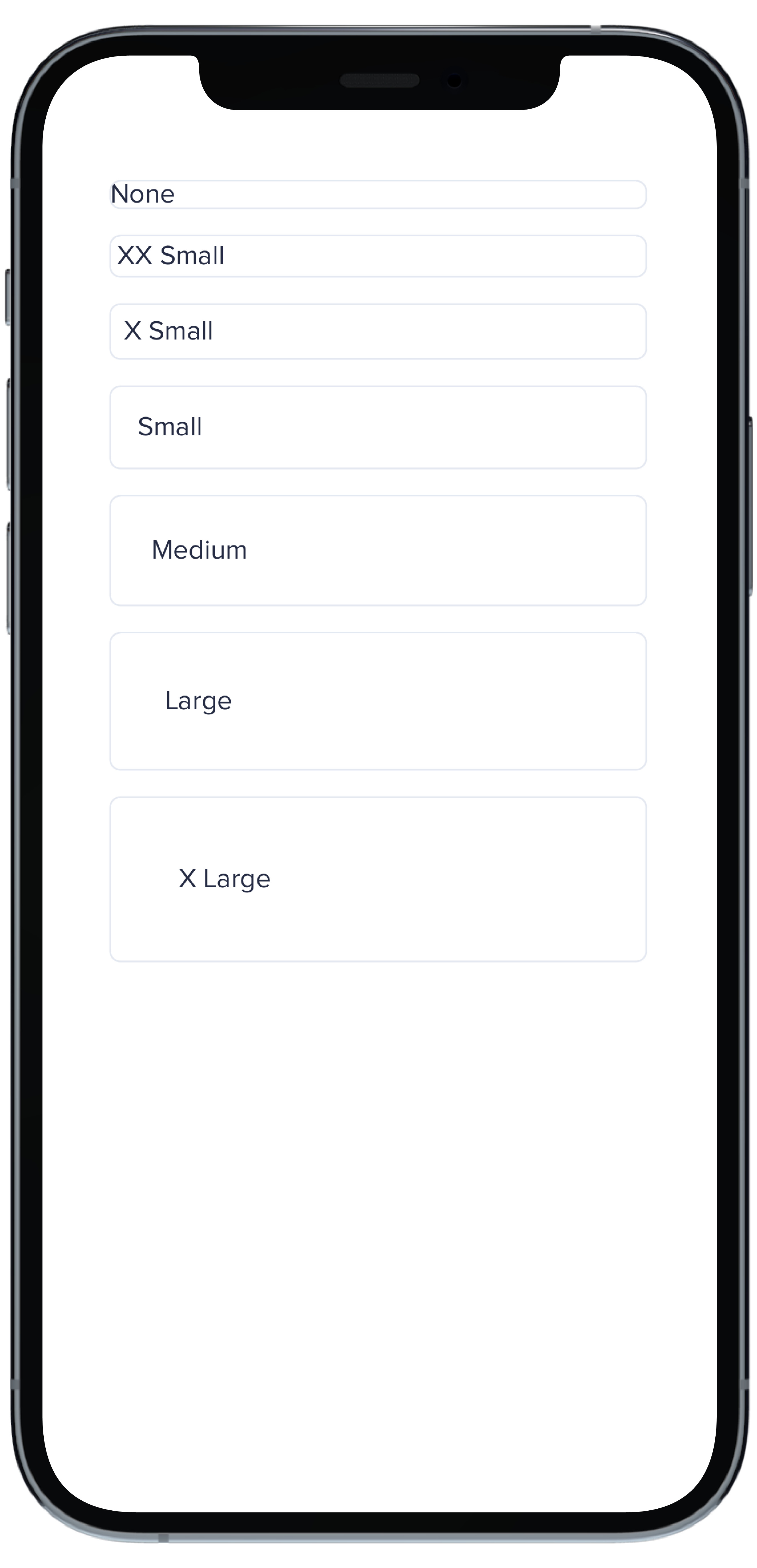
@@ -0,0 +1,33 @@
|
|
|
1
|
+
|
|
2
|
+
|
|
3
|
+
```swift
|
|
4
|
+
VStack(spacing: Spacing.small) {
|
|
5
|
+
PBCard(borderRadius: BorderRadius.none) {
|
|
6
|
+
Text("None").pbFont(.body)
|
|
7
|
+
}
|
|
8
|
+
|
|
9
|
+
PBCard(borderRadius: BorderRadius.xSmall) {
|
|
10
|
+
Text("X Small").pbFont(.body)
|
|
11
|
+
}
|
|
12
|
+
|
|
13
|
+
PBCard(borderRadius: BorderRadius.small) {
|
|
14
|
+
Text("Small").pbFont(.body)
|
|
15
|
+
}
|
|
16
|
+
|
|
17
|
+
PBCard(borderRadius: BorderRadius.medium) {
|
|
18
|
+
Text("Medium").pbFont(.body)
|
|
19
|
+
}
|
|
20
|
+
|
|
21
|
+
PBCard(borderRadius: BorderRadius.large) {
|
|
22
|
+
Text("Large").pbFont(.body)
|
|
23
|
+
}
|
|
24
|
+
|
|
25
|
+
PBCard(borderRadius: BorderRadius.xLarge) {
|
|
26
|
+
Text("X Large").pbFont(.body)
|
|
27
|
+
}
|
|
28
|
+
|
|
29
|
+
PBCard(borderRadius: BorderRadius.rounded) {
|
|
30
|
+
Text("Rounded").pbFont(.body)
|
|
31
|
+
}
|
|
32
|
+
}
|
|
33
|
+
``````
|
|
@@ -0,0 +1,33 @@
|
|
|
1
|
+
|
|
2
|
+
|
|
3
|
+
```swift
|
|
4
|
+
Stack(spacing: Spacing.small) {
|
|
5
|
+
PBCard(padding: Spacing.none) {
|
|
6
|
+
PBCardHeader(color: .category(.category1)) {
|
|
7
|
+
Text("Category 1").pbFont(.body, color: .white).padding(Spacing.small)
|
|
8
|
+
}
|
|
9
|
+
Text("Body").pbFont(.body, color: .text(.default)).padding(Spacing.small)
|
|
10
|
+
}
|
|
11
|
+
|
|
12
|
+
PBCard(padding: Spacing.none) {
|
|
13
|
+
PBCardHeader(color: .category(.category3)) {
|
|
14
|
+
Text("Category 3").pbFont(.body, color: .black).padding(Spacing.small)
|
|
15
|
+
}
|
|
16
|
+
Text("Body").pbFont(.body, color: .text(.default)).padding(Spacing.small)
|
|
17
|
+
}
|
|
18
|
+
|
|
19
|
+
PBCard(padding: Spacing.none) {
|
|
20
|
+
PBCardHeader(color: .product(.product2, category: .background)) {
|
|
21
|
+
Text("Product 2 Background").pbFont(.body, color: .white).padding(Spacing.small)
|
|
22
|
+
}
|
|
23
|
+
Text("Body").pbFont(.body, color: .text(.default)).padding(Spacing.small)
|
|
24
|
+
}
|
|
25
|
+
|
|
26
|
+
PBCard(padding: Spacing.none) {
|
|
27
|
+
PBCardHeader(color: .product(.product6, category: .background)) {
|
|
28
|
+
Text("Product 6 Background").pbFont(.body, color: .white).padding(Spacing.small)
|
|
29
|
+
}
|
|
30
|
+
Text("Body").pbFont(.body, color: .text(.default)).padding(Spacing.small)
|
|
31
|
+
}
|
|
32
|
+
}
|
|
33
|
+
```
|
|
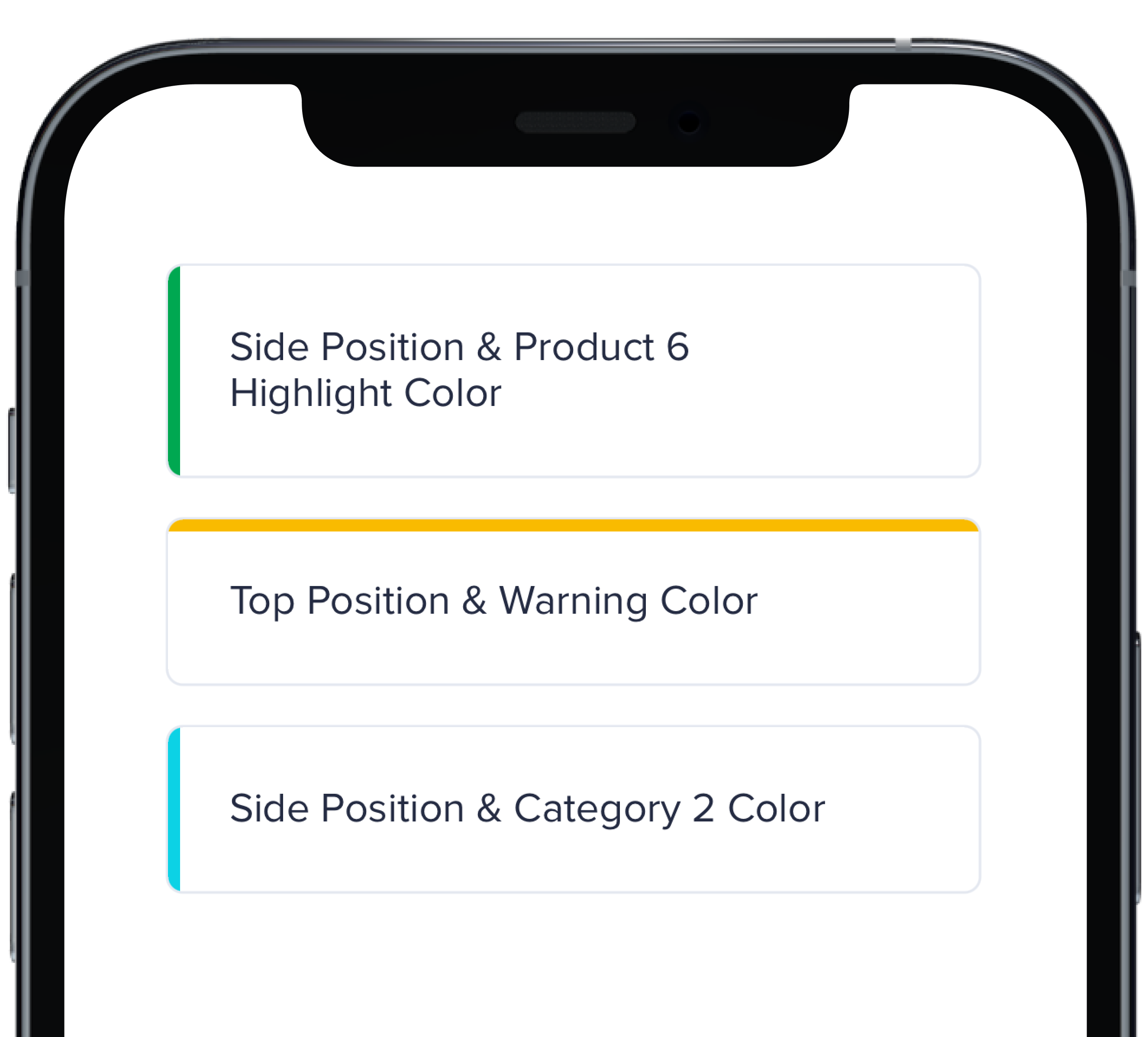
@@ -0,0 +1,17 @@
|
|
|
1
|
+
|
|
2
|
+
|
|
3
|
+
```swift
|
|
4
|
+
VStack(spacing: Spacing.small) {
|
|
5
|
+
PBCard(highlight: .side(.product(.product6, category: .highlight))) {
|
|
6
|
+
Text("Side Position & Product 6 Highlight Color").pbFont(.body)
|
|
7
|
+
}
|
|
8
|
+
|
|
9
|
+
PBCard(highlight: .top(.status(.warning))) {
|
|
10
|
+
Text("Top Position & Warning Color").pbFont(.body)
|
|
11
|
+
}
|
|
12
|
+
|
|
13
|
+
PBCard(highlight: .side(.category(.category2))) {
|
|
14
|
+
Text("Side Position & Category 2 Color").pbFont(.body)
|
|
15
|
+
}
|
|
16
|
+
}
|
|
17
|
+
```
|
|
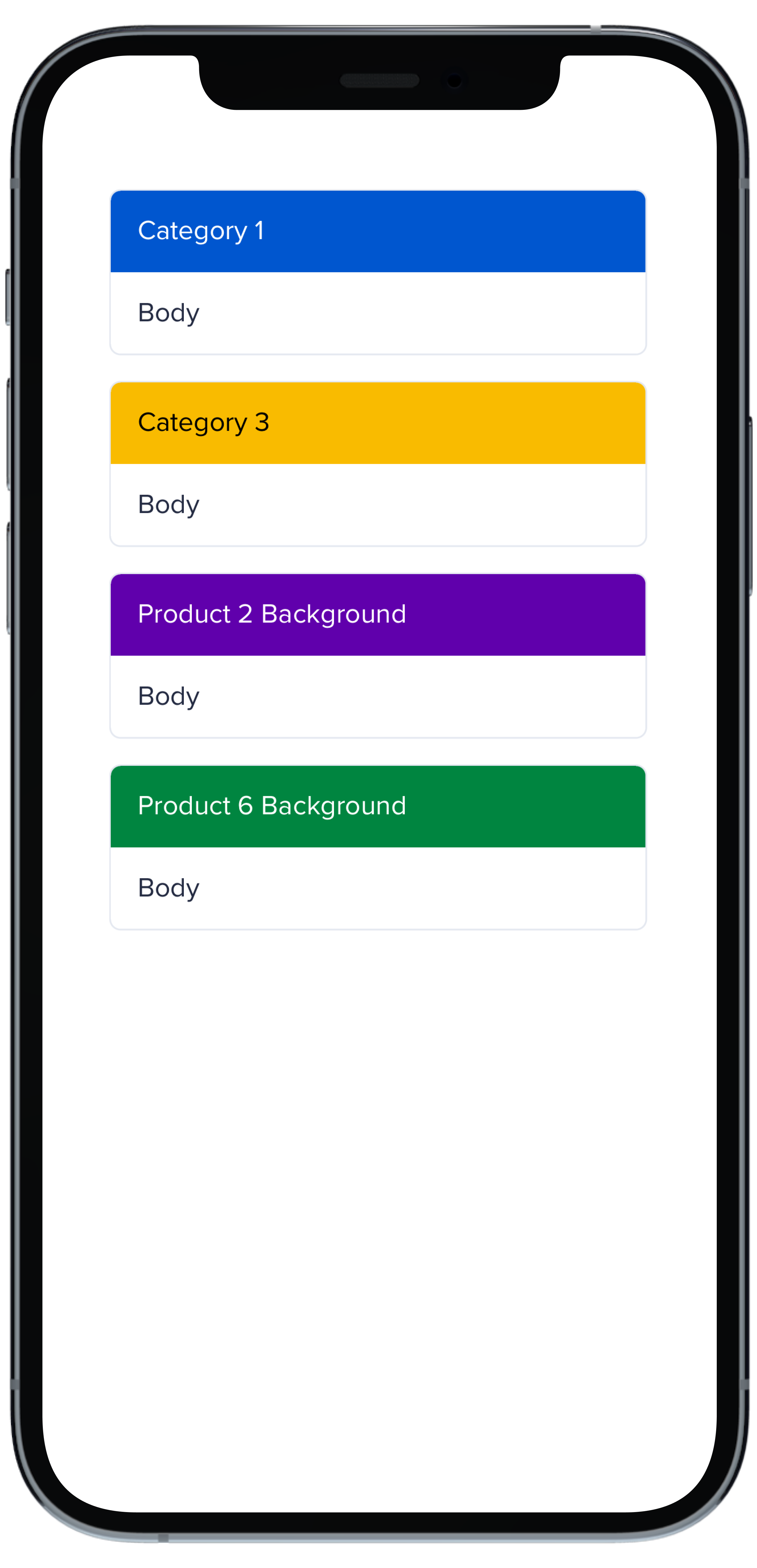
@@ -0,0 +1,33 @@
|
|
|
1
|
+
|
|
2
|
+
|
|
3
|
+
```swift
|
|
4
|
+
VStack(spacing: Spacing.small) {
|
|
5
|
+
PBCard(padding: Spacing.none) {
|
|
6
|
+
Text("None").pbFont(.body)
|
|
7
|
+
}
|
|
8
|
+
|
|
9
|
+
PBCard(padding: Spacing.xxSmall) {
|
|
10
|
+
Text("XX Small").pbFont(.body)
|
|
11
|
+
}
|
|
12
|
+
|
|
13
|
+
PBCard(padding: Spacing.xSmall) {
|
|
14
|
+
Text("X Small").pbFont(.body)
|
|
15
|
+
}
|
|
16
|
+
|
|
17
|
+
PBCard(padding: Spacing.small) {
|
|
18
|
+
Text("Small").pbFont(.body)
|
|
19
|
+
}
|
|
20
|
+
|
|
21
|
+
PBCard(padding: Spacing.medium) {
|
|
22
|
+
Text("Medium").pbFont(.body)
|
|
23
|
+
}
|
|
24
|
+
|
|
25
|
+
PBCard(padding: Spacing.large) {
|
|
26
|
+
Text("Large").pbFont(.body)
|
|
27
|
+
}
|
|
28
|
+
|
|
29
|
+
PBCard(padding: Spacing.xLarge) {
|
|
30
|
+
Text("X Large").pbFont(.body)
|
|
31
|
+
}
|
|
32
|
+
}
|
|
33
|
+
```
|
|
@@ -0,0 +1,10 @@
|
|
|
1
|
+
### Props
|
|
2
|
+
| Name | Type | Description | Default | Values |
|
|
3
|
+
| --- | ----------- | --------- | --------- | --------- |
|
|
4
|
+
| **Background Color** | `Color` | Changes background color | `.card` | `Color` |
|
|
5
|
+
| **Border** | `Bool` | Adds border around the Card | `true` | `true` `false` |
|
|
6
|
+
| **Border Radius** | `CGFloat` | Specifies the roundness of the Card | `BorderRadius.medium` | `BorderRadius.none` `BorderRadius.xSmall` `BorderRadius.small` `BorderRadius.medium` `BorderRadius.large` `BorderRadius.xLarge` `BorderRadius.rounded` |
|
|
7
|
+
| **Highlight** | `Highlight` | Adds a border accent color | `.none` | `Color` |
|
|
8
|
+
| **Padding** | `CGFloat` | Applies padding between text and border | `Spacing.medium` | `Spacing.none` `Spacing.xxSmall` `Spacing.xSmall` `Spacing.small` `Spacing.medium` `Spacing.large` `Spacing.xLarge` |
|
|
9
|
+
| **Style** | `PBCardStyle` | Specifies the color of the border | `.default` | `.default` `.selected` `.error` `.inline` |
|
|
10
|
+
| **Shadow** | `Shadow` | Applies shadow | `nil` | `Shadow.deep` `Shadow.deeper` `Shadow.deepest` `Shadow.none` |
|
|
File without changes
|
|
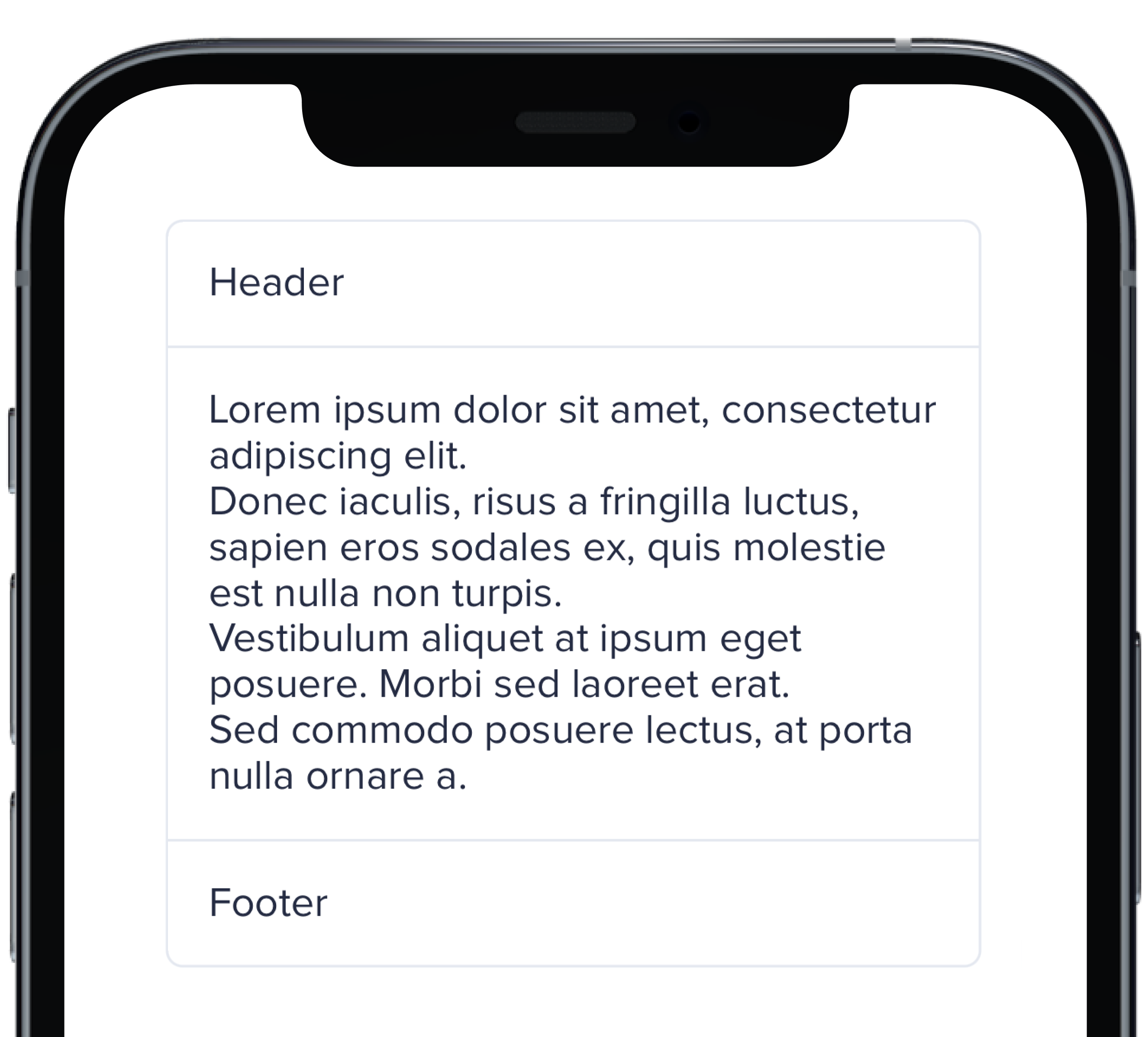
@@ -0,0 +1,11 @@
|
|
|
1
|
+
|
|
2
|
+
|
|
3
|
+
```swift
|
|
4
|
+
PBCard(padding: Spacing.none) {
|
|
5
|
+
Text("Header").pbFont(.body).padding(Spacing.small)
|
|
6
|
+
PBSectionSeparator()
|
|
7
|
+
Text(loremIpsum).pbFont(.body).padding(Spacing.small)
|
|
8
|
+
PBSectionSeparator()
|
|
9
|
+
Text("Footer").pbFont(.body).padding(Spacing.small)
|
|
10
|
+
}
|
|
11
|
+
```
|
|
@@ -0,0 +1,21 @@
|
|
|
1
|
+

|
|
2
|
+
|
|
3
|
+
```swift
|
|
4
|
+
VStack(spacing: Spacing.small) {
|
|
5
|
+
PBCard(shadow: Shadow.deep) {
|
|
6
|
+
Text("Deep").pbFont(.body)
|
|
7
|
+
}
|
|
8
|
+
|
|
9
|
+
PBCard(shadow: Shadow.deeper) {
|
|
10
|
+
Text("Deeper").pbFont(.body)
|
|
11
|
+
}
|
|
12
|
+
|
|
13
|
+
PBCard(shadow: Shadow.deepest) {
|
|
14
|
+
Text("Deepest").pbFont(.body)
|
|
15
|
+
}
|
|
16
|
+
|
|
17
|
+
PBCard(shadow: Shadow.none) {
|
|
18
|
+
Text("None").pbFont(.body)
|
|
19
|
+
}
|
|
20
|
+
}
|
|
21
|
+
```
|
|
@@ -0,0 +1,17 @@
|
|
|
1
|
+
|
|
2
|
+
|
|
3
|
+
```swift
|
|
4
|
+
VStack(alignment: .leading, spacing: Spacing.small) {
|
|
5
|
+
PBCard {
|
|
6
|
+
Text("Card Context").pbFont(.body)
|
|
7
|
+
}
|
|
8
|
+
|
|
9
|
+
PBCard(style: .selected()) {
|
|
10
|
+
Text("Card Context").pbFont(.body)
|
|
11
|
+
}
|
|
12
|
+
|
|
13
|
+
PBCard(style: .error) {
|
|
14
|
+
Text("Card Context").pbFont(.body)
|
|
15
|
+
}
|
|
16
|
+
}
|
|
17
|
+
```
|
|
File without changes
|
|
@@ -25,3 +25,15 @@ examples:
|
|
|
25
25
|
- card_separator: Separator Card
|
|
26
26
|
- card_border_none: No Border
|
|
27
27
|
- card_border_radius: Border Radius
|
|
28
|
+
swift:
|
|
29
|
+
- card_light_swift: Default
|
|
30
|
+
- card_background_swift: Card Backgrounds
|
|
31
|
+
- card_highlight_swift: Highlight Cards
|
|
32
|
+
- card_header_swift: Header Cards
|
|
33
|
+
- card_padding_swift: Padding Size
|
|
34
|
+
- card_shadow_swift: Shadow Size
|
|
35
|
+
- card_separator_swift: Separator Card
|
|
36
|
+
- card_border_none_swift: No Border
|
|
37
|
+
- card_border_radius_swift: Border Radius
|
|
38
|
+
- card_styles_swift: Styles
|
|
39
|
+
- card_props_swift: ""
|
|
@@ -0,0 +1,10 @@
|
|
|
1
|
+

|
|
2
|
+
|
|
3
|
+
```swift
|
|
4
|
+
|
|
5
|
+
PBCheckbox(checked: false, text: "Unchecked", action: {})
|
|
6
|
+
.padding(.bottom, Spacing.small)
|
|
7
|
+
|
|
8
|
+
PBCheckbox(checked: true, text: "Checked", action: {})
|
|
9
|
+
|
|
10
|
+
```
|
|
@@ -0,0 +1,7 @@
|
|
|
1
|
+
### Props
|
|
2
|
+
| Name | Type | Description | Default | Values |
|
|
3
|
+
| --- | ----------- | --------- | --------- | --------- |
|
|
4
|
+
| **Checked** | `Bool` | Adds a check to the Checkbox | `false` | `true` `false` |
|
|
5
|
+
| **Checkbox Type** | `CheckboxType` | Changes the style of the Checkbox | `default` | `default` `error` `indeterminate` |
|
|
6
|
+
| **Text** | `String` | Adds a text label | `nil` | |
|
|
7
|
+
| **Action** | `(() -> Void)` | Adds an action | `{}` | |
|
|
@@ -13,3 +13,10 @@ examples:
|
|
|
13
13
|
- checkbox_custom: Custom Checkbox
|
|
14
14
|
- checkbox_error: Default w/ Error
|
|
15
15
|
- checkbox_indeterminate: Indeterminate Checkbox
|
|
16
|
+
|
|
17
|
+
swift:
|
|
18
|
+
- checkbox_default_swift: Default
|
|
19
|
+
- checkbox_error_swift: Default w/ Error
|
|
20
|
+
- checkbox_indeterminate_swift: Indeterminate Checkbox
|
|
21
|
+
- checkbox_props_swift: ""
|
|
22
|
+
|