isomorfeus-react 16.6.6 → 16.6.7
This diff represents the content of publicly available package versions that have been released to one of the supported registries. The information contained in this diff is provided for informational purposes only and reflects changes between package versions as they appear in their respective public registries.
- checksums.yaml +4 -4
- data/README.md +439 -0
- data/lib/isomorfeus-react.rb +36 -38
- data/lib/isomorfeus/config.rb +66 -5
- data/lib/isomorfeus/execution_environment.rb +31 -0
- data/lib/isomorfeus/react_view_helper.rb +26 -0
- data/lib/isomorfeus/top_level_browser.rb +51 -0
- data/lib/isomorfeus/top_level_ssr.rb +18 -0
- data/lib/lucid_app/api.rb +1 -1
- data/lib/lucid_app/native_component_constructor.rb +2 -2
- data/lib/lucid_component/native_component_constructor.rb +9 -6
- data/lib/lucid_router.rb +18 -0
- data/lib/react.rb +14 -14
- data/lib/react/component/features.rb +12 -12
- data/lib/react/component/native_component_constructor.rb +2 -2
- data/lib/react/component/resolution.rb +6 -3
- data/lib/react/context_wrapper.rb +1 -1
- data/lib/react/function_component/creator.rb +1 -1
- data/lib/react/function_component/resolution.rb +7 -5
- data/lib/react/native_constant_wrapper.rb +3 -1
- data/lib/react/redux_component/app_store_proxy.rb +0 -3
- data/lib/react/redux_component/class_store_proxy.rb +0 -4
- data/lib/react/redux_component/native_component_constructor.rb +7 -4
- data/lib/react/version.rb +1 -1
- data/lib/react_dom.rb +38 -28
- data/lib/react_dom_server.rb +13 -11
- metadata +40 -9
- data/lib/isomorfeus/top_level.rb +0 -48
- data/lib/isomorfeus/view_helpers.rb +0 -22
- data/readme.md +0 -661
data/lib/isomorfeus/top_level.rb
DELETED
|
@@ -1,48 +0,0 @@
|
|
|
1
|
-
module Isomorfeus
|
|
2
|
-
class TopLevel
|
|
3
|
-
def self.search_path
|
|
4
|
-
@search_path ||= [Object]
|
|
5
|
-
end
|
|
6
|
-
|
|
7
|
-
def self.on_ready_mount(component, params = nil, element_query = nil)
|
|
8
|
-
# init in case it hasn't been run yet
|
|
9
|
-
Isomorfeus.init
|
|
10
|
-
# this looks a bit odd but works across _all_ browsers, and no event handler mess
|
|
11
|
-
# TODO: server rendering
|
|
12
|
-
%x{
|
|
13
|
-
function do_the_mount() { #{mount(component, params, element_query)} };
|
|
14
|
-
function ready_fun() {
|
|
15
|
-
/in/.test(document.readyState) ? setTimeout(ready_fun,5) : do_the_mount();
|
|
16
|
-
};
|
|
17
|
-
ready_fun();
|
|
18
|
-
}
|
|
19
|
-
end
|
|
20
|
-
|
|
21
|
-
def self.mount(component, params = nil, element_or_query = nil)
|
|
22
|
-
# TODO: server rendering
|
|
23
|
-
if element_or_query.nil?
|
|
24
|
-
if params.nil?
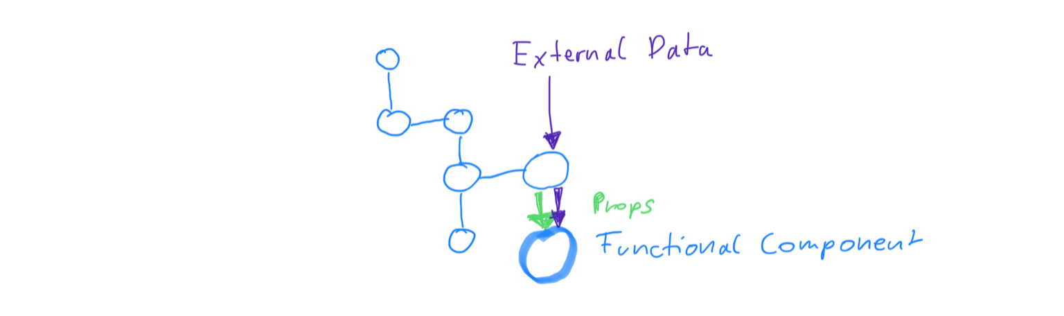
|
|
25
|
-
element = `document.body.querySelector('div')`
|
|
26
|
-
elsif params.class == String
|
|
27
|
-
element = `document.body.querySelector(params)`
|
|
28
|
-
params = nil
|
|
29
|
-
elsif params.is_a?(Browser::DOM::Node)
|
|
30
|
-
element = params.to_n
|
|
31
|
-
params = nil
|
|
32
|
-
end
|
|
33
|
-
else
|
|
34
|
-
if element_or_query.class == String
|
|
35
|
-
element = `document.body.querySelector(params)`
|
|
36
|
-
elsif element_or_query.is_a?(Browser::DOM::Node)
|
|
37
|
-
element = params.to_n
|
|
38
|
-
end
|
|
39
|
-
end
|
|
40
|
-
|
|
41
|
-
ReactDOM.render(React.create_element(component, params), element)
|
|
42
|
-
end
|
|
43
|
-
|
|
44
|
-
def self.ujs_mount
|
|
45
|
-
# TODO: implement mount using RailsUJS, for turbolinks and things
|
|
46
|
-
end
|
|
47
|
-
end
|
|
48
|
-
end
|
|
@@ -1,22 +0,0 @@
|
|
|
1
|
-
module Isomorfeus
|
|
2
|
-
module ViewHelpers
|
|
3
|
-
def react_component(component_name, params)
|
|
4
|
-
component_name_id = component_id_name(component_name)
|
|
5
|
-
tag = <<~SCRIPT
|
|
6
|
-
<div id="#{component_name_id}"></div>
|
|
7
|
-
<script type="text/javascript">
|
|
8
|
-
var component = Opal.Object.$const_get("#{component_name}");
|
|
9
|
-
var json_params = #{Oj.dump(params, mode: :compat)};
|
|
10
|
-
Opal.Isomorfeus.$const_get('TopLevel').$mount(component, Opal.Hash.$new(json_params), "##{component_name_id}" );
|
|
11
|
-
</script>
|
|
12
|
-
SCRIPT
|
|
13
|
-
tag.respond_to?(:html_safe) ? tag.html_safe : tag
|
|
14
|
-
end
|
|
15
|
-
|
|
16
|
-
private
|
|
17
|
-
|
|
18
|
-
def component_id_name(component_name)
|
|
19
|
-
"#{component_name.underscore}_#{Random.rand.to_s[2..-1]}"
|
|
20
|
-
end
|
|
21
|
-
end
|
|
22
|
-
end
|
data/readme.md
DELETED
|
@@ -1,661 +0,0 @@
|
|
|
1
|
-
# isomorfeus-react
|
|
2
|
-
|
|
3
|
-
Develop React components for Opal Ruby along with very easy to use and advanced React-Redux Components.
|
|
4
|
-
|
|
5
|
-
## Chat
|
|
6
|
-
At our [Gitter Isomorfeus Lobby](http://gitter.im/isomorfeus/Lobby)
|
|
7
|
-
|
|
8
|
-
## Versioning
|
|
9
|
-
isomorfeus-react version follows the React version which features and API it implements.
|
|
10
|
-
Isomorfeus-react 16.5.x implements features and the API of React 16.6 and should be used with React 16.6
|
|
11
|
-
|
|
12
|
-
## Installation
|
|
13
|
-
To install React with the matching version:
|
|
14
|
-
```
|
|
15
|
-
yarn add react@16.6
|
|
16
|
-
```
|
|
17
|
-
then add to the Gemfile:
|
|
18
|
-
```ruby
|
|
19
|
-
gem 'isomorfeus-react' # this will also include isomorfeus-redux
|
|
20
|
-
```
|
|
21
|
-
then `bundle install`
|
|
22
|
-
and to your client code add:
|
|
23
|
-
```ruby
|
|
24
|
-
require 'isomorfeus-react' # this will also require isomorfeus-redux
|
|
25
|
-
```
|
|
26
|
-
|
|
27
|
-
### Dependencies
|
|
28
|
-
|
|
29
|
-
For full functionality the following are required:
|
|
30
|
-
- [Opal ES6 import export](https://github.com/opal/opal/pull/1832)
|
|
31
|
-
- [Opal Webpack Loader](https://github.com/janbiedermann/opal-webpack-loader)
|
|
32
|
-
- [Opal Autoloader](https://github.com/janbiedermann/opal-autoloader)
|
|
33
|
-
|
|
34
|
-
For the Gemfile:
|
|
35
|
-
```ruby
|
|
36
|
-
gem 'opal', github: 'janbiedermann/opal', branch: 'es6_import_export'
|
|
37
|
-
gem 'opal-webpack-loader', '~> 0.3.7'
|
|
38
|
-
gem 'opal-autoloader', '~> 0.0.3'
|
|
39
|
-
```
|
|
40
|
-
|
|
41
|
-
## Usage
|
|
42
|
-
Because isomorfeus-react follows closely the React principles/implementation/API and Documentation, most things of the official React documentation
|
|
43
|
-
apply, but in the Ruby way, see:
|
|
44
|
-
- https://reactjs.org/docs/getting-started.html
|
|
45
|
-
|
|
46
|
-
Redux is also required, for the more advanced components to function properly.
|
|
47
|
-
|
|
48
|
-
React, Redux and accompanying libraries must be imported and made available in the global namespace in the application javascript entry file,
|
|
49
|
-
with webpack this can be ensured by assigning them to the global namespace:
|
|
50
|
-
```javascript
|
|
51
|
-
import * as Redux from 'redux';
|
|
52
|
-
import React from 'react';
|
|
53
|
-
import ReactDOM from 'react-dom';
|
|
54
|
-
global.Redux = Redux;
|
|
55
|
-
global.React = React;
|
|
56
|
-
global.ReactDOM = ReactDOM;
|
|
57
|
-
```
|
|
58
|
-
|
|
59
|
-
Following features are presented with its differences to the Javascript React implementation, along with enhancements and the advanced components.
|
|
60
|
-
|
|
61
|
-
### Class Components
|
|
62
|
-
Class Components can be created in two ways, either by inheritance or by including a module.
|
|
63
|
-
Inheritance:
|
|
64
|
-
```ruby
|
|
65
|
-
class MyComponent < React::Component::Base
|
|
66
|
-
|
|
67
|
-
end
|
|
68
|
-
```
|
|
69
|
-
including a module:
|
|
70
|
-
```ruby
|
|
71
|
-
class MyComponent
|
|
72
|
-
include React::Component::Mixin
|
|
73
|
-
|
|
74
|
-
end
|
|
75
|
-
```
|
|
76
|
-
|
|
77
|
-
Each Component must have at least a render block:
|
|
78
|
-
```ruby
|
|
79
|
-
class MyComponent < React::Component::Base
|
|
80
|
-
render do
|
|
81
|
-
DIV { "some text" }
|
|
82
|
-
end
|
|
83
|
-
end
|
|
84
|
-
```
|
|
85
|
-
|
|
86
|
-
Class Component allow for the definition of a custom should_component_update? block, but that is optional:
|
|
87
|
-
```ruby
|
|
88
|
-
class MyComponent < React::Component::Base
|
|
89
|
-
should_component_update? do |next_props, next_state|
|
|
90
|
-
return true # to always update for example
|
|
91
|
-
end
|
|
92
|
-
|
|
93
|
-
render do
|
|
94
|
-
DIV { "some text" }
|
|
95
|
-
end
|
|
96
|
-
end
|
|
97
|
-
```
|
|
98
|
-
A default should_component_update? implementation is supplied. The default should_component_update? implementation for Class Components is most
|
|
99
|
-
efficient if complex props or state are used.
|
|
100
|
-
|
|
101
|
-
**Data flow of a React::Component:**
|
|
102
|
-

|
|
103
|
-
|
|
104
|
-
|
|
105
|
-
### Pure Components
|
|
106
|
-
Pure Components can be created in two ways, either by inheritance or by including a module.
|
|
107
|
-
Inheritance:
|
|
108
|
-
```ruby
|
|
109
|
-
class MyComponent < React::PureComponent::Base
|
|
110
|
-
|
|
111
|
-
end
|
|
112
|
-
```
|
|
113
|
-
including a module:
|
|
114
|
-
```ruby
|
|
115
|
-
class MyComponent
|
|
116
|
-
include React::PureComponent::Mixin
|
|
117
|
-
|
|
118
|
-
end
|
|
119
|
-
```
|
|
120
|
-
|
|
121
|
-
Each Component must have at least a render block:
|
|
122
|
-
```ruby
|
|
123
|
-
class MyComponent < React::PureComponent::Base
|
|
124
|
-
render do
|
|
125
|
-
DIV { "some text" }
|
|
126
|
-
end
|
|
127
|
-
end
|
|
128
|
-
```
|
|
129
|
-
|
|
130
|
-
A PureComponent does not allow for the definition of a custom should_component_update? block. Its using the default React implementation instead.
|
|
131
|
-
Its recommended to use them only if no props or state are used or if props and state have simple values only, like strings or numbers.
|
|
132
|
-
|
|
133
|
-
**Data flow of a React::PureComponent:**
|
|
134
|
-

|
|
135
|
-
|
|
136
|
-
### Function Components
|
|
137
|
-
Function Components are created using a Ruby DSL that is used within the creator class. To create a function component that renders only
|
|
138
|
-
when props change, use the memo_component, which uses React.memo:
|
|
139
|
-
```ruby
|
|
140
|
-
class React::FunctionComponent::Creator
|
|
141
|
-
function_component 'MyComponent' do |props|
|
|
142
|
-
SPAN { props.text }
|
|
143
|
-
end
|
|
144
|
-
# Javascript .-notation can be used for the component name:
|
|
145
|
-
function_component 'MyObject.MyComponent' do |props|
|
|
146
|
-
SPAN { props.text }
|
|
147
|
-
end
|
|
148
|
-
# a React.memo function component:
|
|
149
|
-
memo_component 'MyObject.MyComponent' do |props|
|
|
150
|
-
SPAN { props.text }
|
|
151
|
-
end
|
|
152
|
-
end
|
|
153
|
-
```
|
|
154
|
-
This creates a native javascript components.
|
|
155
|
-
The file containing the creator must be explicitly required, because the automatic resolution of Javascript constant names
|
|
156
|
-
is not done by opal-autoloader.
|
|
157
|
-
|
|
158
|
-
A custom memo props function can be utilized when using React.memo directly with a function component and a block for checking the props:
|
|
159
|
-
```ruby
|
|
160
|
-
React.memo(`MyComponent`) do |prev_props, next_props|
|
|
161
|
-
prev_props.var != next_props.var
|
|
162
|
-
end
|
|
163
|
-
```
|
|
164
|
-
|
|
165
|
-
A Function Component can then be used in other Components:
|
|
166
|
-
```ruby
|
|
167
|
-
class MyComponent < React::PureComponent::Base
|
|
168
|
-
render do
|
|
169
|
-
MyComponent(text: 'some text')
|
|
170
|
-
MyObject.MyComponent(text: 'more text')
|
|
171
|
-
end
|
|
172
|
-
end
|
|
173
|
-
```
|
|
174
|
-
To get the native component, for example to pass it in props, javascript inlining can be used:
|
|
175
|
-
```ruby
|
|
176
|
-
Route(path: '/fun_fun/:count', exact: true, component: `MyObject.MyComponent`)
|
|
177
|
-
```
|
|
178
|
-
|
|
179
|
-
**Data flow of a React::FunctionComponent:**
|
|
180
|
-
|
|
181
|
-
|
|
182
|
-
### Props
|
|
183
|
-
In ruby props are underscored: `className -> class_name`. The conversion for React is done automatically.
|
|
184
|
-
Within a component props can be accessed using `props`:
|
|
185
|
-
```ruby
|
|
186
|
-
class MyComponent < React::PureComponent::Base
|
|
187
|
-
render do
|
|
188
|
-
DIV { props.text }
|
|
189
|
-
end
|
|
190
|
-
end
|
|
191
|
-
```
|
|
192
|
-
Props are passed as argument to the component:
|
|
193
|
-
```ruby
|
|
194
|
-
class MyOtherComponent < React::PureComponent::Base
|
|
195
|
-
render do
|
|
196
|
-
MyComponent(text: 'some other text')
|
|
197
|
-
end
|
|
198
|
-
end
|
|
199
|
-
```
|
|
200
|
-
Props can be declared and type checked and a default value can be given:
|
|
201
|
-
```ruby
|
|
202
|
-
class MyComponent < React::PureComponent::Base
|
|
203
|
-
prop :text, class: String # a required prop of class String, class must match exactly
|
|
204
|
-
prop :other, is_a: Enumerable # a required prop, which can be a Array for example, but at least must be a Enumerable
|
|
205
|
-
prop :cool, default: 'yet some more text' # a optional prop with a default value
|
|
206
|
-
prop :even_cooler, class: String, required: false # a optional prop, which when given, must be of class String
|
|
207
|
-
|
|
208
|
-
render do
|
|
209
|
-
DIV { props.text }
|
|
210
|
-
end
|
|
211
|
-
end
|
|
212
|
-
```
|
|
213
|
-
|
|
214
|
-
### State
|
|
215
|
-
State can be accessed in components using `state`:
|
|
216
|
-
```ruby
|
|
217
|
-
class MyComponent < React::PureComponent::Base
|
|
218
|
-
render do
|
|
219
|
-
if state.toggled
|
|
220
|
-
DIV { 'toggled' }
|
|
221
|
-
else
|
|
222
|
-
DIV { 'not toggled' }
|
|
223
|
-
end
|
|
224
|
-
end
|
|
225
|
-
end
|
|
226
|
-
```
|
|
227
|
-
State can be intialized like so:
|
|
228
|
-
```ruby
|
|
229
|
-
class MyComponent < React::PureComponent::Base
|
|
230
|
-
state.toggled = false
|
|
231
|
-
|
|
232
|
-
render do
|
|
233
|
-
if state.toggled
|
|
234
|
-
DIV { 'toggled' }
|
|
235
|
-
else
|
|
236
|
-
DIV { 'not toggled' }
|
|
237
|
-
end
|
|
238
|
-
end
|
|
239
|
-
end
|
|
240
|
-
```
|
|
241
|
-
State can be changed like so, the component setState() will be called:
|
|
242
|
-
```ruby
|
|
243
|
-
class MyComponent < React::PureComponent::Base
|
|
244
|
-
render do
|
|
245
|
-
if some_condition_is_met
|
|
246
|
-
|
|
247
|
-
state.toggled = true # calls components setState to cause a render
|
|
248
|
-
|
|
249
|
-
# or if a callback is needed:
|
|
250
|
-
|
|
251
|
-
set_state({toggled: true}) do
|
|
252
|
-
# some callback code here
|
|
253
|
-
end
|
|
254
|
-
end
|
|
255
|
-
if state.toggled
|
|
256
|
-
DIV { 'toggled' }
|
|
257
|
-
else
|
|
258
|
-
DIV { 'not toggled' }
|
|
259
|
-
end
|
|
260
|
-
end
|
|
261
|
-
end
|
|
262
|
-
```
|
|
263
|
-
When changing state, the state is not immediately available, just like in React! For example:
|
|
264
|
-
```ruby
|
|
265
|
-
class MyComponent < React::PureComponent::Base
|
|
266
|
-
render do
|
|
267
|
-
previous_state_value = state.variable
|
|
268
|
-
state.variable = next_state_value # even though this looks like a assignment, it causes a side effect
|
|
269
|
-
# state may be updated after the next render cycle
|
|
270
|
-
next_state_value == state.variable # very probably false here until next render
|
|
271
|
-
previous_state_value == state.variable # probably true here until next render
|
|
272
|
-
|
|
273
|
-
# to work with next_state_value, wait for the next render cycle, or just keep using the next_state_value variable here instead of state.value
|
|
274
|
-
end
|
|
275
|
-
end
|
|
276
|
-
```
|
|
277
|
-
To make the side effect of a set_state more visible, state can be set by using a method call instead of a assignment:
|
|
278
|
-
```ruby
|
|
279
|
-
class MyComponent < React::PureComponent::Base
|
|
280
|
-
render do
|
|
281
|
-
previous_state_value = state.variable
|
|
282
|
-
state.variable(next_state_value) # setting state with a method call, it causes a side effect
|
|
283
|
-
# state may be updated after the next render cycle
|
|
284
|
-
next_state_value == state.variable # very probably false here until next render
|
|
285
|
-
previous_state_value == state.variable # probably true here until next render
|
|
286
|
-
|
|
287
|
-
# to work with next_state_value, wait for the next render cycle, or just keep using the next_state_value variable here instead of state.value
|
|
288
|
-
end
|
|
289
|
-
end
|
|
290
|
-
```
|
|
291
|
-
### Lifecycle Callbacks
|
|
292
|
-
All lifecycle callbacks that are available in the matching React version are available as DSL. Callback names are underscored.
|
|
293
|
-
Callback names prefixed with UNSAFE_ in React are prefixed with unsafe_ in ruby.
|
|
294
|
-
Example:
|
|
295
|
-
```ruby
|
|
296
|
-
class MyComponent < React::Component::Base
|
|
297
|
-
render do
|
|
298
|
-
SPAN { 'some more text' }
|
|
299
|
-
end
|
|
300
|
-
|
|
301
|
-
component_did_mount do
|
|
302
|
-
`console.log("MyComponent mounted!")`
|
|
303
|
-
end
|
|
304
|
-
end
|
|
305
|
-
```
|
|
306
|
-
|
|
307
|
-
### Events
|
|
308
|
-
Event names are underscored in ruby: `onClick` becomes `on_click`. The conversion for React is done automatically.
|
|
309
|
-
|
|
310
|
-
|
|
311
|
-
Event handlers must be declared using the `event_handler` DSL. This is to make sure, that they are not recreated during render and can be properly
|
|
312
|
-
compared by reference by shouldComponentUpdate(). Use the DSL like so:
|
|
313
|
-
```ruby
|
|
314
|
-
class MyComponent < React::Component::Base
|
|
315
|
-
event_handler :handle_click do |event|
|
|
316
|
-
state.toggler = !state.toggler
|
|
317
|
-
end
|
|
318
|
-
|
|
319
|
-
render do
|
|
320
|
-
SPAN(on_click: :handle_click) { 'some more text' }
|
|
321
|
-
SPAN(on_click: :handle_click) { 'a lot more text' } # event handlers can be reused
|
|
322
|
-
end
|
|
323
|
-
end
|
|
324
|
-
```
|
|
325
|
-
|
|
326
|
-
To the event handler the event is passed as argument. The event is a ruby object `React::SyntheticEvent` and supports all the methods, properties
|
|
327
|
-
and events as the React.Synthetic event. Methods are underscored. Example:
|
|
328
|
-
```ruby
|
|
329
|
-
class MyComponent < React::Component::Base
|
|
330
|
-
event_handler :handle_click do |event|
|
|
331
|
-
event.prevent_default
|
|
332
|
-
event.current_target
|
|
333
|
-
end
|
|
334
|
-
|
|
335
|
-
render do
|
|
336
|
-
SPAN(on_click: :handle_click) { 'some more text' }
|
|
337
|
-
end
|
|
338
|
-
end
|
|
339
|
-
```
|
|
340
|
-
Targets of the event, like current_target, are wrapped Elements as supplied by opal-browser.
|
|
341
|
-
|
|
342
|
-
#### Events and Function Components
|
|
343
|
-
The event_handler DSL can be used within the React::FunctionComponent::Creator. However, function component dont react by themselves to events,
|
|
344
|
-
the event handler must be applied to a element.
|
|
345
|
-
```ruby
|
|
346
|
-
class React::FunctionComponent::Creator
|
|
347
|
-
event_handler :show_red_alert do |event|
|
|
348
|
-
`alert("RED ALERT!")`
|
|
349
|
-
end
|
|
350
|
-
|
|
351
|
-
event_handler :show_orange_alert do |event|
|
|
352
|
-
`alert("ORANGE ALERT!")`
|
|
353
|
-
end
|
|
354
|
-
|
|
355
|
-
function_component 'AFunComponent' do
|
|
356
|
-
SPAN(on_click: props.on_click) { 'Click for orange alert! ' } # event handler passed in props, applied to a element
|
|
357
|
-
SPAN(on_click: :show_red_alert) { 'Click for red alert! ' } # event handler directly applied to a element
|
|
358
|
-
end
|
|
359
|
-
|
|
360
|
-
function_component 'AnotherFunComponent' do
|
|
361
|
-
AFunComponent(on_click: :show_orange_alert, text: 'Fun') # event handler passed as prop, but must be applied to element, see above
|
|
362
|
-
end
|
|
363
|
-
end
|
|
364
|
-
```
|
|
365
|
-
### Render blocks
|
|
366
|
-
render or element or component blocks work like ruby blocks, the result of the last expression in a block is returned and then rendered,
|
|
367
|
-
but only if it is a string or a React Element.
|
|
368
|
-
HTML Elements and Components at any place in the blocks are rendered too.
|
|
369
|
-
Examples:
|
|
370
|
-
```ruby
|
|
371
|
-
class MyComponent < React::Component::Base
|
|
372
|
-
render do
|
|
373
|
-
SPAN { "string" } # this string is rendered in a SPAN HTML Element
|
|
374
|
-
SPAN { "another string" } # this string is rendered in a SPAN too
|
|
375
|
-
end
|
|
376
|
-
end
|
|
377
|
-
```
|
|
378
|
-
```ruby
|
|
379
|
-
class MyComponent < React::Component::Base
|
|
380
|
-
render do
|
|
381
|
-
"string" # this string is NOT rendered, its not returned from the block and its not wrapped in a Element,
|
|
382
|
-
# to render it, wrap it in a element or fragment
|
|
383
|
-
"another string" # this string is returned from the block, so its rendered
|
|
384
|
-
end
|
|
385
|
-
end
|
|
386
|
-
```
|
|
387
|
-
```ruby
|
|
388
|
-
class MyComponent < React::Component::Base
|
|
389
|
-
render do
|
|
390
|
-
Fragment { "string" } # this string is rendered without surrounding element
|
|
391
|
-
100 # this is not a string, so its NOT rendered, to render it, simply convert it to a string: "#{100}" or 100.to_s
|
|
392
|
-
end
|
|
393
|
-
end
|
|
394
|
-
```
|
|
395
|
-
### Rendering HTML or SVG Elements
|
|
396
|
-
Elements are rendered using a DSL which provides all Elements supported by React following these specs:
|
|
397
|
-
- https://www.w3.org/TR/html52/fullindex.html#index-elements
|
|
398
|
-
- https://www.w3.org/TR/SVG11/eltindex.html
|
|
399
|
-
|
|
400
|
-
The DSL can be used like so:
|
|
401
|
-
```ruby
|
|
402
|
-
class MyComponent < React::Component::Base
|
|
403
|
-
render do
|
|
404
|
-
SPAN { 'some more text' } # upper case
|
|
405
|
-
span { 'so much text' } # lower case
|
|
406
|
-
end
|
|
407
|
-
end
|
|
408
|
-
```
|
|
409
|
-
Use whichever you prefer. There are some clashes with opal ruby kernel methods, like `p 'text'`, that may have to be considered.
|
|
410
|
-
|
|
411
|
-
### Accessibility
|
|
412
|
-
Props like `aria-label` must be written underscored `aria_label`. They are automatically converted for React. Example:
|
|
413
|
-
```ruby
|
|
414
|
-
class MyComponent < React::Component::Base
|
|
415
|
-
render do
|
|
416
|
-
SPAN(aria_label: 'label text') { 'some more text' }
|
|
417
|
-
end
|
|
418
|
-
end
|
|
419
|
-
```
|
|
420
|
-
|
|
421
|
-
### Fragments
|
|
422
|
-
Fragments can be created like so:
|
|
423
|
-
```ruby
|
|
424
|
-
class MyComponent < React::Component::Base
|
|
425
|
-
render do
|
|
426
|
-
Fragment do
|
|
427
|
-
SPAN { 'useful text' }
|
|
428
|
-
SPAN { 'extremely useful text' }
|
|
429
|
-
end
|
|
430
|
-
end
|
|
431
|
-
end
|
|
432
|
-
```
|
|
433
|
-
|
|
434
|
-
### Portals
|
|
435
|
-
Portals can be created like so:
|
|
436
|
-
```ruby
|
|
437
|
-
class MyComponent < React::Component::Base
|
|
438
|
-
render do
|
|
439
|
-
Portal(`document.querySelector('div')`) do
|
|
440
|
-
SPAN { 'useful text' }
|
|
441
|
-
end
|
|
442
|
-
end
|
|
443
|
-
end
|
|
444
|
-
```
|
|
445
|
-
Portals currently require a native DOM node as argument. (This may change to something conveniently provided by opal-browser.)
|
|
446
|
-
|
|
447
|
-
### StrictMode
|
|
448
|
-
React.StrictMode can be used like so:
|
|
449
|
-
```ruby
|
|
450
|
-
class MyComponent < React::Component::Base
|
|
451
|
-
render do
|
|
452
|
-
StrictMode do
|
|
453
|
-
SPAN { 'useful text' }
|
|
454
|
-
end
|
|
455
|
-
end
|
|
456
|
-
end
|
|
457
|
-
```
|
|
458
|
-
|
|
459
|
-
### Ref
|
|
460
|
-
Refs must be declared using the `ref` DSL. This is to make sure, that they are not recreated during render and can be properly
|
|
461
|
-
compared by reference by shouldComponentUpdate(). Use the DSL like so:
|
|
462
|
-
```ruby
|
|
463
|
-
class MyComponent < React::Component::Base
|
|
464
|
-
ref :my_ref # a simple ref
|
|
465
|
-
ref :my_other_ref do |ref| # a ref with block
|
|
466
|
-
ref.current
|
|
467
|
-
end
|
|
468
|
-
|
|
469
|
-
render do
|
|
470
|
-
SPAN(ref: :my_ref) { 'useful text' } # refs can then be passed as prop
|
|
471
|
-
end
|
|
472
|
-
end
|
|
473
|
-
```
|
|
474
|
-
If the ref declaration supplies a block, the block receives a `React::Ref` ruby instance as argument. `ref.current`may then be the ruby component or
|
|
475
|
-
native DOM node. ()The latter may change to something conveniently provided by opal-browser.)
|
|
476
|
-
|
|
477
|
-
### React Javascript Components
|
|
478
|
-
Native React Javascript Components must be available in the global namespace. When importing them with webpack,
|
|
479
|
-
this can be ensured by assigning them to the global namespace:
|
|
480
|
-
```javascript
|
|
481
|
-
import * as Sem from 'semantic-ui-react'
|
|
482
|
-
global.Sem = Sem;
|
|
483
|
-
```
|
|
484
|
-
They can then be used like so:
|
|
485
|
-
```ruby
|
|
486
|
-
class MyComponent < React::Component::Base
|
|
487
|
-
render do
|
|
488
|
-
Sem.Button(as: 'a') { 'useful text' }
|
|
489
|
-
end
|
|
490
|
-
end
|
|
491
|
-
```
|
|
492
|
-
|
|
493
|
-
Some Javascript components accept another Javascript component as property, like for example React Router. The Ruby class won't work here,
|
|
494
|
-
instead the Javascript React component of the Ruby class must be passed.
|
|
495
|
-
It can be accessed by using Opals JS syntax to get the React Component of the Ruby class:
|
|
496
|
-
```ruby
|
|
497
|
-
Route(path: '/', strict: true, component: MyComponent.JS[:react_component])
|
|
498
|
-
```
|
|
499
|
-
Native Javascript components can be passed using the Javascript inlining of Opal, this also works for function components:
|
|
500
|
-
```ruby
|
|
501
|
-
Route(path: '/a_button', strict: true, component: `Sem.Button`)
|
|
502
|
-
```
|
|
503
|
-
|
|
504
|
-
### Context
|
|
505
|
-
A context can be created using `React.create_context(constant_name, default_value)`. Constant_name must be a string like `"MyContext"`.
|
|
506
|
-
The context withs its Provider and Consumer can then be used like a component:
|
|
507
|
-
```ruby
|
|
508
|
-
React.create_context("MyContext", 'div')
|
|
509
|
-
|
|
510
|
-
class MyComponent < React::Component::Base
|
|
511
|
-
render do
|
|
512
|
-
MyContext.Provider(value="span") do
|
|
513
|
-
MyOtherComponent()
|
|
514
|
-
end
|
|
515
|
-
end
|
|
516
|
-
end
|
|
517
|
-
```
|
|
518
|
-
or the consumer:
|
|
519
|
-
```ruby
|
|
520
|
-
class MyOtherComponent < React::Component::Base
|
|
521
|
-
render do
|
|
522
|
-
MyContext.Consumer do |value|
|
|
523
|
-
Sem.Button(as: value) { 'useful text' }
|
|
524
|
-
end
|
|
525
|
-
end
|
|
526
|
-
end
|
|
527
|
-
```
|
|
528
|
-
|
|
529
|
-
### Using React Router
|
|
530
|
-
First the Components of React Router must be imported and made available in the global context:
|
|
531
|
-
```javascript
|
|
532
|
-
import * as ReactRouter from 'react-router';
|
|
533
|
-
import * as ReactRouterDOM from 'react-router-dom';
|
|
534
|
-
import { BrowserRouter, Link, NavLink, Route, Switch } from 'react-router-dom';
|
|
535
|
-
|
|
536
|
-
global.ReactRouter = ReactRouter;
|
|
537
|
-
global.ReactRouterDOM = ReactRouterDOM;
|
|
538
|
-
global.BrowserRouter = BrowserRouter;
|
|
539
|
-
global.Link = Link;
|
|
540
|
-
global.NavLink = NavLink;
|
|
541
|
-
global.Route = Route;
|
|
542
|
-
global.Switch = Switch;
|
|
543
|
-
```
|
|
544
|
-
Only import whats needed, or import HashRouter instead of BrowserRouter.
|
|
545
|
-
Then the Router components can be used as an other component:
|
|
546
|
-
```ruby
|
|
547
|
-
class RouterComponent < React::Component::Base
|
|
548
|
-
render do
|
|
549
|
-
DIV do
|
|
550
|
-
BrowserRouter do
|
|
551
|
-
Switch do
|
|
552
|
-
Route(path: '/my_path/:id', exact: true, component: MyOtherComponent.JS[:react_component])
|
|
553
|
-
Route(path: '/', strict: true, component: MyCompnent.JS[:react_component])
|
|
554
|
-
end
|
|
555
|
-
end
|
|
556
|
-
end
|
|
557
|
-
end
|
|
558
|
-
end
|
|
559
|
-
```
|
|
560
|
-
The Javascript React components of the ruby class must be passed as shown above. The child components then get the Router props
|
|
561
|
-
(match, history, location) passed in their props. They can be accessed like this:
|
|
562
|
-
```ruby
|
|
563
|
-
class MyOtherComponent < React::Component::Base
|
|
564
|
-
|
|
565
|
-
render do
|
|
566
|
-
Sem.Container(text_align: 'left', text: true) do
|
|
567
|
-
DIV do
|
|
568
|
-
SPAN { 'match :id is: ' }
|
|
569
|
-
SPAN { props.match.id }
|
|
570
|
-
end
|
|
571
|
-
DIV do
|
|
572
|
-
SPAN { 'location pathname is: ' }
|
|
573
|
-
SPAN { props.location.pathname }
|
|
574
|
-
end
|
|
575
|
-
DIV do
|
|
576
|
-
SPAN { 'number of history entries: ' }
|
|
577
|
-
SPAN { props.history.length }
|
|
578
|
-
end
|
|
579
|
-
end
|
|
580
|
-
end
|
|
581
|
-
end
|
|
582
|
-
```
|
|
583
|
-
Otherwise the React Router documentation applies: https://reacttraining.com/react-router/
|
|
584
|
-
|
|
585
|
-
### React::ReduxComponent
|
|
586
|
-
This component is like a React::Component and in addition to it, allows do manage its state conveniently over redux using a simple DSL:
|
|
587
|
-
- `store` - works similar like the components state, but manages the components state with redux
|
|
588
|
-
- `class_store` - allows to have a class state, when changing this state, all instances of the component class change the state and render
|
|
589
|
-
- `app_store` - allows to access application state, when changing this state, all instances that have requested the same variables, will render.
|
|
590
|
-
```ruby
|
|
591
|
-
class MyComponent < React::PureComponent::Base
|
|
592
|
-
store.a_var = 100 # set a initial value for the instance
|
|
593
|
-
class_store.another_var = 200 # set a initial value for the class
|
|
594
|
-
render do
|
|
595
|
-
# in a React::ReduxComponent state can be used for local state managed by react:
|
|
596
|
-
state.some_var
|
|
597
|
-
# in addition to that, store can be used for local state managed by redux:
|
|
598
|
-
store.a_var
|
|
599
|
-
# and for managing class state:
|
|
600
|
-
class_store.another_var
|
|
601
|
-
# and for managing application wide state:
|
|
602
|
-
app_store.yet_another_var
|
|
603
|
-
end
|
|
604
|
-
end
|
|
605
|
-
```
|
|
606
|
-
Provided some middleware is used for redux, state changes using `store` or `class_store` can be watched, debugged and otherwise handled by redux
|
|
607
|
-
middleware.
|
|
608
|
-
|
|
609
|
-
The lifecycle callbacks starting with `unsafe_` are not supported.
|
|
610
|
-
Overwriting should_component_update is also not supported.
|
|
611
|
-
|
|
612
|
-
**Data flow of a React::ReduxComponent:**
|
|
613
|
-

|
|
614
|
-
|
|
615
|
-
### LucidApp and LucidComponent
|
|
616
|
-
A LucidComponent works very similar like a React::ReduxComponent, the same `store` and `class_store` is available. The difference is, that the
|
|
617
|
-
data changes are passed using props instead of setting component state. Therefore, a LucidComponent needs a LucidApp as outer component.
|
|
618
|
-
LucidApp sets up a React::Context Provider, LucidComponent works as a React::Context Consumer.
|
|
619
|
-
```ruby
|
|
620
|
-
class MyApp < LucidApp::Base # is a React::Context provider
|
|
621
|
-
render do
|
|
622
|
-
MyComponent()
|
|
623
|
-
end
|
|
624
|
-
end
|
|
625
|
-
|
|
626
|
-
class MyComponent < LucidComponent::Base # is a React::Context Consumer
|
|
627
|
-
store.a_var = 100 # set a initial value for the instance
|
|
628
|
-
class_store.another_var = 200 # set a initial value for the class
|
|
629
|
-
render do
|
|
630
|
-
# in a LucidComponent state can be used for local state managed by react:
|
|
631
|
-
state.some_var
|
|
632
|
-
# in addition to that, store can be used for local state managed by redux:
|
|
633
|
-
store.a_var
|
|
634
|
-
# and for managing class state:
|
|
635
|
-
class_store.another_var
|
|
636
|
-
# and for managing application wide state:
|
|
637
|
-
app_store.yet_another_var
|
|
638
|
-
end
|
|
639
|
-
end
|
|
640
|
-
```
|
|
641
|
-
|
|
642
|
-
The lifecycle callbacks starting with `unsafe_` are not supported.
|
|
643
|
-
Overwriting should_component_update is also not supported.
|
|
644
|
-
|
|
645
|
-
**Data flow of a LucidComponent within a LucidApp:**
|
|
646
|
-

|
|
647
|
-
|
|
648
|
-
### Code Splitting with Suspense (doc is wip)
|
|
649
|
-
|
|
650
|
-
React.lazy is availalable and so is the Suspense Component, in a render block:
|
|
651
|
-
```ruby
|
|
652
|
-
render do
|
|
653
|
-
Suspense do
|
|
654
|
-
MyComponent()
|
|
655
|
-
end
|
|
656
|
-
end
|
|
657
|
-
```
|
|
658
|
-
|
|
659
|
-
### Development Tools
|
|
660
|
-
The React Developer Tools allow for analyzing, debugging and profiling components. A very helpful toolset and working very nice with isomorfeus-react:
|
|
661
|
-
https://github.com/facebook/react-devtools
|