flexablelib-components 3.3.0__tar.gz
This diff represents the content of publicly available package versions that have been released to one of the supported registries. The information contained in this diff is provided for informational purposes only and reflects changes between package versions as they appear in their respective public registries.
- flexablelib_components-3.3.0/LICENSE +21 -0
- flexablelib_components-3.3.0/MANIFEST.in +3 -0
- flexablelib_components-3.3.0/PKG-INFO +44 -0
- flexablelib_components-3.3.0/README.md +11 -0
- flexablelib_components-3.3.0/flexablelib_components/__init__.py +64 -0
- flexablelib_components-3.3.0/flexablelib_components/base.py +329 -0
- flexablelib_components-3.3.0/flexablelib_components/data.py +931 -0
- flexablelib_components-3.3.0/flexablelib_components/dates.py +828 -0
- flexablelib_components-3.3.0/flexablelib_components/display.py +1059 -0
- flexablelib_components-3.3.0/flexablelib_components/inputs.py +1543 -0
- flexablelib_components-3.3.0/flexablelib_components/navigation.py +1257 -0
- flexablelib_components-3.3.0/flexablelib_components/overlays.py +234 -0
- flexablelib_components-3.3.0/flexablelib_components/py.typed +0 -0
- flexablelib_components-3.3.0/flexablelib_components.egg-info/PKG-INFO +44 -0
- flexablelib_components-3.3.0/flexablelib_components.egg-info/SOURCES.txt +18 -0
- flexablelib_components-3.3.0/flexablelib_components.egg-info/dependency_links.txt +1 -0
- flexablelib_components-3.3.0/flexablelib_components.egg-info/requires.txt +2 -0
- flexablelib_components-3.3.0/flexablelib_components.egg-info/top_level.txt +1 -0
- flexablelib_components-3.3.0/setup.cfg +4 -0
- flexablelib_components-3.3.0/setup.py +45 -0
|
@@ -0,0 +1,21 @@
|
|
|
1
|
+
MIT License
|
|
2
|
+
|
|
3
|
+
Copyright (c) 2021-2022 Benjamin Ramirez
|
|
4
|
+
|
|
5
|
+
Permission is hereby granted, free of charge, to any person obtaining a copy
|
|
6
|
+
of this software and associated documentation files (the "Software"), to deal
|
|
7
|
+
in the Software without restriction, including without limitation the rights
|
|
8
|
+
to use, copy, modify, merge, publish, distribute, sublicense, and/or sell
|
|
9
|
+
copies of the Software, and to permit persons to whom the Software is
|
|
10
|
+
furnished to do so, subject to the following conditions:
|
|
11
|
+
|
|
12
|
+
The above copyright notice and this permission notice shall be included in all
|
|
13
|
+
copies or substantial portions of the Software.
|
|
14
|
+
|
|
15
|
+
THE SOFTWARE IS PROVIDED "AS IS", WITHOUT WARRANTY OF ANY KIND, EXPRESS OR
|
|
16
|
+
IMPLIED, INCLUDING BUT NOT LIMITED TO THE WARRANTIES OF MERCHANTABILITY,
|
|
17
|
+
FITNESS FOR A PARTICULAR PURPOSE AND NONINFRINGEMENT. IN NO EVENT SHALL THE
|
|
18
|
+
AUTHORS OR COPYRIGHT HOLDERS BE LIABLE FOR ANY CLAIM, DAMAGES OR OTHER
|
|
19
|
+
LIABILITY, WHETHER IN AN ACTION OF CONTRACT, TORT OR OTHERWISE, ARISING FROM,
|
|
20
|
+
OUT OF OR IN CONNECTION WITH THE SOFTWARE OR THE USE OR OTHER DEALINGS IN THE
|
|
21
|
+
SOFTWARE.
|
|
@@ -0,0 +1,44 @@
|
|
|
1
|
+
Metadata-Version: 2.4
|
|
2
|
+
Name: flexablelib-components
|
|
3
|
+
Version: 3.3.0
|
|
4
|
+
Summary: Interactive terminal components for flexablelib: inputs, dates, tables, forms, menus, tabs, dialogs and more.
|
|
5
|
+
Home-page: https://github.com/Opus-Perpetuus/flexablelib
|
|
6
|
+
Author: Benjamin Ramirez
|
|
7
|
+
Author-email: chilerito12@gmail.com
|
|
8
|
+
License: MIT
|
|
9
|
+
Classifier: Development Status :: 5 - Production/Stable
|
|
10
|
+
Classifier: Environment :: Console
|
|
11
|
+
Classifier: Environment :: Console :: Curses
|
|
12
|
+
Classifier: License :: OSI Approved :: MIT License
|
|
13
|
+
Classifier: Operating System :: OS Independent
|
|
14
|
+
Classifier: Programming Language :: Python :: 3
|
|
15
|
+
Classifier: Topic :: Terminals
|
|
16
|
+
Classifier: Topic :: Software Development :: User Interfaces
|
|
17
|
+
Requires-Python: >=3.8
|
|
18
|
+
Description-Content-Type: text/markdown
|
|
19
|
+
License-File: LICENSE
|
|
20
|
+
Requires-Dist: flexablelib>=3.3.0
|
|
21
|
+
Requires-Dist: flexablelib-tui>=3.3.0
|
|
22
|
+
Dynamic: author
|
|
23
|
+
Dynamic: author-email
|
|
24
|
+
Dynamic: classifier
|
|
25
|
+
Dynamic: description
|
|
26
|
+
Dynamic: description-content-type
|
|
27
|
+
Dynamic: home-page
|
|
28
|
+
Dynamic: license
|
|
29
|
+
Dynamic: license-file
|
|
30
|
+
Dynamic: requires-dist
|
|
31
|
+
Dynamic: requires-python
|
|
32
|
+
Dynamic: summary
|
|
33
|
+
|
|
34
|
+
# flexablelib-components
|
|
35
|
+
|
|
36
|
+
Interactive terminal components for [flexablelib](https://github.com/Opus-Perpetuus/flexablelib): form inputs, dates and times, interactive and editable tables, filters, forms, menus, tabs, wizard, tree, command palette, dialogs, charts and more, all keyboard driven.
|
|
37
|
+
|
|
38
|
+
Install it with `pip install flexablelib[components]`.
|
|
39
|
+
|
|
40
|
+
Documentation: [COMPONENTS.md](https://github.com/Opus-Perpetuus/flexablelib/blob/main/docs/COMPONENTS.md)
|
|
41
|
+
|
|
42
|
+
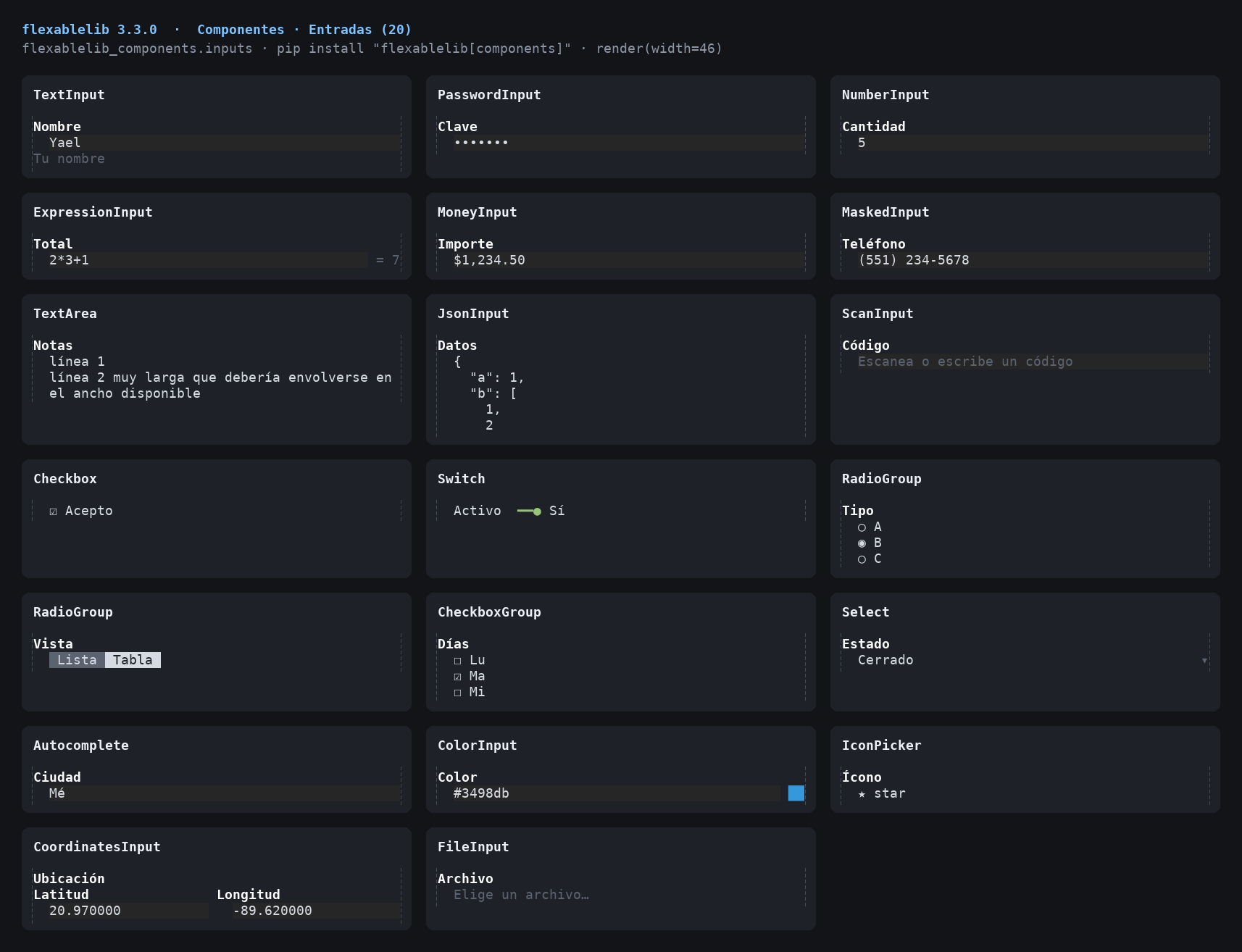
|
|
43
|
+
|
|
44
|
+
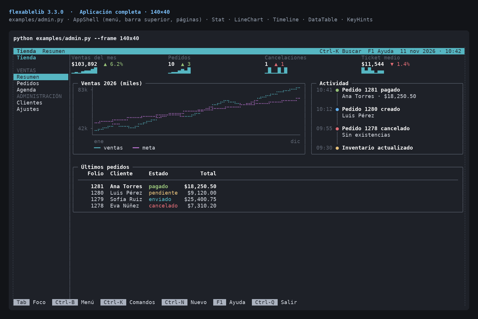
|
|
@@ -0,0 +1,11 @@
|
|
|
1
|
+
# flexablelib-components
|
|
2
|
+
|
|
3
|
+
Interactive terminal components for [flexablelib](https://github.com/Opus-Perpetuus/flexablelib): form inputs, dates and times, interactive and editable tables, filters, forms, menus, tabs, wizard, tree, command palette, dialogs, charts and more, all keyboard driven.
|
|
4
|
+
|
|
5
|
+
Install it with `pip install flexablelib[components]`.
|
|
6
|
+
|
|
7
|
+
Documentation: [COMPONENTS.md](https://github.com/Opus-Perpetuus/flexablelib/blob/main/docs/COMPONENTS.md)
|
|
8
|
+
|
|
9
|
+

|
|
10
|
+
|
|
11
|
+

|
|
@@ -0,0 +1,64 @@
|
|
|
1
|
+
"""
|
|
2
|
+
Interactive terminal components for flexablelib
|
|
3
|
+
(``pip install flexablelib[components]``).
|
|
4
|
+
|
|
5
|
+
Form inputs (text, password, numbers, arithmetic, money, masks, multi-line,
|
|
6
|
+
JSON, code scanners, checkboxes, switches, radio and checkbox groups, selects,
|
|
7
|
+
autocomplete, colours, icons, coordinates, files), dates and times, display
|
|
8
|
+
pieces (badges, alerts, links, breadcrumbs, code, Markdown/HTML, timelines,
|
|
9
|
+
steppers, comments, stats, charts), navigation (tabs, menus, pagination,
|
|
10
|
+
sidebar, wizard, accordion, tree, command palette, split panes, app shell),
|
|
11
|
+
data (interactive and editable tables, filter bar, catalog, forms, login)
|
|
12
|
+
and dialogs (modal, confirm, prompt, loading, popover).
|
|
13
|
+
|
|
14
|
+
Every component works inside :class:`flexablelib_tui.App` (focus with Tab,
|
|
15
|
+
keys to the focused component) and also renders on its own with
|
|
16
|
+
``render(width)``. See docs/COMPONENTS.md.
|
|
17
|
+
"""
|
|
18
|
+
|
|
19
|
+
__version__ = '3.3.0'
|
|
20
|
+
|
|
21
|
+
from .base import Theme, DEFAULT_THEME, Input, Box, Button, frame
|
|
22
|
+
from .inputs import (TextInput, PasswordInput, NumberInput, ExpressionInput,
|
|
23
|
+
MoneyInput, MaskedInput, MASKS, TextArea, JsonInput,
|
|
24
|
+
ScanInput, Checkbox, Switch, RadioGroup, CheckboxGroup,
|
|
25
|
+
Select, Autocomplete, ColorInput, IconPicker,
|
|
26
|
+
CoordinatesInput, FileInput, evaluate_expression, ICONS)
|
|
27
|
+
from .dates import (Calendar, DateInput, TimeInput, DateTimeInput, WeekInput,
|
|
28
|
+
MonthInput, YearInput, WeekdayInput, DateRangeInput,
|
|
29
|
+
Timer)
|
|
30
|
+
from .display import (Badge, Tag, StatusBadge, Alert, Link, Breadcrumbs,
|
|
31
|
+
EmptyState, ErrorPanel, Spinner, Skeleton, Code,
|
|
32
|
+
MarkdownView, HtmlView, DetailView, Timeline, Stepper,
|
|
33
|
+
CommentList, AttachmentList, Stat, LineChart,
|
|
34
|
+
human_size)
|
|
35
|
+
from .navigation import (Tabs, Menu, ContextMenu, MenuButton, Pagination,
|
|
36
|
+
Sidebar, TopBar, Toolbar, Wizard, Accordion,
|
|
37
|
+
Carousel, Tree, CommandPalette, Split, Stack,
|
|
38
|
+
AppShell, SortControl)
|
|
39
|
+
from .data import (DataTable, FilterBar, EditableTable, CatalogGrid, Form,
|
|
40
|
+
ValidationSummary, LoginForm, FilePreview, parse_query)
|
|
41
|
+
from .overlays import (Modal, ConfirmDialog, PromptDialog, LoadingOverlay,
|
|
42
|
+
Popover, HelpLine)
|
|
43
|
+
|
|
44
|
+
__all__ = [
|
|
45
|
+
'Theme', 'DEFAULT_THEME', 'Input', 'Box', 'Button', 'frame',
|
|
46
|
+
'TextInput', 'PasswordInput', 'NumberInput', 'ExpressionInput',
|
|
47
|
+
'MoneyInput', 'MaskedInput', 'MASKS', 'TextArea', 'JsonInput',
|
|
48
|
+
'ScanInput', 'Checkbox', 'Switch', 'RadioGroup', 'CheckboxGroup',
|
|
49
|
+
'Select', 'Autocomplete', 'ColorInput', 'IconPicker', 'CoordinatesInput',
|
|
50
|
+
'FileInput', 'evaluate_expression', 'ICONS',
|
|
51
|
+
'Calendar', 'DateInput', 'TimeInput', 'DateTimeInput', 'WeekInput',
|
|
52
|
+
'MonthInput', 'YearInput', 'WeekdayInput', 'DateRangeInput', 'Timer',
|
|
53
|
+
'Badge', 'Tag', 'StatusBadge', 'Alert', 'Link', 'Breadcrumbs',
|
|
54
|
+
'EmptyState', 'ErrorPanel', 'Spinner', 'Skeleton', 'Code',
|
|
55
|
+
'MarkdownView', 'HtmlView', 'DetailView', 'Timeline', 'Stepper',
|
|
56
|
+
'CommentList', 'AttachmentList', 'Stat', 'LineChart', 'human_size',
|
|
57
|
+
'Tabs', 'Menu', 'ContextMenu', 'MenuButton', 'Pagination', 'Sidebar',
|
|
58
|
+
'TopBar', 'Toolbar', 'Wizard', 'Accordion', 'Carousel', 'Tree',
|
|
59
|
+
'CommandPalette', 'Split', 'Stack', 'AppShell', 'SortControl',
|
|
60
|
+
'DataTable', 'FilterBar', 'EditableTable', 'CatalogGrid', 'Form',
|
|
61
|
+
'ValidationSummary', 'LoginForm', 'FilePreview', 'parse_query',
|
|
62
|
+
'Modal', 'ConfirmDialog', 'PromptDialog', 'LoadingOverlay', 'Popover',
|
|
63
|
+
'HelpLine', '__version__',
|
|
64
|
+
]
|
|
@@ -0,0 +1,329 @@
|
|
|
1
|
+
"""
|
|
2
|
+
Shared pieces of the components: the colour theme, the input base class with
|
|
3
|
+
labels, help text and validation, and a few drawing helpers.
|
|
4
|
+
"""
|
|
5
|
+
|
|
6
|
+
from flexablelib import _frames as _fx
|
|
7
|
+
from flexablelib.colors import RESET, parse_spec
|
|
8
|
+
from flexablelib_tui import Component
|
|
9
|
+
|
|
10
|
+
__all__ = ['Theme', 'DEFAULT_THEME', 'Input', 'frame', 'join_columns',
|
|
11
|
+
'Box', 'Button']
|
|
12
|
+
|
|
13
|
+
|
|
14
|
+
class Theme(object):
|
|
15
|
+
"""
|
|
16
|
+
Colours the components use, as flexablelib colour specs.
|
|
17
|
+
|
|
18
|
+
``accent`` marks focus and selection, ``muted`` secondary text,
|
|
19
|
+
``selection`` the highlighted row of a list or table, and ``info`` /
|
|
20
|
+
``success`` / ``warning`` / ``error`` the message kinds, ``field`` the
|
|
21
|
+
background of text fields.
|
|
22
|
+
"""
|
|
23
|
+
|
|
24
|
+
def __init__(self, accent='cyan', muted='bright_black', text=None,
|
|
25
|
+
selection='black on cyan', border='bright_black',
|
|
26
|
+
info='blue', success='green', warning='yellow',
|
|
27
|
+
error='red', title='bold', field='on #262626'):
|
|
28
|
+
self.field = field
|
|
29
|
+
self.accent = accent
|
|
30
|
+
self.muted = muted
|
|
31
|
+
self.text = text
|
|
32
|
+
self.selection = selection
|
|
33
|
+
self.border = border
|
|
34
|
+
self.info = info
|
|
35
|
+
self.success = success
|
|
36
|
+
self.warning = warning
|
|
37
|
+
self.error = error
|
|
38
|
+
self.title = title
|
|
39
|
+
|
|
40
|
+
def kind(self, name):
|
|
41
|
+
"""The colour for a message kind ('info', 'success', ...)."""
|
|
42
|
+
return getattr(self, name, None) or self.info
|
|
43
|
+
|
|
44
|
+
|
|
45
|
+
DEFAULT_THEME = Theme()
|
|
46
|
+
|
|
47
|
+
_SPEC_CACHE = {}
|
|
48
|
+
|
|
49
|
+
_BOXES = {
|
|
50
|
+
'rounded': '╭╮╰╯─│',
|
|
51
|
+
'single': '┌┐└┘─│',
|
|
52
|
+
'double': '╔╗╚╝═║',
|
|
53
|
+
'heavy': '┏┓┗┛━┃',
|
|
54
|
+
'ascii': '++++-|',
|
|
55
|
+
}
|
|
56
|
+
|
|
57
|
+
|
|
58
|
+
class _Themed(Component):
|
|
59
|
+
"""A component with a theme and cached colour specs."""
|
|
60
|
+
|
|
61
|
+
def __init__(self, theme=None, **kwargs):
|
|
62
|
+
super(_Themed, self).__init__(**kwargs)
|
|
63
|
+
self.theme = theme or DEFAULT_THEME
|
|
64
|
+
|
|
65
|
+
def paint(self, text, spec):
|
|
66
|
+
if not text or not spec or not self._active():
|
|
67
|
+
return text
|
|
68
|
+
prefix = _SPEC_CACHE.get(spec)
|
|
69
|
+
if prefix is None:
|
|
70
|
+
prefix = _SPEC_CACHE[spec] = parse_spec(spec)
|
|
71
|
+
if not prefix:
|
|
72
|
+
return text
|
|
73
|
+
return prefix + text.replace(RESET, RESET + prefix) + RESET
|
|
74
|
+
|
|
75
|
+
def cursor(self, char):
|
|
76
|
+
"""``char`` drawn as the text cursor."""
|
|
77
|
+
if not self._active():
|
|
78
|
+
return char
|
|
79
|
+
return self.paint(char or ' ', 'reverse')
|
|
80
|
+
|
|
81
|
+
|
|
82
|
+
def frame(lines, width, title=None, color=None, painter=None, style='rounded',
|
|
83
|
+
title_color=None, footer=None):
|
|
84
|
+
"""``lines`` inside a box exactly ``width`` columns wide."""
|
|
85
|
+
tl, tr, bl, br, h, v = _BOXES.get(style, _BOXES['rounded'])
|
|
86
|
+
inner = max(0, width - 2)
|
|
87
|
+
paint = painter or (lambda text, spec: text)
|
|
88
|
+
|
|
89
|
+
def edge(left, right, label):
|
|
90
|
+
if not label or inner < 6:
|
|
91
|
+
return paint(left + h * inner + right, color)
|
|
92
|
+
label = _fx.truncate(' ' + label + ' ', inner - 2, '… ')
|
|
93
|
+
rest = inner - 1 - _fx.visible_width(label)
|
|
94
|
+
return (paint(left + h, color) + paint(label, title_color or color) +
|
|
95
|
+
paint(h * rest + right, color))
|
|
96
|
+
out = [edge(tl, tr, title)]
|
|
97
|
+
side = paint(v, color)
|
|
98
|
+
for line in lines:
|
|
99
|
+
out.append(side + _fx.fit_line(line, inner) + side)
|
|
100
|
+
out.append(edge(bl, br, footer))
|
|
101
|
+
return out
|
|
102
|
+
|
|
103
|
+
|
|
104
|
+
def join_columns(blocks, widths, gap=1):
|
|
105
|
+
"""Side-by-side blocks of lines, each fitted to its width."""
|
|
106
|
+
height = max((len(b) for b in blocks), default=0)
|
|
107
|
+
out = []
|
|
108
|
+
for k in range(height):
|
|
109
|
+
parts = [_fx.fit_line(b[k] if k < len(b) else '', w)
|
|
110
|
+
for b, w in zip(blocks, widths)]
|
|
111
|
+
out.append((' ' * gap).join(parts))
|
|
112
|
+
return out
|
|
113
|
+
|
|
114
|
+
|
|
115
|
+
class Box(_Themed):
|
|
116
|
+
"""
|
|
117
|
+
A titled frame around a component; the frame takes the accent colour
|
|
118
|
+
while anything inside has the focus. ``children`` keep their own focus.
|
|
119
|
+
"""
|
|
120
|
+
|
|
121
|
+
expand = True
|
|
122
|
+
|
|
123
|
+
def __init__(self, child, title=None, style='rounded', padding=1,
|
|
124
|
+
height=None, footer=None, **kwargs):
|
|
125
|
+
super(Box, self).__init__(**kwargs)
|
|
126
|
+
self.child = child
|
|
127
|
+
self.title = title
|
|
128
|
+
self.style = style
|
|
129
|
+
self.padding = max(0, int(padding))
|
|
130
|
+
self.height = height
|
|
131
|
+
self.footer = footer
|
|
132
|
+
|
|
133
|
+
def children(self):
|
|
134
|
+
return [self.child]
|
|
135
|
+
|
|
136
|
+
def natural_width(self):
|
|
137
|
+
from flexablelib.layout import _natural_width
|
|
138
|
+
return _natural_width(self.child) + 2 + 2 * self.padding
|
|
139
|
+
|
|
140
|
+
def _has_focus(self):
|
|
141
|
+
app = self.app
|
|
142
|
+
node = app.focused if app is not None else None
|
|
143
|
+
while node is not None:
|
|
144
|
+
if node is self:
|
|
145
|
+
return True
|
|
146
|
+
node = getattr(node, 'parent', None)
|
|
147
|
+
return False
|
|
148
|
+
|
|
149
|
+
def draw(self, width, height):
|
|
150
|
+
from flexablelib.layout import _accepts_height, _render_child
|
|
151
|
+
height = self.height or height
|
|
152
|
+
inner_w = max(1, width - 2 - 2 * self.padding)
|
|
153
|
+
inner_h = None if height is None else max(0, height - 2)
|
|
154
|
+
child = self.child
|
|
155
|
+
if inner_h is not None and _accepts_height(child):
|
|
156
|
+
text = child.render(width=inner_w, height=inner_h)
|
|
157
|
+
else:
|
|
158
|
+
text = _render_child(child, inner_w)
|
|
159
|
+
lines = text.split('\n') if text else []
|
|
160
|
+
if inner_h is not None:
|
|
161
|
+
lines = lines[:inner_h] + [''] * (inner_h - len(lines))
|
|
162
|
+
pad = ' ' * self.padding
|
|
163
|
+
lines = [pad + _fx.fit_line(line, inner_w) + pad for line in lines]
|
|
164
|
+
focus = self._has_focus()
|
|
165
|
+
color = self.theme.accent if focus else self.theme.border
|
|
166
|
+
return frame(lines, width, self.title, color, self.paint, self.style,
|
|
167
|
+
title_color=('bold ' + self.theme.accent) if focus
|
|
168
|
+
else self.theme.title, footer=self.footer)
|
|
169
|
+
|
|
170
|
+
|
|
171
|
+
class Input(_Themed):
|
|
172
|
+
"""
|
|
173
|
+
Base of the form inputs.
|
|
174
|
+
|
|
175
|
+
``label`` is drawn above the control, ``help`` below it (muted), and the
|
|
176
|
+
validation error below that (in the error colour). ``required`` and
|
|
177
|
+
``validators`` (callables taking the value and returning an error message
|
|
178
|
+
or None) are checked by :meth:`validate`. ``on_change(value)`` runs when
|
|
179
|
+
the value changes, ``on_submit(value)`` on Enter. ``name`` is the key the
|
|
180
|
+
value has in a :class:`~flexablelib_components.Form`.
|
|
181
|
+
"""
|
|
182
|
+
|
|
183
|
+
focusable = True
|
|
184
|
+
|
|
185
|
+
def __init__(self, label=None, value=None, name=None, help=None,
|
|
186
|
+
required=False, validators=None, on_change=None,
|
|
187
|
+
on_submit=None, width=None, **kwargs):
|
|
188
|
+
super(Input, self).__init__(**kwargs)
|
|
189
|
+
self.label = label
|
|
190
|
+
self.name = name or (label.lower().replace(' ', '_') if label
|
|
191
|
+
else None)
|
|
192
|
+
self.help = help
|
|
193
|
+
self.required = bool(required)
|
|
194
|
+
self.validators = list(validators or [])
|
|
195
|
+
self.on_change = on_change
|
|
196
|
+
self.on_submit = on_submit
|
|
197
|
+
self.width = width
|
|
198
|
+
self.error = None
|
|
199
|
+
self._value = None
|
|
200
|
+
self.value = value
|
|
201
|
+
|
|
202
|
+
# -- value --------------------------------------------------------------
|
|
203
|
+
|
|
204
|
+
@property
|
|
205
|
+
def value(self):
|
|
206
|
+
return self._value
|
|
207
|
+
|
|
208
|
+
@value.setter
|
|
209
|
+
def value(self, new):
|
|
210
|
+
self._value = self.coerce(new)
|
|
211
|
+
|
|
212
|
+
def coerce(self, value):
|
|
213
|
+
return value
|
|
214
|
+
|
|
215
|
+
def set_value(self, value):
|
|
216
|
+
"""Set the value as the user would: runs ``on_change``."""
|
|
217
|
+
old = self.value
|
|
218
|
+
self.value = value
|
|
219
|
+
new = self.value
|
|
220
|
+
if new != old:
|
|
221
|
+
self.error = None
|
|
222
|
+
if self.on_change is not None:
|
|
223
|
+
self.on_change(new)
|
|
224
|
+
self.refresh()
|
|
225
|
+
|
|
226
|
+
def is_empty(self):
|
|
227
|
+
return self.value in (None, '', [], {})
|
|
228
|
+
|
|
229
|
+
def validate(self):
|
|
230
|
+
"""Check the value; returns (and keeps in ``error``) the message."""
|
|
231
|
+
error = None
|
|
232
|
+
if self.required and self.is_empty():
|
|
233
|
+
error = 'Requerido'
|
|
234
|
+
else:
|
|
235
|
+
for check in self.validators:
|
|
236
|
+
error = check(self.value)
|
|
237
|
+
if error:
|
|
238
|
+
break
|
|
239
|
+
self.error = error or None
|
|
240
|
+
return self.error
|
|
241
|
+
|
|
242
|
+
def submit(self):
|
|
243
|
+
self.validate()
|
|
244
|
+
if self.on_submit is not None:
|
|
245
|
+
self.on_submit(self.value)
|
|
246
|
+
return True
|
|
247
|
+
|
|
248
|
+
# -- drawing ------------------------------------------------------------
|
|
249
|
+
|
|
250
|
+
def natural_width(self):
|
|
251
|
+
return max(self.width or 24, _fx.visible_width(self.label or '') + 2)
|
|
252
|
+
|
|
253
|
+
def control(self, width, height): # pragma: no cover - abstract
|
|
254
|
+
return []
|
|
255
|
+
|
|
256
|
+
def draw(self, width, height):
|
|
257
|
+
out = []
|
|
258
|
+
if self.label:
|
|
259
|
+
mark = '*' if self.required else ''
|
|
260
|
+
spec = self.theme.accent if self.focused else self.theme.title
|
|
261
|
+
out.append(self.paint(self.label + mark, spec))
|
|
262
|
+
out.extend(self.control(width, height))
|
|
263
|
+
if self.help and not self.error:
|
|
264
|
+
out.append(self.paint(self.help, self.theme.muted))
|
|
265
|
+
if self.error:
|
|
266
|
+
out.append(self.paint('✖ ' + self.error, self.theme.error))
|
|
267
|
+
return out
|
|
268
|
+
|
|
269
|
+
def marker(self):
|
|
270
|
+
"""The gutter that shows focus: a bar when focused."""
|
|
271
|
+
if self.focused:
|
|
272
|
+
return self.paint('▌', self.theme.accent) if self._active() \
|
|
273
|
+
else '›'
|
|
274
|
+
return ' '
|
|
275
|
+
|
|
276
|
+
|
|
277
|
+
class Button(_Themed):
|
|
278
|
+
"""
|
|
279
|
+
A button: Enter or Space calls ``on_press()``. ``kind`` colours it
|
|
280
|
+
(``'primary'``, ``'danger'``, ``'default'``); ``shortcut`` is a key that
|
|
281
|
+
presses it from anywhere in its parent (shown after the label).
|
|
282
|
+
"""
|
|
283
|
+
|
|
284
|
+
focusable = True
|
|
285
|
+
|
|
286
|
+
def __init__(self, label, on_press=None, kind='default', shortcut=None,
|
|
287
|
+
**kwargs):
|
|
288
|
+
super(Button, self).__init__(**kwargs)
|
|
289
|
+
self.label = label
|
|
290
|
+
self.on_press = on_press
|
|
291
|
+
self.kind = kind
|
|
292
|
+
self.shortcut = shortcut
|
|
293
|
+
self.presses = 0
|
|
294
|
+
|
|
295
|
+
def natural_width(self):
|
|
296
|
+
return _fx.visible_width(self.text())
|
|
297
|
+
|
|
298
|
+
def text(self):
|
|
299
|
+
hint = ' ' + self.shortcut if self.shortcut else ''
|
|
300
|
+
return '[ {0}{1} ]'.format(self.label, hint) if not self._active() \
|
|
301
|
+
else ' {0}{1} '.format(self.label, hint)
|
|
302
|
+
|
|
303
|
+
def press(self):
|
|
304
|
+
self.presses += 1
|
|
305
|
+
if self.on_press is not None:
|
|
306
|
+
self.on_press()
|
|
307
|
+
self.refresh()
|
|
308
|
+
return True
|
|
309
|
+
|
|
310
|
+
def style(self):
|
|
311
|
+
theme = self.theme
|
|
312
|
+
if self.disabled:
|
|
313
|
+
return theme.muted
|
|
314
|
+
base = {'primary': 'black on ' + theme.accent,
|
|
315
|
+
'danger': 'white on ' + theme.error}.get(self.kind)
|
|
316
|
+
if self.focused:
|
|
317
|
+
return 'bold reverse' if base is None else 'bold ' + base
|
|
318
|
+
return base or 'on bright_black'
|
|
319
|
+
|
|
320
|
+
def draw(self, width, height):
|
|
321
|
+
label = self.text()
|
|
322
|
+
if not self._active() and self.focused:
|
|
323
|
+
label = '[>' + label[2:-2] + '<]'
|
|
324
|
+
return [self.paint(label, self.style())]
|
|
325
|
+
|
|
326
|
+
def on_key(self, key):
|
|
327
|
+
if str(key) in ('enter', 'space'):
|
|
328
|
+
return self.press()
|
|
329
|
+
return False
|