wikyd-fancy-buttons 0.5.1
This diff represents the content of publicly available package versions that have been released to one of the supported registries. The information contained in this diff is provided for informational purposes only and reflects changes between package versions as they appear in their respective public registries.
- data/README.markdown +38 -0
- data/Rakefile +21 -0
- data/fancy-buttons.gemspec +53 -0
- data/lib/fancy-buttons.rb +3 -0
- data/lib/stylesheets/_fancy_buttons.sass +175 -0
- data/lib/stylesheets/_fancy_gradient.sass +28 -0
- data/lib/templates/project/button_bg.png +0 -0
- data/lib/templates/project/buttons.sass +58 -0
- data/lib/templates/project/ie6.sass +4 -0
- data/lib/templates/project/index.html +39 -0
- data/lib/templates/project/manifest.rb +11 -0
- metadata +112 -0
data/README.markdown
ADDED
|
@@ -0,0 +1,38 @@
|
|
|
1
|
+
## Using fancy buttons on your site?
|
|
2
|
+
Add a link to the [wiki](http://wiki.github.com/imathis/fancy-buttons)
|
|
3
|
+
|
|
4
|
+
## Demo
|
|
5
|
+

|
|
6
|
+
|
|
7
|
+
Without CSS gradient support:
|
|
8
|
+
|
|
9
|
+
|
|
10
|
+
|
|
11
|
+
## Install
|
|
12
|
+
|
|
13
|
+
Install the plugin: (should automatically install latest dependencies for Compass, and Haml)
|
|
14
|
+
sudo gem install fancy-buttons
|
|
15
|
+
|
|
16
|
+
To create a new project based on fancy-buttons:
|
|
17
|
+
|
|
18
|
+
compass install -r fancy-buttons -f fancy-buttons
|
|
19
|
+
|
|
20
|
+
To add fancy-buttons to an existing compass project:
|
|
21
|
+
|
|
22
|
+
# Add the following lines to your compass configuration file:
|
|
23
|
+
require 'fancy-buttons'
|
|
24
|
+
|
|
25
|
+
# Then run the following command:
|
|
26
|
+
compass install -r fancy-buttons -f fancy-buttons
|
|
27
|
+
|
|
28
|
+
# Project Goals:
|
|
29
|
+
|
|
30
|
+
- Generate a color palette from the base color
|
|
31
|
+
- Discern sensible palette variations based on a base color (dark, medium, light)
|
|
32
|
+
- Allow button style types (subtle gradient, shiny gradient)
|
|
33
|
+
- Make it easy to override/modify styles
|
|
34
|
+
- Reduce weight of generated styles (define button base, add color through additional classes)
|
|
35
|
+
- Create good defaults
|
|
36
|
+
- Ensure approximate consistency for browsers that don't support CSS gradients
|
|
37
|
+
- Style the button element
|
|
38
|
+
- Provide a decent alternative styling for ie6
|
data/Rakefile
ADDED
|
@@ -0,0 +1,21 @@
|
|
|
1
|
+
begin
|
|
2
|
+
require 'jeweler'
|
|
3
|
+
Jeweler::Tasks.new do |gemspec|
|
|
4
|
+
gemspec.name = "fancy-buttons"
|
|
5
|
+
gemspec.summary = "Make fancy buttons with the Compass stylesheet authoring framework."
|
|
6
|
+
gemspec.description = "Easily style buttons with beautiful CSS3 features like gradients, rounded corners, etc. Don't worry the buttons also degrade nicely for browsers with no support. This requires the Compass stylesheet authoring framework."
|
|
7
|
+
gemspec.email = "brandon@imathis.com"
|
|
8
|
+
gemspec.homepage = "http://github.com/imathis/fancy-buttons"
|
|
9
|
+
gemspec.author = "Brandon Mathis"
|
|
10
|
+
gemspec.add_dependency('haml', '>= 3.0.0.beta.3')
|
|
11
|
+
gemspec.add_dependency('compass', '>= 0.10.0.rc3')
|
|
12
|
+
gemspec.files = []
|
|
13
|
+
gemspec.files << "fancy-buttons.gemspec"
|
|
14
|
+
gemspec.files << "README.markdown"
|
|
15
|
+
gemspec.files << "Rakefile"
|
|
16
|
+
gemspec.files << "VERSION"
|
|
17
|
+
gemspec.files += Dir.glob("lib/**/*")
|
|
18
|
+
end
|
|
19
|
+
rescue LoadError
|
|
20
|
+
puts "Jeweler not available. Install it with: sudo gem install jeweler -s http://rubygems.org"
|
|
21
|
+
end
|
|
@@ -0,0 +1,53 @@
|
|
|
1
|
+
# Generated by jeweler
|
|
2
|
+
# DO NOT EDIT THIS FILE DIRECTLY
|
|
3
|
+
# Instead, edit Jeweler::Tasks in Rakefile, and run the gemspec command
|
|
4
|
+
# -*- encoding: utf-8 -*-
|
|
5
|
+
|
|
6
|
+
Gem::Specification.new do |s|
|
|
7
|
+
s.name = %q{wikyd-fancy-buttons}
|
|
8
|
+
s.version = "0.5.1"
|
|
9
|
+
|
|
10
|
+
s.required_rubygems_version = Gem::Requirement.new(">= 0") if s.respond_to? :required_rubygems_version=
|
|
11
|
+
s.authors = ["Brandon Mathis"]
|
|
12
|
+
s.date = %q{2010-04-24}
|
|
13
|
+
s.description = %q{Easily style buttons with beautiful CSS3 features like gradients, rounded corners, etc. Don't worry the buttons also degrade nicely for browsers with no support. This requires the Compass stylesheet authoring framework. Forked, to handle text colors better.}
|
|
14
|
+
s.email = %q{brandon@imathis.com}
|
|
15
|
+
s.extra_rdoc_files = [
|
|
16
|
+
"README.markdown"
|
|
17
|
+
]
|
|
18
|
+
s.files = [
|
|
19
|
+
"README.markdown",
|
|
20
|
+
"Rakefile",
|
|
21
|
+
"fancy-buttons.gemspec",
|
|
22
|
+
"lib/fancy-buttons.rb",
|
|
23
|
+
"lib/stylesheets/_fancy_buttons.sass",
|
|
24
|
+
"lib/stylesheets/_fancy_gradient.sass",
|
|
25
|
+
"lib/templates/project/button_bg.png",
|
|
26
|
+
"lib/templates/project/buttons.sass",
|
|
27
|
+
"lib/templates/project/ie6.sass",
|
|
28
|
+
"lib/templates/project/index.html",
|
|
29
|
+
"lib/templates/project/manifest.rb"
|
|
30
|
+
]
|
|
31
|
+
s.homepage = %q{http://github.com/imathis/fancy-buttons}
|
|
32
|
+
s.rdoc_options = ["--charset=UTF-8"]
|
|
33
|
+
s.require_paths = ["lib"]
|
|
34
|
+
s.rubygems_version = %q{1.3.6}
|
|
35
|
+
s.summary = %q{Make fancy buttons with the Compass stylesheet authoring framework.}
|
|
36
|
+
|
|
37
|
+
if s.respond_to? :specification_version then
|
|
38
|
+
current_version = Gem::Specification::CURRENT_SPECIFICATION_VERSION
|
|
39
|
+
s.specification_version = 3
|
|
40
|
+
|
|
41
|
+
if Gem::Version.new(Gem::RubyGemsVersion) >= Gem::Version.new('1.2.0') then
|
|
42
|
+
s.add_runtime_dependency(%q<haml>, [">= 3.0.0.beta.3"])
|
|
43
|
+
s.add_runtime_dependency(%q<compass>, [">= 0.10.0.rc3"])
|
|
44
|
+
else
|
|
45
|
+
s.add_dependency(%q<haml>, [">= 3.0.0.beta.3"])
|
|
46
|
+
s.add_dependency(%q<compass>, [">= 0.10.0.rc3"])
|
|
47
|
+
end
|
|
48
|
+
else
|
|
49
|
+
s.add_dependency(%q<haml>, [">= 3.0.0.beta.3"])
|
|
50
|
+
s.add_dependency(%q<compass>, [">= 0.10.0.rc3"])
|
|
51
|
+
end
|
|
52
|
+
end
|
|
53
|
+
|
|
@@ -0,0 +1,175 @@
|
|
|
1
|
+
@import compass/css3
|
|
2
|
+
@import fancy_gradient
|
|
3
|
+
|
|
4
|
+
$fb_gradient_style: glossy !default
|
|
5
|
+
$fb_invert_on_click: 1 !default
|
|
6
|
+
$fb_font_size: 18px !default
|
|
7
|
+
$fb_color: #444444 !default
|
|
8
|
+
$fb_font_weight: bold !default
|
|
9
|
+
$fb_border_width: 1px !default
|
|
10
|
+
$fb_radius: 6px !default
|
|
11
|
+
$fb_light_text: white !default
|
|
12
|
+
$fb_dark_text: #222222 !default
|
|
13
|
+
$fb_gradient: 1 !default
|
|
14
|
+
$fb_image_path: image_url("button_bg.png") !default
|
|
15
|
+
|
|
16
|
+
// Make a fancy button.
|
|
17
|
+
|
|
18
|
+
=fancy-button($color: $fb_color, $font_size: $fb_font_size, $radius: $fb_radius, $border_width: $fb_border_width)
|
|
19
|
+
+fancy-button-structure($font_size, $radius, $border_width)
|
|
20
|
+
+fancy-button-colors($color)
|
|
21
|
+
|
|
22
|
+
// Style the button's colors, picking the most appropriate color set for the base color.
|
|
23
|
+
|
|
24
|
+
=fancy-button-colors($color: $fb_color, $hover: 0, $active: 0)
|
|
25
|
+
+fb-color($color, "default")
|
|
26
|
+
&.disabled:active, &.disabled:hover, &[disabled]:active, &[disabled]:hover
|
|
27
|
+
+fb-color($color, "default")
|
|
28
|
+
&:hover, &:focus
|
|
29
|
+
@if $hover == 0
|
|
30
|
+
+fb-color(darken($color, 3), "hover", $color)
|
|
31
|
+
@else
|
|
32
|
+
+fb-color($hover, "hover")
|
|
33
|
+
&:active
|
|
34
|
+
@if $active == 0
|
|
35
|
+
+fb-color(darken($color, 6), "active", $color)
|
|
36
|
+
@else
|
|
37
|
+
+fb-color($active, "active")
|
|
38
|
+
|
|
39
|
+
=fancy-button-matte($color: $fb_color, $font_size: $fb_font_size, $radius: $fb_radius, $border_width: $fb_border_width)
|
|
40
|
+
+fancy-button-structure($font_size, $radius, $border_width)
|
|
41
|
+
+fancy-button-colors-matte($color)
|
|
42
|
+
|
|
43
|
+
=fancy-button-custom($color: $fb_color, $font_size: $fb_font_size, $radius: $fb_radius, $border_width: $fb_border_width)
|
|
44
|
+
+fancy-button-structure($font_size, $radius, $border_width)
|
|
45
|
+
+fancy-button-colors-custom($color, $font_size, $radius, $border_width)
|
|
46
|
+
|
|
47
|
+
=fancy-button-colors-matte($color: $fb_color, $hover: 0, $active: 0)
|
|
48
|
+
$fb_current_style: $fb_gradient_style
|
|
49
|
+
$fb_gradient_style: matte
|
|
50
|
+
+fancy-button-colors($color, $hover, $active)
|
|
51
|
+
$fb_gradient_style: $fb_current_style
|
|
52
|
+
|
|
53
|
+
=fancy-button-colors-custom($color: $fb_color, $hover: 0, $active: 0)
|
|
54
|
+
$fb_current_style: $fb_gradient_style
|
|
55
|
+
$fb_gradient_style: custom
|
|
56
|
+
+fancy-button-colors($color, $hover, $active)
|
|
57
|
+
$fb_gradient_style: $fb_current_style
|
|
58
|
+
|
|
59
|
+
// Default state color settings
|
|
60
|
+
=fb-color($color, $state, $lumins: $color)
|
|
61
|
+
$gradient_top: lighten($color, 15)
|
|
62
|
+
$gradient_bottom: darken($color, 6)
|
|
63
|
+
$border_color: darken($color, 8)
|
|
64
|
+
@if $fb_invert_on_click != 0
|
|
65
|
+
$border_color: darken($color, 15)
|
|
66
|
+
@if saturation($color) > 0
|
|
67
|
+
$color: saturate($color, 40)
|
|
68
|
+
@else if lightness($lumins) >= lightness(#aaaaaa)
|
|
69
|
+
$color: lighten($color, 20)
|
|
70
|
+
+fb-state-colors($color, $gradient_top, $gradient_bottom, $border_color, $state, $lumins)
|
|
71
|
+
|
|
72
|
+
// Apply the button colors specified for the button state into which it is mixed.
|
|
73
|
+
=fb-state-colors($color, $gradient_top, $gradient_bottom, $border, $state, $lumins: $color)
|
|
74
|
+
background-color: $color
|
|
75
|
+
@if $fb_gradient != 0
|
|
76
|
+
@if $fb_gradient_style == "glossy"
|
|
77
|
+
@if $fb_invert_on_click != 0 and $state == "active"
|
|
78
|
+
+invert-fancy-gradient($gradient_top, $gradient_bottom)
|
|
79
|
+
@else
|
|
80
|
+
+fancy-gradient($gradient_top, $gradient_bottom)
|
|
81
|
+
@else if $fb_gradient_style == "matte"
|
|
82
|
+
@if $fb_invert_on_click and $state == "active"
|
|
83
|
+
+invert-fancy-matte-gradient($gradient_top, $gradient_bottom)
|
|
84
|
+
@else
|
|
85
|
+
+fancy-matte-gradient($gradient_top, $gradient_bottom)
|
|
86
|
+
@else if $fb_gradient_style == "custom"
|
|
87
|
+
@if $fb_invert_on_click and $state == "active"
|
|
88
|
+
+invert-custom-fancy-gradient($gradient_top, $gradient_bottom)
|
|
89
|
+
@else
|
|
90
|
+
+custom-fancy-gradient($gradient_top, $gradient_bottom)
|
|
91
|
+
border:
|
|
92
|
+
color: $border
|
|
93
|
+
$text_shadow_settings: unquote("0px 1px 1px")
|
|
94
|
+
@if $fb_invert_on_click != 0 and $state == "active"
|
|
95
|
+
$text_shadow_settings: unquote("0px -1px -1px")
|
|
96
|
+
//@if lightness($lumins) < lightness(#aaaaaa)
|
|
97
|
+
text-shadow: darken($color, 25) $text_shadow_settings
|
|
98
|
+
color: $fb_light_text
|
|
99
|
+
//@else
|
|
100
|
+
// text-shadow: lighten($color, 15) $text_shadow_settings
|
|
101
|
+
// color: $fb_dark_text
|
|
102
|
+
|
|
103
|
+
|
|
104
|
+
=fancy-button-text-colors($color, $hover, $active)
|
|
105
|
+
color: $color
|
|
106
|
+
&:hover, &:focus
|
|
107
|
+
color: $hover
|
|
108
|
+
&:active
|
|
109
|
+
color: $active
|
|
110
|
+
&.disabled:active, &.disabled:hover, &[disabled]:active, &[disabled]:hover
|
|
111
|
+
color: $color
|
|
112
|
+
|
|
113
|
+
// Apply this mixin to a nested element to style an arrow
|
|
114
|
+
=fancy-arrow($font_size)
|
|
115
|
+
font-size: $font_size + 4px
|
|
116
|
+
line-height: $font_size - 4px
|
|
117
|
+
margin-left: 4px
|
|
118
|
+
|
|
119
|
+
// Layout the button's box
|
|
120
|
+
=fancy-button-structure($font_size: $fb_font_size, $radius: $fb_radius, $border_width: $fb_border_width, $line_height: $font_size * 1.2)
|
|
121
|
+
+fb-reset
|
|
122
|
+
+fancy-button-size($font_size, $radius, $border_width, $line_height)
|
|
123
|
+
|
|
124
|
+
=fancy-button-size($font_size: $fb_font_size, $radius: $fb_radius, $border_width: $fb_border_width, $line_height: $font_size * 1.2)
|
|
125
|
+
// better padding for smaller buttons
|
|
126
|
+
$v_padding: 0
|
|
127
|
+
$h_padding: 0
|
|
128
|
+
@if $font_size > 15
|
|
129
|
+
$v_padding: floor($font_size / 3.5)
|
|
130
|
+
$h_padding: $font_size
|
|
131
|
+
@else
|
|
132
|
+
$v_padding: floor($font_size / 5)
|
|
133
|
+
$h_padding: floor($font_size / 1.2)
|
|
134
|
+
@if $radius > 0
|
|
135
|
+
+border-radius($radius)
|
|
136
|
+
font-size: $font_size
|
|
137
|
+
line-height: $line_height
|
|
138
|
+
+fancy-button-padding($v_padding, $h_padding, $border_width)
|
|
139
|
+
|
|
140
|
+
=fancy-button-padding($v_padding, $h_padding, $border_width: $fb_border_width)
|
|
141
|
+
$v_padding_active: $v_padding - 1px
|
|
142
|
+
$h_padding_active: $h_padding - 1px
|
|
143
|
+
padding: $v_padding $h_padding
|
|
144
|
+
border-width: $border_width
|
|
145
|
+
&:active
|
|
146
|
+
padding: $v_padding_active $h_padding_active
|
|
147
|
+
border-width: $border_width + 1px
|
|
148
|
+
&.disabled:active, &[disabled]
|
|
149
|
+
padding: $v_padding $h_padding
|
|
150
|
+
border-width: $border_width
|
|
151
|
+
|
|
152
|
+
// Reset the button's important properties to make sure they behave correctly
|
|
153
|
+
=fb-reset($font_weight: $fb_font_weight)
|
|
154
|
+
font-family: "Lucida Grande", Lucida, Arial, sans_serif
|
|
155
|
+
background: #{$fb_image_path} repeat-x bottom left
|
|
156
|
+
margin: 0
|
|
157
|
+
width: auto
|
|
158
|
+
overflow: visible
|
|
159
|
+
display: inline-block
|
|
160
|
+
cursor: pointer
|
|
161
|
+
text-decoration: none
|
|
162
|
+
border-style: solid
|
|
163
|
+
font-weight: $font_weight
|
|
164
|
+
&::-moz-focus-inner
|
|
165
|
+
border: none
|
|
166
|
+
padding: 0
|
|
167
|
+
&:focus
|
|
168
|
+
outline: none
|
|
169
|
+
&.disabled, &[disabled]
|
|
170
|
+
+disable-button
|
|
171
|
+
|
|
172
|
+
=disable-button($opacity: 0.7)
|
|
173
|
+
+opacity($opacity)
|
|
174
|
+
&:hover, &:focus
|
|
175
|
+
cursor: default
|
|
@@ -0,0 +1,28 @@
|
|
|
1
|
+
=fancy-gradient($color1, $color2)
|
|
2
|
+
$top_shine: lighten($color1, 18)
|
|
3
|
+
$bottom_glow: lighten($color2, 10)
|
|
4
|
+
$top_middle: $color1
|
|
5
|
+
$middle: lighten($color2, 3)
|
|
6
|
+
$bottom_middle: $color2
|
|
7
|
+
+linear-gradient(color_stops($top_shine, $top_middle 10%, $middle 50%, $bottom_middle 50%, $bottom_glow))
|
|
8
|
+
|
|
9
|
+
=invert-fancy-gradient($color1, $color2)
|
|
10
|
+
$top: lighten($color2, 6)
|
|
11
|
+
$bottom: lighten($color2, 14)
|
|
12
|
+
$top_middle: lighten($color2, 8)
|
|
13
|
+
$middle: lighten($color2, 4)
|
|
14
|
+
$bottom_middle: lighten($color2, 1)
|
|
15
|
+
+linear-gradient(color_stops($top, $top_middle 30%, $middle 50%, $bottom_middle 50%, $bottom))
|
|
16
|
+
|
|
17
|
+
=fancy-matte-gradient($color1, $color2)
|
|
18
|
+
+linear-gradient(color_stops($color1, $color2))
|
|
19
|
+
|
|
20
|
+
=invert-fancy-matte-gradient($color1, $color2)
|
|
21
|
+
$top: lighten($color2, 5)
|
|
22
|
+
$bottom: lighten($color2, 15)
|
|
23
|
+
$middle: lighten($color2, 8)
|
|
24
|
+
+linear-gradient(color_stops($top, $middle 40%, $middle 85%, $bottom))
|
|
25
|
+
|
|
26
|
+
/* incase an inverted custom gradient isn't specified
|
|
27
|
+
=invert-custom-fancy-gradient($color1, $color2)
|
|
28
|
+
+custom-fancy-gradient($color1, $color2)
|
|
Binary file
|
|
@@ -0,0 +1,58 @@
|
|
|
1
|
+
@import fancy_buttons.sass
|
|
2
|
+
|
|
3
|
+
body
|
|
4
|
+
text-align: center
|
|
5
|
+
padding-top: 10px
|
|
6
|
+
h1, h2, h3
|
|
7
|
+
font-family: "Helvetica Neue", Helvetica, Arial, sans-serif
|
|
8
|
+
color: #333333
|
|
9
|
+
letter-spacing: -1px
|
|
10
|
+
h1
|
|
11
|
+
font-size: 50px
|
|
12
|
+
h2
|
|
13
|
+
font-size: 30px
|
|
14
|
+
div
|
|
15
|
+
margin-top: 15px
|
|
16
|
+
|
|
17
|
+
$green: darken(#57b42c, 8)
|
|
18
|
+
$blue: adjust_hue($green, 110)
|
|
19
|
+
$red: adjust_hue($green, -100)
|
|
20
|
+
$heart_button: saturate(lighten($red, 2), 20)
|
|
21
|
+
|
|
22
|
+
=custom-fancy-gradient($color1, $color2)
|
|
23
|
+
+radial-gradient("50% 10%, 10, 50% 10%, 30", $color1, darken($color2, 5))
|
|
24
|
+
|
|
25
|
+
=invert-custom-fancy-gradient($color1, $color2)
|
|
26
|
+
+custom-fancy-gradient(lighten($color2, 10), lighten($color2, 25))
|
|
27
|
+
|
|
28
|
+
a.button, button
|
|
29
|
+
+fancy-button-structure
|
|
30
|
+
+fancy-button-colors
|
|
31
|
+
margin: 0 2px
|
|
32
|
+
vertical-align: middle
|
|
33
|
+
&.light
|
|
34
|
+
+fancy-button-colors-matte(#dddddd)
|
|
35
|
+
&.matte-blue
|
|
36
|
+
+fancy-button-colors-matte($blue)
|
|
37
|
+
&.green
|
|
38
|
+
+fancy-button-colors($green)
|
|
39
|
+
&.blue
|
|
40
|
+
+fancy-button-size(32px, 32px, 3px)
|
|
41
|
+
+fancy-button-colors($blue)
|
|
42
|
+
&.red
|
|
43
|
+
+fancy-button-colors($red)
|
|
44
|
+
&.yellow
|
|
45
|
+
+fancy-button-colors(darken(desaturate(yellow, 35), 5))
|
|
46
|
+
&.custom
|
|
47
|
+
+fancy-button-size(30px, 10px)
|
|
48
|
+
+fancy-button-padding(2px, 12px, 2px)
|
|
49
|
+
&.heart
|
|
50
|
+
+fancy-button-colors-custom($heart_button)
|
|
51
|
+
&.arrow
|
|
52
|
+
+fancy-button-size(30px, 30px)
|
|
53
|
+
+fancy-button-colors-custom(#dddddd)
|
|
54
|
+
+fancy-button-padding(2px, 6px, 2px)
|
|
55
|
+
&.spade
|
|
56
|
+
+fancy-button-colors-custom($blue)
|
|
57
|
+
+fancy-button-padding(2px, 8px, 2px)
|
|
58
|
+
//color: #333 !important
|
|
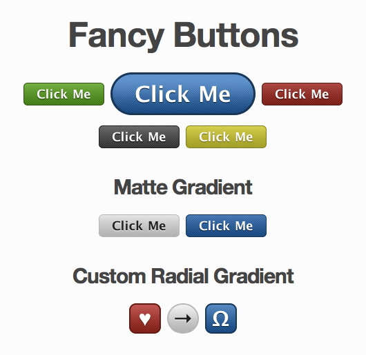
@@ -0,0 +1,39 @@
|
|
|
1
|
+
<!DOCTYPE html PUBLIC "-//W3C//DTD XHTML 1.0 Transitional//EN" "http://www.w3.org/TR/xhtml1/DTD/xhtml1-transitional.dtd">
|
|
2
|
+
<html lang="en" xml:lang="en" xmlns="http://www.w3.org/1999/xhtml">
|
|
3
|
+
<head>
|
|
4
|
+
<meta content="text/html; charset=utf-8" http-equiv="Content-Type" />
|
|
5
|
+
<title>Fancy Buttons - Demo</title>
|
|
6
|
+
<link href="./stylesheets/buttons.css" media="screen, projection" rel="stylesheet" type="text/css" />
|
|
7
|
+
<!--[if lte IE 6]>
|
|
8
|
+
<link href='./stylesheets/ie6.css' rel='stylesheet' type='text/css' />
|
|
9
|
+
<![endif]-->
|
|
10
|
+
</head>
|
|
11
|
+
<body>
|
|
12
|
+
<h1>Fancy Buttons</h1>
|
|
13
|
+
<div>
|
|
14
|
+
<button class="green">Click Me</button>
|
|
15
|
+
<a href="#" class="button blue">Click Me</a>
|
|
16
|
+
<button class="red">Click Me</button>
|
|
17
|
+
</div>
|
|
18
|
+
<div>
|
|
19
|
+
<button>Click Me</button>
|
|
20
|
+
<button class="yellow">Click Me</button>
|
|
21
|
+
</div>
|
|
22
|
+
<h2>Matte Gradient</h2>
|
|
23
|
+
<div>
|
|
24
|
+
<button class="light">Click Me</button>
|
|
25
|
+
<button class="matte-blue">Click Me</button>
|
|
26
|
+
</div>
|
|
27
|
+
<h2>Disabled Buttons</h2>
|
|
28
|
+
<div>
|
|
29
|
+
<button class="green" disabled>Click Me</button>
|
|
30
|
+
<button class="red" disabled>Click Me</button>
|
|
31
|
+
</div>
|
|
32
|
+
<h2>Custom Radial Gradient</h2>
|
|
33
|
+
<div>
|
|
34
|
+
<button class="custom heart">♥</button>
|
|
35
|
+
<button class="custom arrow">→</button>
|
|
36
|
+
<button class="custom spade">Ω</button>
|
|
37
|
+
</div>
|
|
38
|
+
</body>
|
|
39
|
+
</html>
|
|
@@ -0,0 +1,11 @@
|
|
|
1
|
+
# Make sure you list all the project template files here in the manifest.
|
|
2
|
+
stylesheet 'ie6.sass', :media => 'screen, projection', :condition => "lt IE 7"
|
|
3
|
+
image 'button_bg.png'
|
|
4
|
+
|
|
5
|
+
#print "Install example files? (html and buttons.sass) (Y/n)?"
|
|
6
|
+
#response = gets
|
|
7
|
+
#if response.downcase == "y" || response.downcase == "\n"
|
|
8
|
+
file 'index.html'
|
|
9
|
+
stylesheet 'buttons.sass', :media => 'screen, projection'
|
|
10
|
+
#end
|
|
11
|
+
#print 'Don\'t forget to @import "fancy-buttons"'
|
metadata
ADDED
|
@@ -0,0 +1,112 @@
|
|
|
1
|
+
--- !ruby/object:Gem::Specification
|
|
2
|
+
name: wikyd-fancy-buttons
|
|
3
|
+
version: !ruby/object:Gem::Version
|
|
4
|
+
hash: 9
|
|
5
|
+
prerelease:
|
|
6
|
+
segments:
|
|
7
|
+
- 0
|
|
8
|
+
- 5
|
|
9
|
+
- 1
|
|
10
|
+
version: 0.5.1
|
|
11
|
+
platform: ruby
|
|
12
|
+
authors:
|
|
13
|
+
- Brandon Mathis
|
|
14
|
+
autorequire:
|
|
15
|
+
bindir: bin
|
|
16
|
+
cert_chain: []
|
|
17
|
+
|
|
18
|
+
date: 2010-04-24 00:00:00 -07:00
|
|
19
|
+
default_executable:
|
|
20
|
+
dependencies:
|
|
21
|
+
- !ruby/object:Gem::Dependency
|
|
22
|
+
name: haml
|
|
23
|
+
prerelease: false
|
|
24
|
+
requirement: &id001 !ruby/object:Gem::Requirement
|
|
25
|
+
none: false
|
|
26
|
+
requirements:
|
|
27
|
+
- - ">="
|
|
28
|
+
- !ruby/object:Gem::Version
|
|
29
|
+
hash: 62196421
|
|
30
|
+
segments:
|
|
31
|
+
- 3
|
|
32
|
+
- 0
|
|
33
|
+
- 0
|
|
34
|
+
- beta
|
|
35
|
+
- 3
|
|
36
|
+
version: 3.0.0.beta.3
|
|
37
|
+
type: :runtime
|
|
38
|
+
version_requirements: *id001
|
|
39
|
+
- !ruby/object:Gem::Dependency
|
|
40
|
+
name: compass
|
|
41
|
+
prerelease: false
|
|
42
|
+
requirement: &id002 !ruby/object:Gem::Requirement
|
|
43
|
+
none: false
|
|
44
|
+
requirements:
|
|
45
|
+
- - ">="
|
|
46
|
+
- !ruby/object:Gem::Version
|
|
47
|
+
hash: 15424179
|
|
48
|
+
segments:
|
|
49
|
+
- 0
|
|
50
|
+
- 10
|
|
51
|
+
- 0
|
|
52
|
+
- rc
|
|
53
|
+
- 3
|
|
54
|
+
version: 0.10.0.rc3
|
|
55
|
+
type: :runtime
|
|
56
|
+
version_requirements: *id002
|
|
57
|
+
description: Easily style buttons with beautiful CSS3 features like gradients, rounded corners, etc. Don't worry the buttons also degrade nicely for browsers with no support. This requires the Compass stylesheet authoring framework. Forked, to handle text colors better.
|
|
58
|
+
email: brandon@imathis.com
|
|
59
|
+
executables: []
|
|
60
|
+
|
|
61
|
+
extensions: []
|
|
62
|
+
|
|
63
|
+
extra_rdoc_files:
|
|
64
|
+
- README.markdown
|
|
65
|
+
files:
|
|
66
|
+
- README.markdown
|
|
67
|
+
- Rakefile
|
|
68
|
+
- fancy-buttons.gemspec
|
|
69
|
+
- lib/fancy-buttons.rb
|
|
70
|
+
- lib/stylesheets/_fancy_buttons.sass
|
|
71
|
+
- lib/stylesheets/_fancy_gradient.sass
|
|
72
|
+
- lib/templates/project/button_bg.png
|
|
73
|
+
- lib/templates/project/buttons.sass
|
|
74
|
+
- lib/templates/project/ie6.sass
|
|
75
|
+
- lib/templates/project/index.html
|
|
76
|
+
- lib/templates/project/manifest.rb
|
|
77
|
+
has_rdoc: true
|
|
78
|
+
homepage: http://github.com/imathis/fancy-buttons
|
|
79
|
+
licenses: []
|
|
80
|
+
|
|
81
|
+
post_install_message:
|
|
82
|
+
rdoc_options:
|
|
83
|
+
- --charset=UTF-8
|
|
84
|
+
require_paths:
|
|
85
|
+
- lib
|
|
86
|
+
required_ruby_version: !ruby/object:Gem::Requirement
|
|
87
|
+
none: false
|
|
88
|
+
requirements:
|
|
89
|
+
- - ">="
|
|
90
|
+
- !ruby/object:Gem::Version
|
|
91
|
+
hash: 3
|
|
92
|
+
segments:
|
|
93
|
+
- 0
|
|
94
|
+
version: "0"
|
|
95
|
+
required_rubygems_version: !ruby/object:Gem::Requirement
|
|
96
|
+
none: false
|
|
97
|
+
requirements:
|
|
98
|
+
- - ">="
|
|
99
|
+
- !ruby/object:Gem::Version
|
|
100
|
+
hash: 3
|
|
101
|
+
segments:
|
|
102
|
+
- 0
|
|
103
|
+
version: "0"
|
|
104
|
+
requirements: []
|
|
105
|
+
|
|
106
|
+
rubyforge_project:
|
|
107
|
+
rubygems_version: 1.4.2
|
|
108
|
+
signing_key:
|
|
109
|
+
specification_version: 3
|
|
110
|
+
summary: Make fancy buttons with the Compass stylesheet authoring framework.
|
|
111
|
+
test_files: []
|
|
112
|
+
|