playbook_ui 13.13.0 → 13.14.0.pre.alpha.PLAY1109bugdisplaypropblocksfontcolor1784
This diff represents the content of publicly available package versions that have been released to one of the supported registries. The information contained in this diff is provided for informational purposes only and reflects changes between package versions as they appear in their respective public registries.
- checksums.yaml +4 -4
- data/app/pb_kits/playbook/index.js +13 -1
- data/app/pb_kits/playbook/pb_card/_card_mixin.scss +0 -1
- data/app/pb_kits/playbook/pb_contact/docs/_contact_default_swift.md +14 -0
- data/app/pb_kits/playbook/pb_contact/docs/_contact_props_swift.md +6 -0
- data/app/pb_kits/playbook/pb_contact/docs/_contact_with_detail_swift.md +14 -0
- data/app/pb_kits/playbook/pb_contact/docs/example.yml +6 -0
- data/app/pb_kits/playbook/pb_date/docs/_date_alignment_swift.md +11 -0
- data/app/pb_kits/playbook/pb_date/docs/_date_default_swift.md +16 -0
- data/app/pb_kits/playbook/pb_date/docs/_date_props_swift.md +8 -0
- data/app/pb_kits/playbook/pb_date/docs/_date_unstyled_swift.md +11 -0
- data/app/pb_kits/playbook/pb_date/docs/_date_variants_swift.md +14 -0
- data/app/pb_kits/playbook/pb_date/docs/example.yml +7 -0
- data/app/pb_kits/playbook/pb_date_picker/_date_picker.tsx +3 -0
- data/app/pb_kits/playbook/pb_date_picker/date_picker.rb +3 -0
- data/app/pb_kits/playbook/pb_date_picker/date_picker_helper.ts +11 -10
- data/app/pb_kits/playbook/pb_date_picker/docs/_date_picker_quick_pick_custom.html.erb +29 -0
- data/app/pb_kits/playbook/pb_date_picker/docs/_date_picker_quick_pick_custom.jsx +34 -0
- data/app/pb_kits/playbook/pb_date_picker/docs/_date_picker_quick_pick_custom.md +7 -0
- data/app/pb_kits/playbook/pb_date_picker/docs/_date_picker_quick_pick_custom_override.html.erb +28 -0
- data/app/pb_kits/playbook/pb_date_picker/docs/_date_picker_quick_pick_custom_override.jsx +34 -0
- data/app/pb_kits/playbook/pb_date_picker/docs/_date_picker_quick_pick_custom_override.md +1 -0
- data/app/pb_kits/playbook/pb_date_picker/docs/_date_picker_quick_pick_react.jsx +2 -2
- data/app/pb_kits/playbook/pb_date_picker/docs/example.yml +4 -0
- data/app/pb_kits/playbook/pb_date_picker/docs/index.js +2 -0
- data/app/pb_kits/playbook/pb_date_picker/plugins/quickPick.tsx +69 -3
- data/app/pb_kits/playbook/pb_detail/_detail.scss +2 -2
- data/app/pb_kits/playbook/pb_detail/_detail.tsx +2 -2
- data/app/pb_kits/playbook/pb_detail/detail.rb +1 -1
- data/app/pb_kits/playbook/pb_detail/detail.test.jsx +2 -2
- data/app/pb_kits/playbook/pb_enhanced_element/element_observer.ts +1 -1
- data/app/pb_kits/playbook/pb_enhanced_element/index.ts +1 -1
- data/app/pb_kits/playbook/pb_home_address_street/docs/_home_address_street_default_swift.md +18 -0
- data/app/pb_kits/playbook/pb_home_address_street/docs/_home_address_street_emphasis_swift.md +34 -0
- data/app/pb_kits/playbook/pb_home_address_street/docs/_home_address_street_link_swift.md +18 -0
- data/app/pb_kits/playbook/pb_home_address_street/docs/_home_address_street_modified_swift.md +13 -0
- data/app/pb_kits/playbook/pb_home_address_street/docs/_home_address_street_props_swift.md +14 -0
- data/app/pb_kits/playbook/pb_home_address_street/docs/example.yml +6 -0
- data/app/pb_kits/playbook/pb_person/docs/_person_default_swift.md +8 -0
- data/app/pb_kits/playbook/pb_person/docs/_person_props_swift.md +5 -0
- data/app/pb_kits/playbook/pb_person/docs/example.yml +4 -0
- data/app/pb_kits/playbook/pb_star_rating/_star_rating.scss +105 -53
- data/app/pb_kits/playbook/pb_star_rating/_star_rating.tsx +184 -62
- data/app/pb_kits/playbook/pb_star_rating/docs/_star_rating_background_options.html.erb +2 -0
- data/app/pb_kits/playbook/pb_star_rating/docs/_star_rating_background_options.jsx +25 -0
- data/app/pb_kits/playbook/pb_star_rating/docs/_star_rating_color_options.html.erb +3 -0
- data/app/pb_kits/playbook/pb_star_rating/docs/_star_rating_color_options.jsx +31 -0
- data/app/pb_kits/playbook/pb_star_rating/docs/_star_rating_default.html.erb +6 -8
- data/app/pb_kits/playbook/pb_star_rating/docs/_star_rating_default.jsx +19 -6
- data/app/pb_kits/playbook/pb_star_rating/docs/_star_rating_hide.html.erb +4 -1
- data/app/pb_kits/playbook/pb_star_rating/docs/_star_rating_hide.jsx +30 -5
- data/app/pb_kits/playbook/pb_star_rating/docs/_star_rating_number_config.html.erb +6 -0
- data/app/pb_kits/playbook/pb_star_rating/docs/_star_rating_number_config.jsx +58 -0
- data/app/pb_kits/playbook/pb_star_rating/docs/_star_rating_size_options.html.erb +16 -0
- data/app/pb_kits/playbook/pb_star_rating/docs/_star_rating_size_options.jsx +60 -0
- data/app/pb_kits/playbook/pb_star_rating/docs/example.yml +12 -5
- data/app/pb_kits/playbook/pb_star_rating/docs/index.js +8 -0
- data/app/pb_kits/playbook/pb_star_rating/star_rating.html.erb +54 -26
- data/app/pb_kits/playbook/pb_star_rating/star_rating.rb +86 -6
- data/app/pb_kits/playbook/pb_star_rating/star_rating.test.js +34 -34
- data/app/pb_kits/playbook/pb_star_rating/stars/primary_star.svg +3 -0
- data/app/pb_kits/playbook/pb_star_rating/stars/star_outline.svg +3 -0
- data/app/pb_kits/playbook/pb_star_rating/stars/subtle_dark_star.svg +3 -0
- data/app/pb_kits/playbook/pb_star_rating/stars/subtle_star.svg +3 -0
- data/app/pb_kits/playbook/pb_star_rating/stars/yellow_star.svg +3 -0
- data/app/pb_kits/playbook/pb_user/docs/_user_horizontal_swift.md +37 -0
- data/app/pb_kits/playbook/pb_user/docs/_user_props_table.md +10 -0
- data/app/pb_kits/playbook/pb_user/docs/_user_size_swift.md +35 -0
- data/app/pb_kits/playbook/pb_user/docs/_user_text_only_swift.md +27 -0
- data/app/pb_kits/playbook/pb_user/docs/_user_vertical_size_swift.md +35 -0
- data/app/pb_kits/playbook/pb_user/docs/example.yml +7 -0
- data/dist/menu.yml +240 -168
- data/dist/playbook-rails.js +6 -6
- data/lib/playbook/version.rb +2 -2
- metadata +46 -7
checksums.yaml
CHANGED
|
@@ -1,7 +1,7 @@
|
|
|
1
1
|
---
|
|
2
2
|
SHA256:
|
|
3
|
-
metadata.gz:
|
|
4
|
-
data.tar.gz:
|
|
3
|
+
metadata.gz: 8ffc4f97c395ad7ccf46927ac7de9951900347fa14517d3b2eb2c630e22cb359
|
|
4
|
+
data.tar.gz: '04629c19a8a33d87804cfec3191d24fd45e5014c29d869a291143255b89a39fe'
|
|
5
5
|
SHA512:
|
|
6
|
-
metadata.gz:
|
|
7
|
-
data.tar.gz:
|
|
6
|
+
metadata.gz: be32d4c62bbc74d86831742b40ac3d6d55539f75d6bd6a624ac07cccf4ce5ac6bc061390062f6c5774f2d4b7f8c48db59c414eaf20adc7c6ee73b406eeeb57d8
|
|
7
|
+
data.tar.gz: 3eb126af7f71f54853bdc7810c0f67a312fbd4e182f04a65e8a4bfb076dc5b1354cbe5e458417632ff3baaa12772633db4396aef979022c72500f8c4fd14ff9d
|
|
@@ -130,4 +130,16 @@ export { default as dialogHelper } from './pb_dialog/dialogHelper'
|
|
|
130
130
|
|
|
131
131
|
//Theming
|
|
132
132
|
export {default as mapTheme} from './pb_map/pbMapTheme'
|
|
133
|
-
export {default as useCollapsible} from './pb_collapsible/useCollapsible'
|
|
133
|
+
export {default as useCollapsible} from './pb_collapsible/useCollapsible'
|
|
134
|
+
|
|
135
|
+
// CSS Tokens
|
|
136
|
+
export { default as borderRadius } from './tokens/exports/_border_radius.scss'
|
|
137
|
+
export { default as colors } from './tokens/exports/_colors.scss'
|
|
138
|
+
export { default as lineHeight } from './tokens/exports/_line_height.scss'
|
|
139
|
+
export { default as opacity } from './tokens/exports/_opacity.scss'
|
|
140
|
+
export { default as positioning } from './tokens/exports/_positioning.scss'
|
|
141
|
+
export { default as scale } from './tokens/exports/_scale.scss'
|
|
142
|
+
export { default as screenSizes } from './tokens/exports/_screen_sizes.scss'
|
|
143
|
+
export { default as shadows } from './tokens/exports/_shadows.scss'
|
|
144
|
+
export { default as spacing } from './tokens/exports/_spacing.scss'
|
|
145
|
+
export { default as typography } from './tokens/exports/_typography.scss'
|
|
@@ -0,0 +1,14 @@
|
|
|
1
|
+

|
|
2
|
+
|
|
3
|
+
```swift
|
|
4
|
+
|
|
5
|
+
VStack(alignment: .leading, spacing: Spacing.small) {
|
|
6
|
+
PBContact(type: .cell, value: "3491859988")
|
|
7
|
+
PBContact(value: "5555555555")
|
|
8
|
+
PBContact(type: .email, value: "email@example.com")
|
|
9
|
+
PBContact(type: .work, value: "3245627482")
|
|
10
|
+
PBContact(type: .workCell, value: "3245627482")
|
|
11
|
+
}
|
|
12
|
+
|
|
13
|
+
|
|
14
|
+
```
|
|
@@ -0,0 +1,6 @@
|
|
|
1
|
+
### Props
|
|
2
|
+
| Name | Type | Description | Default | Values |
|
|
3
|
+
| --- | ----------- | --------- | --------- | --------- |
|
|
4
|
+
| **detail** | `Bool` | Displays text describing the Contact's type | `false` | `true` `false` |
|
|
5
|
+
| **contactValue** | `String` | Sets the Contact's text value | | |
|
|
6
|
+
| **type** | `ContactType` | Sets the icon | `.home` | `cell` `email` `home` `work` `workCell` `wrongPhone` `ext` `custom` |
|
|
@@ -0,0 +1,14 @@
|
|
|
1
|
+

|
|
2
|
+
|
|
3
|
+
```swift
|
|
4
|
+
|
|
5
|
+
VStack(alignment: .leading, spacing: Spacing.small) {
|
|
6
|
+
PBContact(type: .cell, value: "3491859988", detail: true)
|
|
7
|
+
PBContact(value: "5555555555", detail: true)
|
|
8
|
+
PBContact(type: .email, value: "email@example.com", detail: true)
|
|
9
|
+
PBContact(type: .work, value: "3245627482", detail: true)
|
|
10
|
+
PBContact(type: .ext, value: "1234", detail: true)
|
|
11
|
+
}
|
|
12
|
+
|
|
13
|
+
|
|
14
|
+
```
|
|
@@ -0,0 +1,11 @@
|
|
|
1
|
+

|
|
2
|
+
|
|
3
|
+
```swift
|
|
4
|
+
|
|
5
|
+
VStack(spacing: Spacing.small) {
|
|
6
|
+
PBDate(Date(), variant: .standard, typography: .title4, alignment: .leading)
|
|
7
|
+
PBDate(Date(), variant: .withIcon(isStandard: true), typography: .title4, iconSize: .x1, alignment: .center)
|
|
8
|
+
PBDate(Date(), variant: .short, typography: .title4, alignment: .trailing)
|
|
9
|
+
}
|
|
10
|
+
|
|
11
|
+
```
|
|
@@ -0,0 +1,16 @@
|
|
|
1
|
+

|
|
2
|
+
|
|
3
|
+
|
|
4
|
+
```swift
|
|
5
|
+
|
|
6
|
+
VStack(alignment: .leading, spacing: Spacing.small) {
|
|
7
|
+
PBDate(Date(), variant: .short)
|
|
8
|
+
PBDate(Date(), variant: .dayDate)
|
|
9
|
+
PBDate(Date(), variant: .standard)
|
|
10
|
+
Spacer()
|
|
11
|
+
PBDate(Date(), variant: .short, typography: .title4)
|
|
12
|
+
PBDate(Date(), variant: .dayDate, typography: .title4)
|
|
13
|
+
PBDate(Date(), variant: .standard, typography: .title4)
|
|
14
|
+
}
|
|
15
|
+
|
|
16
|
+
```
|
|
@@ -0,0 +1,8 @@
|
|
|
1
|
+
### Props
|
|
2
|
+
| Name | Type | Description | Default | Values |
|
|
3
|
+
| --- | ----------- | --------- | --------- | --------- |
|
|
4
|
+
| **datestamp** | `Date` | Sets the date | | |
|
|
5
|
+
| **variant** | `Variant` | Changes the style | `.short` | `.short` `.dayDate` `.standard` `.withIcon(isStandard: true)` `withIcon(isStandard: false)` |
|
|
6
|
+
| **typography** | `PBFont` | Sets the font | `.caption` | `.title1` `.title2` `.title3` `.title4` `.body` `.buttonText` `.largeCaption` `.caption` `.subcaption` `.monogram` `.badgeText` `.detail` |
|
|
7
|
+
| **iconSize** | `PBIcon.IconSize` | Chances the icon's size | `.x1` | `xSmall` `small` `large` `x1` `x2` `x3` `x4` `x5` `x6` `x7` `x8` `x9` `x10` |
|
|
8
|
+
| **alignment** | `Alignment` | Changes the alignment | `.leading` | `.leading` `.trailing` |
|
|
@@ -0,0 +1,11 @@
|
|
|
1
|
+

|
|
2
|
+
|
|
3
|
+
```swift
|
|
4
|
+
|
|
5
|
+
VStack(alignment: .leading, spacing: Spacing.small) {
|
|
6
|
+
PBDate(Date(), variant: .short, typography: .body)
|
|
7
|
+
PBDate(Date(), variant: .standard, typography: .title1)
|
|
8
|
+
PBDate(Date(), variant: .withIcon(isStandard: false), typography: .subcaption, iconSize: .xSmall)
|
|
9
|
+
}
|
|
10
|
+
|
|
11
|
+
```
|
|
@@ -0,0 +1,14 @@
|
|
|
1
|
+

|
|
2
|
+
|
|
3
|
+
|
|
4
|
+
```swift
|
|
5
|
+
|
|
6
|
+
VStack(alignment: .leading, spacing: Spacing.small) {
|
|
7
|
+
PBDate(Date(), variant: .withIcon(isStandard: true), typography: .caption, iconSize: .xSmall)
|
|
8
|
+
PBDate(Date(), variant: .standard, typography: .title4)
|
|
9
|
+
PBDate(Date(), variant: .withIcon(isStandard: true), typography: .title4, iconSize: .x1)
|
|
10
|
+
PBDate(Date(), variant: .dayDate, typography: .title4)
|
|
11
|
+
PBDate(Date(), variant: .withIcon(isStandard: false), typography: .title4, iconSize: .x1)
|
|
12
|
+
}
|
|
13
|
+
|
|
14
|
+
```
|
|
@@ -12,3 +12,10 @@ examples:
|
|
|
12
12
|
- date_variants: Variants
|
|
13
13
|
- date_alignment: Alignment
|
|
14
14
|
- date_unstyled: Unstyled
|
|
15
|
+
|
|
16
|
+
swift:
|
|
17
|
+
- date_default_swift: Default
|
|
18
|
+
- date_variants_swift: Variants
|
|
19
|
+
- date_alignment_swift: Alignment
|
|
20
|
+
- date_unstyled_swift: Unstyled
|
|
21
|
+
- date_props_swift: ""
|
|
@@ -13,6 +13,7 @@ type DatePickerProps = {
|
|
|
13
13
|
allowInput?: boolean,
|
|
14
14
|
aria?: { [key: string]: string },
|
|
15
15
|
className?: string,
|
|
16
|
+
customQuickPickDates: { override: boolean, dates: any[] },
|
|
16
17
|
dark?: boolean,
|
|
17
18
|
data?: { [key: string]: string },
|
|
18
19
|
defaultDate?: string,
|
|
@@ -56,6 +57,7 @@ const DatePicker = (props: DatePickerProps): React.ReactElement => {
|
|
|
56
57
|
allowInput = false,
|
|
57
58
|
aria = {},
|
|
58
59
|
className,
|
|
60
|
+
customQuickPickDates,
|
|
59
61
|
dark = false,
|
|
60
62
|
data = {},
|
|
61
63
|
defaultDate = '',
|
|
@@ -104,6 +106,7 @@ const DatePicker = (props: DatePickerProps): React.ReactElement => {
|
|
|
104
106
|
useEffect(() => {
|
|
105
107
|
datePickerHelper({
|
|
106
108
|
allowInput,
|
|
109
|
+
customQuickPickDates,
|
|
107
110
|
defaultDate,
|
|
108
111
|
disableDate,
|
|
109
112
|
disableRange,
|
|
@@ -5,6 +5,8 @@ module Playbook
|
|
|
5
5
|
class DatePicker < Playbook::KitBase
|
|
6
6
|
prop :allow_input, type: Playbook::Props::Boolean,
|
|
7
7
|
default: false
|
|
8
|
+
prop :custom_quick_pick_dates, type: Playbook::Props::HashProp,
|
|
9
|
+
default: {}
|
|
8
10
|
prop :dark, type: Playbook::Props::Boolean,
|
|
9
11
|
default: false
|
|
10
12
|
prop :default_date, type: Playbook::Props::String,
|
|
@@ -79,6 +81,7 @@ module Playbook
|
|
|
79
81
|
def date_picker_config
|
|
80
82
|
{
|
|
81
83
|
allowInput: allow_input,
|
|
84
|
+
customQuickPickDates: custom_quick_pick_dates,
|
|
82
85
|
defaultDate: default_date,
|
|
83
86
|
disableDate: disable_date,
|
|
84
87
|
disableRange: disable_range,
|
|
@@ -11,6 +11,7 @@ const getPositionElement = (element: string | Element) => {
|
|
|
11
11
|
|
|
12
12
|
type DatePickerConfig = {
|
|
13
13
|
closeOnSelect?: boolean,
|
|
14
|
+
customQuickPickDates: { override: boolean, dates: any[] },
|
|
14
15
|
disableDate?: number[],
|
|
15
16
|
disableRange?: number[],
|
|
16
17
|
disableWeekdays?: number[],
|
|
@@ -34,6 +35,7 @@ const datePickerHelper = (config: DatePickerConfig, scrollContainer: string | HT
|
|
|
34
35
|
const {
|
|
35
36
|
allowInput,
|
|
36
37
|
closeOnSelect = true,
|
|
38
|
+
customQuickPickDates = { override: true, dates: [] },
|
|
37
39
|
defaultDate,
|
|
38
40
|
disableDate,
|
|
39
41
|
disableRange,
|
|
@@ -121,27 +123,26 @@ const datePickerHelper = (config: DatePickerConfig, scrollContainer: string | HT
|
|
|
121
123
|
}
|
|
122
124
|
}
|
|
123
125
|
|
|
124
|
-
const setPlugins = (thisRangesEndToday: boolean) => {
|
|
126
|
+
const setPlugins = (thisRangesEndToday: boolean, customQuickPickDates: any) => {
|
|
125
127
|
const pluginList = []
|
|
126
|
-
|
|
128
|
+
|
|
127
129
|
// month and week selection
|
|
128
130
|
if (selectionType === "month" || plugins.length > 0) {
|
|
129
131
|
pluginList.push(monthSelectPlugin({ shorthand: true, dateFormat: 'F Y', altFormat: 'F Y' }))
|
|
130
132
|
} else if ( selectionType === "week") {
|
|
131
133
|
pluginList.push(weekSelect())
|
|
132
|
-
|
|
134
|
+
|
|
133
135
|
} else if (selectionType === "quickpick") {
|
|
134
|
-
|
|
135
|
-
|
|
136
|
+
//------- QUICKPICK VARIANT PLUGIN -------------//
|
|
137
|
+
pluginList.push(quickPickPlugin(thisRangesEndToday, customQuickPickDates))
|
|
136
138
|
}
|
|
137
|
-
|
|
139
|
+
|
|
138
140
|
// time selection
|
|
139
141
|
if (enableTime) pluginList.push(timeSelectPlugin({ caption: timeCaption, showTimezone: showTimezone}))
|
|
140
|
-
|
|
141
|
-
|
|
142
|
+
|
|
142
143
|
return pluginList
|
|
143
144
|
}
|
|
144
|
-
|
|
145
|
+
|
|
145
146
|
const getDateFormat = () => {
|
|
146
147
|
return enableTime ? `${format} ${timeFormat}` : format
|
|
147
148
|
}
|
|
@@ -181,7 +182,7 @@ const datePickerHelper = (config: DatePickerConfig, scrollContainer: string | HT
|
|
|
181
182
|
onYearChange: [() => {
|
|
182
183
|
yearChangeHook()
|
|
183
184
|
}],
|
|
184
|
-
plugins: setPlugins(thisRangesEndToday),
|
|
185
|
+
plugins: setPlugins(thisRangesEndToday, customQuickPickDates),
|
|
185
186
|
position,
|
|
186
187
|
positionElement: getPositionElement(positionElement),
|
|
187
188
|
prevArrow: '<i class="far fa-angle-left"></i>',
|
|
@@ -0,0 +1,29 @@
|
|
|
1
|
+
<%= pb_rails("date_picker", props: {
|
|
2
|
+
allow_input: true,
|
|
3
|
+
custom_quick_pick_dates: {
|
|
4
|
+
dates: [
|
|
5
|
+
# Allow Playbook to handle the logic...
|
|
6
|
+
{
|
|
7
|
+
label: "Last 15 months",
|
|
8
|
+
value: {
|
|
9
|
+
timePeriod: "months",
|
|
10
|
+
amount: 15,
|
|
11
|
+
},
|
|
12
|
+
},
|
|
13
|
+
# Or, be explicit with an exact date range for more control...
|
|
14
|
+
{
|
|
15
|
+
label: "First Week of June 2022",
|
|
16
|
+
value: ["06/01/2022", "06/07/2022"],
|
|
17
|
+
},
|
|
18
|
+
],
|
|
19
|
+
},
|
|
20
|
+
end_date_id: "quick-pick-end-date",
|
|
21
|
+
end_date_name: "quick-pick-end-date",
|
|
22
|
+
mode: "range",
|
|
23
|
+
picker_id: "date-picker-quick-pick-custom",
|
|
24
|
+
placeholder: "mm/dd/yyyy to mm/dd/yyyy",
|
|
25
|
+
selection_type: "quickpick",
|
|
26
|
+
start_date_id: "quick-pick-start-date",
|
|
27
|
+
start_date_name: "quick-pick-start-date"
|
|
28
|
+
}) %>
|
|
29
|
+
|
|
@@ -0,0 +1,34 @@
|
|
|
1
|
+
import React from "react"
|
|
2
|
+
import DatePicker from "../_date_picker"
|
|
3
|
+
|
|
4
|
+
const DatePickerQuickPickCustom = (props) => (
|
|
5
|
+
<>
|
|
6
|
+
<DatePicker
|
|
7
|
+
allowInput
|
|
8
|
+
customQuickPickDates={{
|
|
9
|
+
dates: [
|
|
10
|
+
// Allow Playbook to handle the logic...
|
|
11
|
+
{
|
|
12
|
+
label: "Last 15 months",
|
|
13
|
+
value: {
|
|
14
|
+
timePeriod: "months",
|
|
15
|
+
amount: 15,
|
|
16
|
+
},
|
|
17
|
+
},
|
|
18
|
+
// Or, be explicit with an exact date range for more control...
|
|
19
|
+
{
|
|
20
|
+
label: "First Week of June 2022",
|
|
21
|
+
value: ["06/01/2022", "06/07/2022"],
|
|
22
|
+
},
|
|
23
|
+
],
|
|
24
|
+
}}
|
|
25
|
+
mode='range'
|
|
26
|
+
pickerId='date-picker-quick-pick-custom-override'
|
|
27
|
+
placeholder='mm/dd/yyyy to mm/dd/yyyy'
|
|
28
|
+
selectionType='quickpick'
|
|
29
|
+
{...props}
|
|
30
|
+
/>
|
|
31
|
+
</>
|
|
32
|
+
)
|
|
33
|
+
|
|
34
|
+
export default DatePickerQuickPickCustom
|
|
@@ -0,0 +1,7 @@
|
|
|
1
|
+
The customQuickPickDates/custom_quick_pick_dates prop allows for the user/dev to define their own quick pick dates.
|
|
2
|
+
The prop accepts an object with two key/value pairs: dates & override (separate doc example below).
|
|
3
|
+
|
|
4
|
+
The dates property accepts an array of objects. Each object in the array has label and value properties. The label is what will be displayed in the UI of the dropdown menu. The value property is just the date that is going to be passed to the datepicker. The value property can be an array of two strings that represent a range, allowing for the dev to be extremely specific. Additionally, the dates array allows for a clean, simple API under that automatically converts dates in a common vernacular.
|
|
5
|
+
|
|
6
|
+
The timePeriod property accepts "days", "weeks", "months", "quarters" or "years", representing past time periods.
|
|
7
|
+
The amount property accepts any number.
|
data/app/pb_kits/playbook/pb_date_picker/docs/_date_picker_quick_pick_custom_override.html.erb
ADDED
|
@@ -0,0 +1,28 @@
|
|
|
1
|
+
<%= pb_rails("date_picker", props: {
|
|
2
|
+
allow_input: true,
|
|
3
|
+
custom_quick_pick_dates: {
|
|
4
|
+
override: false,
|
|
5
|
+
dates: [
|
|
6
|
+
{
|
|
7
|
+
label: "Last 15 months",
|
|
8
|
+
value: {
|
|
9
|
+
timePeriod: "months",
|
|
10
|
+
amount: 15,
|
|
11
|
+
},
|
|
12
|
+
},
|
|
13
|
+
{
|
|
14
|
+
label: "First Week of June 2022",
|
|
15
|
+
value: ["06/01/2022", "06/07/2022"],
|
|
16
|
+
},
|
|
17
|
+
],
|
|
18
|
+
},
|
|
19
|
+
end_date_id: "quick-pick-end-date",
|
|
20
|
+
end_date_name: "quick-pick-end-date",
|
|
21
|
+
mode: "range",
|
|
22
|
+
picker_id: "date-picker-quick-pick-override",
|
|
23
|
+
placeholder: "mm/dd/yyyy to mm/dd/yyyy",
|
|
24
|
+
selection_type: "quickpick",
|
|
25
|
+
start_date_id: "quick-pick-start-date",
|
|
26
|
+
start_date_name: "quick-pick-start-date"
|
|
27
|
+
}) %>
|
|
28
|
+
|
|
@@ -0,0 +1,34 @@
|
|
|
1
|
+
import React from "react"
|
|
2
|
+
import DatePicker from "../_date_picker"
|
|
3
|
+
|
|
4
|
+
const DatePickerQuickPickCustomOverride = (props) => (
|
|
5
|
+
<>
|
|
6
|
+
<DatePicker
|
|
7
|
+
allowInput
|
|
8
|
+
customQuickPickDates={{
|
|
9
|
+
override: false,
|
|
10
|
+
dates: [
|
|
11
|
+
{
|
|
12
|
+
label: "Last 15 months",
|
|
13
|
+
value: {
|
|
14
|
+
timePeriod: "months",
|
|
15
|
+
amount: 15,
|
|
16
|
+
},
|
|
17
|
+
},
|
|
18
|
+
{
|
|
19
|
+
label: "First Week of June 2022",
|
|
20
|
+
value: ["06/01/2022", "06/07/2022"],
|
|
21
|
+
},
|
|
22
|
+
],
|
|
23
|
+
}}
|
|
24
|
+
marginTop='lg'
|
|
25
|
+
mode='range'
|
|
26
|
+
pickerId='date-picker-quick-pick-custom'
|
|
27
|
+
placeholder='mm/dd/yyyy to mm/dd/yyyy'
|
|
28
|
+
selectionType='quickpick'
|
|
29
|
+
{...props}
|
|
30
|
+
/>
|
|
31
|
+
</>
|
|
32
|
+
)
|
|
33
|
+
|
|
34
|
+
export default DatePickerQuickPickCustomOverride
|
|
@@ -0,0 +1 @@
|
|
|
1
|
+
The customQuickPickDates/custom_quick_pick_dates prop allows for an override boolean. The override allows for the user to completely override the quick pick dates that ship with the component. Default of `override` is set to true. If you would like to simply append your dates to the default quick pick dates, set this prop to false explicitly.
|
|
@@ -10,6 +10,8 @@ examples:
|
|
|
10
10
|
- date_picker_range: Range
|
|
11
11
|
- date_picker_quick_pick_rails: Range (Quick Pick)
|
|
12
12
|
- date_picker_quick_pick_range_limit: Range (Quick Pick w/ “This” Range limit)
|
|
13
|
+
- date_picker_quick_pick_custom: Custom Quick Pick Dates
|
|
14
|
+
- date_picker_quick_pick_custom_override: Custom Quick Pick Dates (append to defaults)
|
|
13
15
|
- date_picker_format: Format
|
|
14
16
|
- date_picker_disabled: Disabled Dates
|
|
15
17
|
- date_picker_min_max: Min Max
|
|
@@ -37,6 +39,8 @@ examples:
|
|
|
37
39
|
- date_picker_range: Range
|
|
38
40
|
- date_picker_quick_pick_react: Range (Quick Pick)
|
|
39
41
|
- date_picker_quick_pick_range_limit: Range (Quick Pick w/ “This” Range limit)
|
|
42
|
+
- date_picker_quick_pick_custom: Custom Quick Pick Dates
|
|
43
|
+
- date_picker_quick_pick_custom_override: Custom Quick Pick Dates (append to defaults)
|
|
40
44
|
- date_picker_format: Format
|
|
41
45
|
- date_picker_disabled: Disabled Dates
|
|
42
46
|
- date_picker_min_max: Min Max
|
|
@@ -22,3 +22,5 @@ export { default as DatePickerAllowInput } from './_date_picker_allow_input'
|
|
|
22
22
|
export { default as DatePickerQuickPickReact } from './_date_picker_quick_pick_react'
|
|
23
23
|
export { default as DatePickerQuickPickRangeLimit } from './_date_picker_quick_pick_range_limit'
|
|
24
24
|
export { default as DatePickerOnClose } from './_date_picker_on_close.jsx'
|
|
25
|
+
export { default as DatePickerQuickPickCustom } from './_date_picker_quick_pick_custom'
|
|
26
|
+
export { default as DatePickerQuickPickCustomOverride } from './_date_picker_quick_pick_custom_override'
|
|
@@ -19,9 +19,14 @@ type pluginDataType = {
|
|
|
19
19
|
rangesButtons: [] | any,
|
|
20
20
|
}
|
|
21
21
|
|
|
22
|
+
type customQuickPickDatesType = {
|
|
23
|
+
override: boolean,
|
|
24
|
+
dates: { label: string, value: string[] | { timePeriod: string, amount: number } }[],
|
|
25
|
+
}
|
|
26
|
+
|
|
22
27
|
let activeLabel = ""
|
|
23
28
|
|
|
24
|
-
const quickPickPlugin = (thisRangesEndToday: boolean) => {
|
|
29
|
+
const quickPickPlugin = (thisRangesEndToday: boolean, customQuickPickDates: customQuickPickDatesType | undefined) => {
|
|
25
30
|
return function (fp: FpTypes & any): any {
|
|
26
31
|
const today = new Date()
|
|
27
32
|
const yesterday = DateTime.getYesterdayDate(new Date())
|
|
@@ -46,8 +51,38 @@ const quickPickPlugin = (thisRangesEndToday: boolean) => {
|
|
|
46
51
|
const lastYearStartDate = DateTime.getPreviousYearStartDate(new Date())
|
|
47
52
|
const lastYearEndDate = DateTime.getPreviousYearEndDate(new Date())
|
|
48
53
|
|
|
49
|
-
|
|
50
|
-
|
|
54
|
+
const calculateDateRange = (timePeriod: string, amount: number): Date[] => {
|
|
55
|
+
const endDate = new Date();
|
|
56
|
+
let startDate = new Date();
|
|
57
|
+
|
|
58
|
+
switch (timePeriod) {
|
|
59
|
+
case 'days':
|
|
60
|
+
startDate.setDate(endDate.getDate() - amount);
|
|
61
|
+
break;
|
|
62
|
+
case 'weeks':
|
|
63
|
+
startDate.setDate(endDate.getDate() - (amount * 7));
|
|
64
|
+
break;
|
|
65
|
+
case 'months':
|
|
66
|
+
startDate.setMonth(endDate.getMonth() - amount);
|
|
67
|
+
break;
|
|
68
|
+
case 'quarters':
|
|
69
|
+
startDate.setMonth(endDate.getMonth() - (amount * 3));
|
|
70
|
+
break;
|
|
71
|
+
case 'years':
|
|
72
|
+
startDate.setFullYear(endDate.getFullYear() - amount);
|
|
73
|
+
break;
|
|
74
|
+
default:
|
|
75
|
+
throw new Error('Invalid time period');
|
|
76
|
+
}
|
|
77
|
+
return [startDate, endDate];
|
|
78
|
+
};
|
|
79
|
+
|
|
80
|
+
|
|
81
|
+
type rangesType = {
|
|
82
|
+
[key: string]: Date[]
|
|
83
|
+
};
|
|
84
|
+
|
|
85
|
+
let ranges: rangesType = {
|
|
51
86
|
'Today': [today, today],
|
|
52
87
|
'Yesterday': [yesterday, yesterday],
|
|
53
88
|
'This week': [thisWeekStartDate, thisWeekEndDate],
|
|
@@ -58,16 +93,47 @@ const quickPickPlugin = (thisRangesEndToday: boolean) => {
|
|
|
58
93
|
'Last month': [lastMonthStartDate, lastMonthEndDate],
|
|
59
94
|
'Last quarter': [lastQuarterStartDate, lastQuarterEndDate],
|
|
60
95
|
'Last year': [lastYearStartDate, lastYearEndDate]
|
|
96
|
+
};
|
|
97
|
+
|
|
98
|
+
|
|
99
|
+
if (customQuickPickDates && Object.keys(customQuickPickDates).length !== 0) {
|
|
100
|
+
if (customQuickPickDates.dates.length && customQuickPickDates.override === false) {
|
|
101
|
+
customQuickPickDates.dates.forEach((item) => {
|
|
102
|
+
if (Array.isArray(item.value)) {
|
|
103
|
+
ranges[item.label] = item.value.map((dateStr: string) => new Date(dateStr));
|
|
104
|
+
} else {
|
|
105
|
+
ranges[item.label] = calculateDateRange(
|
|
106
|
+
item.value.timePeriod,
|
|
107
|
+
item.value.amount
|
|
108
|
+
)
|
|
109
|
+
}
|
|
110
|
+
})
|
|
111
|
+
} else if(customQuickPickDates.dates.length && customQuickPickDates.override !== false) {
|
|
112
|
+
ranges = {}
|
|
113
|
+
customQuickPickDates.dates.forEach((item) => {
|
|
114
|
+
if (Array.isArray(item.value)) {
|
|
115
|
+
ranges[item.label] = item.value.map((dateStr: string) => new Date(dateStr));
|
|
116
|
+
} else {
|
|
117
|
+
ranges[item.label] = calculateDateRange(
|
|
118
|
+
item.value.timePeriod,
|
|
119
|
+
item.value.amount
|
|
120
|
+
)
|
|
121
|
+
}
|
|
122
|
+
})
|
|
123
|
+
}
|
|
61
124
|
}
|
|
62
125
|
|
|
126
|
+
|
|
63
127
|
// creating the ul element for the nav dropdown and giving it classnames
|
|
64
128
|
const rangesNav = document.createElement('ul');
|
|
65
129
|
|
|
130
|
+
|
|
66
131
|
// creating the pluginData object that will hold the properties of this plugin
|
|
67
132
|
const pluginData: pluginDataType = {
|
|
68
133
|
ranges: ranges,
|
|
69
134
|
rangesNav: rangesNav,
|
|
70
135
|
rangesButtons: [],
|
|
136
|
+
|
|
71
137
|
};
|
|
72
138
|
|
|
73
139
|
/**
|
|
@@ -6,13 +6,13 @@
|
|
|
6
6
|
@include pb_detail;
|
|
7
7
|
|
|
8
8
|
@each $color_name, $color_value in $pb_detail_colors {
|
|
9
|
-
&[class*=
|
|
9
|
+
&[class*=color_#{$color_name}] {
|
|
10
10
|
@include pb_detail($color_value);
|
|
11
11
|
}
|
|
12
12
|
}
|
|
13
13
|
|
|
14
14
|
@each $dark_color_name, $dark_color_value in $pb_dark_detail_colors{
|
|
15
|
-
&[class*=
|
|
15
|
+
&[class*=color_#{$dark_color_name}][class*=dark]{
|
|
16
16
|
@include pb_detail($dark_color_value)
|
|
17
17
|
}
|
|
18
18
|
}
|
|
@@ -11,7 +11,7 @@ type DetailProps = {
|
|
|
11
11
|
color?: 'light' | 'default' | 'lighter' | 'link' | 'error' | 'success',
|
|
12
12
|
dark?: boolean,
|
|
13
13
|
data?: { [key: string]: string },
|
|
14
|
-
htmlOptions?: {[key: string]: string | number | boolean |
|
|
14
|
+
htmlOptions?: {[key: string]: string | number | boolean | (() => void)},
|
|
15
15
|
id?: string,
|
|
16
16
|
tag?: 'h1' | 'h2' | 'h3' | 'h4' | 'h5' | 'h6' | 'p' | 'span' | 'div',
|
|
17
17
|
text?: string,
|
|
@@ -36,7 +36,7 @@ const Detail = (props: DetailProps) => {
|
|
|
36
36
|
const htmlProps = buildHtmlProps(htmlOptions);
|
|
37
37
|
const isBold = bold ? "bold" : null
|
|
38
38
|
const classes = classnames(
|
|
39
|
-
buildCss('pb_detail_kit', color),
|
|
39
|
+
buildCss('pb_detail_kit', `color`, color),
|
|
40
40
|
isBold,
|
|
41
41
|
globalProps(props),
|
|
42
42
|
className
|
|
@@ -12,7 +12,7 @@ test('returns namespaced class name', () => {
|
|
|
12
12
|
)
|
|
13
13
|
|
|
14
14
|
const kit = screen.getByTestId('primary-test')
|
|
15
|
-
expect(kit).toHaveClass('
|
|
15
|
+
expect(kit).toHaveClass('pb_detail_kit_color_light')
|
|
16
16
|
})
|
|
17
17
|
|
|
18
18
|
test('with colors', () => {
|
|
@@ -28,7 +28,7 @@ test('with colors', () => {
|
|
|
28
28
|
)
|
|
29
29
|
|
|
30
30
|
const kit = screen.getByTestId(testId)
|
|
31
|
-
expect(kit).toHaveClass(`
|
|
31
|
+
expect(kit).toHaveClass(`pb_detail_kit_color_${color}`)
|
|
32
32
|
})
|
|
33
33
|
})
|
|
34
34
|
|
|
@@ -0,0 +1,18 @@
|
|
|
1
|
+
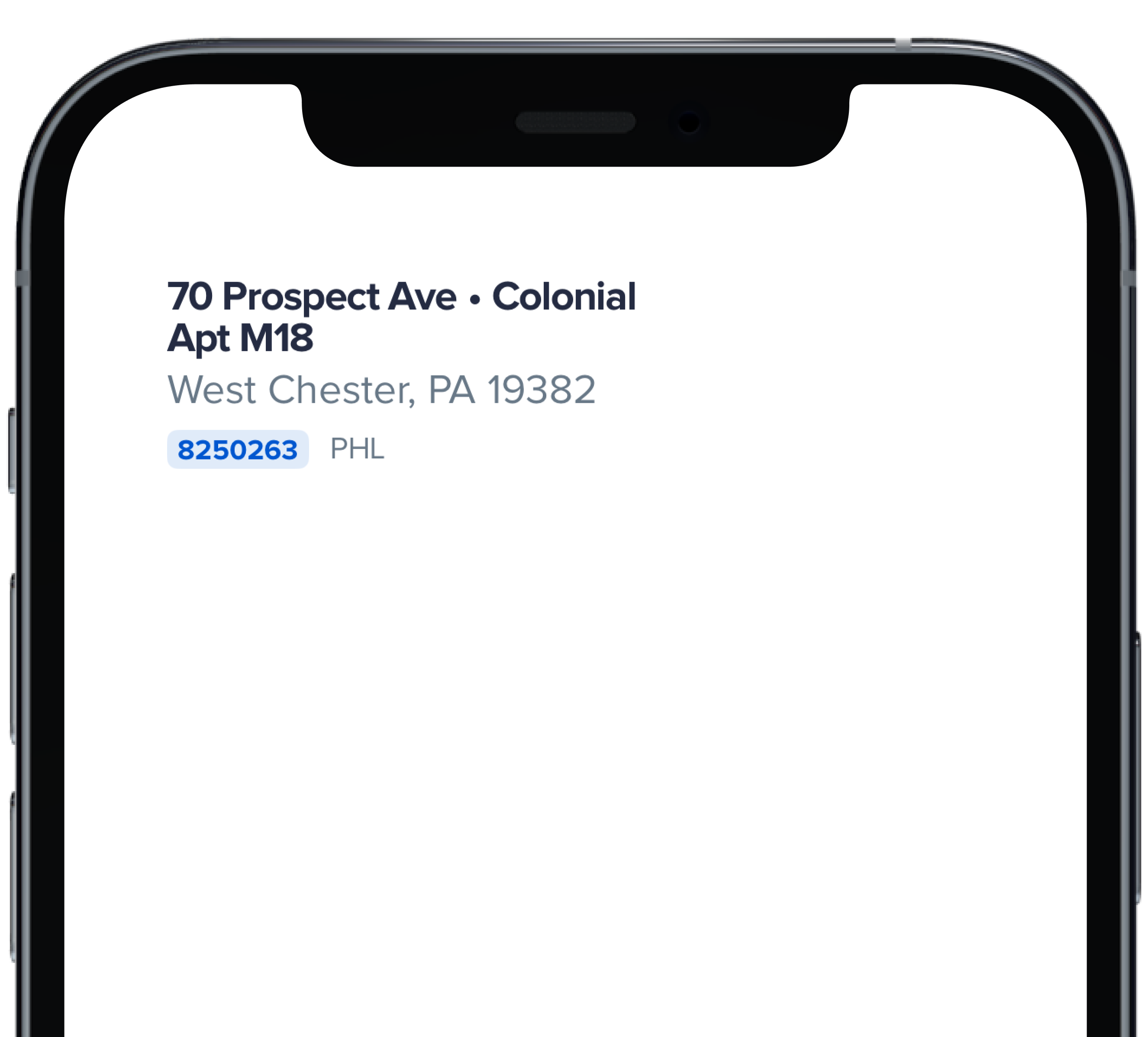
|
|
2
|
+
|
|
3
|
+
```swift
|
|
4
|
+
|
|
5
|
+
PBHomeAddressStreet(
|
|
6
|
+
address: "70 Prospect Ave",
|
|
7
|
+
withBullet: true,
|
|
8
|
+
houseStyle: "Colonial",
|
|
9
|
+
addressCont: "Apt M18",
|
|
10
|
+
city: "West Chester",
|
|
11
|
+
homeId: "8250263",
|
|
12
|
+
homeUrl: "https://powerhrg.com/",
|
|
13
|
+
state: "PA",
|
|
14
|
+
territory: "PHL",
|
|
15
|
+
zipcode: "19382"
|
|
16
|
+
)
|
|
17
|
+
|
|
18
|
+
```
|