playbook_ui 13.11.1 → 13.12.0.pre.alpha.PLAY880cardkithighlightzindex1655
This diff represents the content of publicly available package versions that have been released to one of the supported registries. The information contained in this diff is provided for informational purposes only and reflects changes between package versions as they appear in their respective public registries.
- checksums.yaml +4 -4
- data/app/pb_kits/playbook/pb_card/_card_mixin.scss +0 -1
- data/app/pb_kits/playbook/pb_collapsible/collapsible_content.rb +3 -1
- data/app/pb_kits/playbook/pb_collapsible/docs/_collapsible_external_controls.html.erb +22 -0
- data/app/pb_kits/playbook/pb_collapsible/docs/_collapsible_external_controls.md +3 -0
- data/app/pb_kits/playbook/pb_collapsible/docs/_collapsible_external_controls_multiple.html.erb +40 -0
- data/app/pb_kits/playbook/pb_collapsible/docs/_collapsible_external_controls_multiple.md +1 -0
- data/app/pb_kits/playbook/pb_collapsible/docs/example.yml +2 -0
- data/app/pb_kits/playbook/pb_collapsible/index.js +4 -0
- data/app/pb_kits/playbook/pb_icon/docs/_icon_border_swift.md +7 -0
- data/app/pb_kits/playbook/pb_icon/docs/_icon_default_swift.md +7 -0
- data/app/pb_kits/playbook/pb_icon/docs/_icon_flip_swift.md +11 -0
- data/app/pb_kits/playbook/pb_icon/docs/_icon_props_swift.md +8 -0
- data/app/pb_kits/playbook/pb_icon/docs/_icon_rotate_swift.md +11 -0
- data/app/pb_kits/playbook/pb_icon/docs/_icon_sizes_swift.md +46 -0
- data/app/pb_kits/playbook/pb_icon/docs/example.yml +8 -0
- data/app/pb_kits/playbook/pb_image/docs/_image_props_swift.md +7 -0
- data/app/pb_kits/playbook/pb_image/docs/_rounded_image_swift.md +47 -0
- data/app/pb_kits/playbook/pb_image/docs/_size_image_swift.md +47 -0
- data/app/pb_kits/playbook/pb_image/docs/_size_none_image_swift.md +15 -0
- data/app/pb_kits/playbook/pb_image/docs/example.yml +5 -0
- data/app/pb_kits/playbook/pb_label_value/docs/_label_value_default_swift.md +11 -0
- data/app/pb_kits/playbook/pb_label_value/docs/_label_value_details_examples_swift.md +72 -0
- data/app/pb_kits/playbook/pb_label_value/docs/_label_value_details_swift.md +41 -0
- data/app/pb_kits/playbook/pb_label_value/docs/_label_value_props_swift.md +11 -0
- data/app/pb_kits/playbook/pb_label_value/docs/example.yml +6 -0
- data/app/pb_kits/playbook/pb_message/docs/_message_default_swift.md +57 -0
- data/app/pb_kits/playbook/pb_message/docs/_message_props_swift.md +12 -0
- data/app/pb_kits/playbook/pb_message/docs/example.yml +4 -0
- data/app/pb_kits/playbook/pb_multiple_users/docs/_multiple_users_default_swift.md +11 -0
- data/app/pb_kits/playbook/pb_multiple_users/docs/_multiple_users_props_swift.md +7 -0
- data/app/pb_kits/playbook/pb_multiple_users/docs/_multiple_users_reverse_swift.md +13 -0
- data/app/pb_kits/playbook/pb_multiple_users/docs/_multiple_users_size_swift.md +11 -0
- data/app/pb_kits/playbook/pb_multiple_users/docs/example.yml +6 -0
- data/app/pb_kits/playbook/pb_multiple_users_stacked/docs/_multiple_users_stacked_default_swift.md +15 -0
- data/app/pb_kits/playbook/pb_multiple_users_stacked/docs/_multiple_users_stacked_props_swift.md +5 -0
- data/app/pb_kits/playbook/pb_multiple_users_stacked/docs/_multiple_users_stacked_small_swift.md +15 -0
- data/app/pb_kits/playbook/pb_multiple_users_stacked/docs/_multiple_users_stacked_xsmall_swift.md +15 -0
- data/app/pb_kits/playbook/pb_multiple_users_stacked/docs/example.yml +6 -0
- data/app/pb_kits/playbook/pb_section_separator/docs/_section_separator_children_swift.md +14 -0
- data/app/pb_kits/playbook/pb_section_separator/docs/_section_separator_dashed_swift.md +7 -0
- data/app/pb_kits/playbook/pb_section_separator/docs/_section_separator_line_swift.md +8 -0
- data/app/pb_kits/playbook/pb_section_separator/docs/_section_separator_props_swift.md +8 -0
- data/app/pb_kits/playbook/pb_section_separator/docs/_section_separator_text_swift.md +7 -0
- data/app/pb_kits/playbook/pb_section_separator/docs/_section_separator_vertical_swift.md +18 -0
- data/app/pb_kits/playbook/pb_section_separator/docs/example.yml +8 -0
- data/app/pb_kits/playbook/pb_table/docs/_table_header.html.erb +4 -4
- data/app/pb_kits/playbook/pb_table/styles/_hover.scss +26 -2
- data/app/pb_kits/playbook/pb_table/styles/_table-dark.scss +1 -17
- data/app/pb_kits/playbook/pb_table/table_header.html.erb +4 -3
- data/app/pb_kits/playbook/pb_table/table_header.rb +28 -5
- data/app/pb_kits/playbook/pb_text_input/docs/_text_input_add_on_swift.md +35 -0
- data/app/pb_kits/playbook/pb_text_input/docs/_text_input_default_swift.md +29 -0
- data/app/pb_kits/playbook/pb_text_input/docs/_text_input_disabled_swift.md +13 -0
- data/app/pb_kits/playbook/pb_text_input/docs/_text_input_error_swift.md +24 -0
- data/app/pb_kits/playbook/pb_text_input/docs/_text_input_props_swift.md +13 -0
- data/app/pb_kits/playbook/pb_text_input/docs/example.yml +7 -0
- data/app/pb_kits/playbook/pb_textarea/docs/_textarea_default_swift.md +27 -0
- data/app/pb_kits/playbook/pb_textarea/docs/_textarea_error_swift.md +11 -0
- data/app/pb_kits/playbook/pb_textarea/docs/_textarea_props_swift.md +9 -0
- data/app/pb_kits/playbook/pb_textarea/docs/example.yml +5 -0
- data/app/pb_kits/playbook/pb_toggle/docs/_toggle_default_swift.md +11 -0
- data/app/pb_kits/playbook/pb_toggle/docs/_toggle_name_swift.md +10 -0
- data/app/pb_kits/playbook/pb_toggle/docs/_toggle_props_swift.md +6 -0
- data/app/pb_kits/playbook/pb_toggle/docs/example.yml +4 -0
- data/app/pb_kits/playbook/pb_tooltip/_tooltip.tsx +25 -9
- data/app/pb_kits/playbook/pb_tooltip/docs/_tooltip_default.html.erb +1 -1
- data/app/pb_kits/playbook/pb_tooltip/docs/_tooltip_default_react.jsx +0 -2
- data/app/pb_kits/playbook/pb_tooltip/docs/_tooltip_delay.jsx +0 -1
- data/app/pb_kits/playbook/pb_tooltip/docs/_tooltip_interaction.jsx +0 -1
- data/app/pb_kits/playbook/pb_tooltip/docs/_tooltip_margin.jsx +0 -1
- data/app/pb_kits/playbook/pb_tooltip/docs/_tooltip_selectors.html.erb +1 -1
- data/app/pb_kits/playbook/pb_tooltip/docs/_tooltip_show_tooltip.html.erb +39 -0
- data/app/pb_kits/playbook/pb_tooltip/docs/_tooltip_show_tooltip.md +5 -0
- data/app/pb_kits/playbook/pb_tooltip/docs/_tooltip_show_tooltip_react.jsx +45 -0
- data/app/pb_kits/playbook/pb_tooltip/docs/_tooltip_show_tooltip_react.md +3 -0
- data/app/pb_kits/playbook/pb_tooltip/docs/example.yml +3 -0
- data/app/pb_kits/playbook/pb_tooltip/docs/index.js +1 -0
- data/app/pb_kits/playbook/pb_tooltip/index.js +6 -0
- data/app/pb_kits/playbook/pb_tooltip/tooltip.rb +2 -1
- data/app/pb_kits/playbook/pb_tooltip/tooltip.test.jsx +34 -0
- data/app/pb_kits/playbook/playbook-doc.js +1 -1
- data/dist/playbook-rails.js +3 -3
- data/lib/playbook/version.rb +2 -2
- metadata +56 -7
checksums.yaml
CHANGED
|
@@ -1,7 +1,7 @@
|
|
|
1
1
|
---
|
|
2
2
|
SHA256:
|
|
3
|
-
metadata.gz:
|
|
4
|
-
data.tar.gz:
|
|
3
|
+
metadata.gz: 2df1a239bdc2543fe0c643adbd48ecf1083b5627a3aaff5018f4bc4b5c6f3501
|
|
4
|
+
data.tar.gz: '095f3ef35c2083b78218da353d974108a2ca70127e12d760f07eef70e31b423a'
|
|
5
5
|
SHA512:
|
|
6
|
-
metadata.gz:
|
|
7
|
-
data.tar.gz:
|
|
6
|
+
metadata.gz: 5643ac4dd6cd99c4164f7b0125a1d37cfeb3b4b7b7960cc7a27572ddab5847f4b9f429f4b77d8d6ba04a3303a66dc101f8f57d7354da12be7f3ccaf227d221fd
|
|
7
|
+
data.tar.gz: b7f61a87d132dc21a018945ecd1ffa5aca675ff883ed07cc5a829ec488aa5a1e241bfdacddf81fdd74a8eb25bc91d86a6ca1aae3e5940a8005954af316823de4
|
|
@@ -3,6 +3,8 @@
|
|
|
3
3
|
module Playbook
|
|
4
4
|
module PbCollapsible
|
|
5
5
|
class CollapsibleContent < Playbook::KitBase
|
|
6
|
+
prop :collapsed, type: Playbook::Props::Boolean,
|
|
7
|
+
default: true
|
|
6
8
|
def data
|
|
7
9
|
Hash(values[:data]).merge(
|
|
8
10
|
collapsible_content: true
|
|
@@ -10,7 +12,7 @@ module Playbook
|
|
|
10
12
|
end
|
|
11
13
|
|
|
12
14
|
def classname
|
|
13
|
-
generate_classname("pb_collapsible_content_kit", "toggle-content", padding, separator: " ")
|
|
15
|
+
generate_classname("pb_collapsible_content_kit", "toggle-content", collapsed ? nil : "is-visible", padding, separator: " ")
|
|
14
16
|
end
|
|
15
17
|
end
|
|
16
18
|
end
|
|
@@ -0,0 +1,22 @@
|
|
|
1
|
+
<div onclick="toggleCollapsibleById('collapsed-toggle')">
|
|
2
|
+
<%= pb_rails("button", props: { text: "Toggle Collapsible", variant:"link"}) %>
|
|
3
|
+
</div>
|
|
4
|
+
|
|
5
|
+
<%= pb_rails("collapsible", props: { name: "default-example" }) do %>
|
|
6
|
+
<%= pb_rails("collapsible/collapsible_main", props: { padding: "md", name: "default-main"}) do %>
|
|
7
|
+
<%= pb_rails("body", props: { text: "Main Section"}) %>
|
|
8
|
+
<% end %>
|
|
9
|
+
<%= pb_rails("collapsible/collapsible_content", props: { padding: "md", collapsed: false, id:"collapsed-toggle" }) do %>
|
|
10
|
+
Lorem ipsum dolor sit amet, consectetur adipiscing elit. Donec iaculis, risus a fringilla luctus, sapien eros sodales ex, quis molestie est nulla non turpis. Vestibulum aliquet at ipsum eget posuere. Morbi sed laoreet erat. Sed commodo posuere lectus, at porta nulla ornare a. Suspendisse quam est, sollicitudin ut enim sit amet, commodo placerat enim. Donec laoreet metus ac mauris pellentesque mattis. Pellentesque luctus vel mauris non aliquam. Mauris hendrerit mattis porttitor. Curabitur vehicula justo non ex consectetur commodo. Quisque posuere aliquet quam. Maecenas malesuada magna mauris, ac tempor metus euismod at.
|
|
11
|
+
<br><br>
|
|
12
|
+
Cras ornare fermentum magna mollis efficitur. Sed vitae nulla vel purus ultrices mollis. Maecenas id nulla id libero faucibus feugiat quis sit amet turpis. In commodo pellentesque risus at fringilla. Integer non interdum leo, non commodo ante. Lorem ipsum dolor sit amet, consectetur adipiscing elit. Ut mi augue, dignissim at orci vel, egestas aliquam mi. Proin finibus aliquet tempor. Integer cursus, ex quis gravida rhoncus, nisi elit viverra ipsum, non efficitur est ex ac tortor. Praesent vitae odio massa.
|
|
13
|
+
<% end %>
|
|
14
|
+
<% end %>
|
|
15
|
+
|
|
16
|
+
|
|
17
|
+
|
|
18
|
+
<script>
|
|
19
|
+
const toggleCollapsibleById = (id) => {
|
|
20
|
+
document.dispatchEvent(new CustomEvent(id));
|
|
21
|
+
};
|
|
22
|
+
</script>
|
|
@@ -0,0 +1,3 @@
|
|
|
1
|
+
The `collapsed` prop (boolean; default = true) handles the collapsed state of a collapsible. Set it to 'false' and the collapsible will render in an expanded state on page load.
|
|
2
|
+
|
|
3
|
+
You can also control the collapsed state using an external control (like a button). To do this, you must first apply a unique id to the collapsible/collapsible_content child element. You can then attach an eventListner to the external control of your choice, pass it the id as an argument and use `document.dispatchEvent(new CustomEvent(id))` to trigger the action. See the code example below for details.
|
data/app/pb_kits/playbook/pb_collapsible/docs/_collapsible_external_controls_multiple.html.erb
ADDED
|
@@ -0,0 +1,40 @@
|
|
|
1
|
+
<%= pb_rails("button", props: { variant:"link", text: "Toggle All", id: "toggle-button-example"}) %>
|
|
2
|
+
|
|
3
|
+
<%= pb_rails("collapsible", props: { name: "default-example" }) do %>
|
|
4
|
+
<%= pb_rails("collapsible/collapsible_main", props: { padding: "xs", name: "default-main"}) do %>
|
|
5
|
+
<%= pb_rails("body", props: { text: "Main Section"}) %>
|
|
6
|
+
<% end %>
|
|
7
|
+
<%= pb_rails("collapsible/collapsible_content", props: { padding: "md", id:"collapse-toggle-1" }) do %>
|
|
8
|
+
Cras ornare fermentum magna mollis efficitur. Sed vitae nulla vel purus ultrices mollis. Maecenas id nulla id libero faucibus feugiat quis sit amet turpis. In commodo pellentesque risus at fringilla. Integer non interdum leo, non commodo ante. Lorem ipsum dolor sit amet, consectetur adipiscing elit. Ut mi augue, dignissim at orci vel, egestas aliquam mi. Proin finibus aliquet tempor. Integer cursus, ex quis gravida rhoncus, nisi elit viverra ipsum, non efficitur est ex ac tortor. Praesent vitae odio massa.
|
|
9
|
+
<% end %>
|
|
10
|
+
<% end %>
|
|
11
|
+
<%= pb_rails("collapsible", props: { name: "default-example-2" }) do %>
|
|
12
|
+
<%= pb_rails("collapsible/collapsible_main", props: { padding: "xs", name: "default-main"}) do %>
|
|
13
|
+
<%= pb_rails("body", props: { text: "Main Section"}) %>
|
|
14
|
+
<% end %>
|
|
15
|
+
<%= pb_rails("collapsible/collapsible_content", props: { padding: "md", id:"collapse-toggle-2" }) do %>
|
|
16
|
+
Cras ornare fermentum magna mollis efficitur. Sed vitae nulla vel purus ultrices mollis. Maecenas id nulla id libero faucibus feugiat quis sit amet turpis. In commodo pellentesque risus at fringilla. Integer non interdum leo, non commodo ante. Lorem ipsum dolor sit amet, consectetur adipiscing elit. Ut mi augue, dignissim at orci vel, egestas aliquam mi. Proin finibus aliquet tempor. Integer cursus, ex quis gravida rhoncus, nisi elit viverra ipsum, non efficitur est ex ac tortor. Praesent vitae odio massa.
|
|
17
|
+
<% end %>
|
|
18
|
+
<% end %>
|
|
19
|
+
<%= pb_rails("collapsible", props: { name: "default-example-3" }) do %>
|
|
20
|
+
<%= pb_rails("collapsible/collapsible_main", props: { padding: "xs", name: "default-main"}) do %>
|
|
21
|
+
<%= pb_rails("body", props: { text: "Main Section"}) %>
|
|
22
|
+
<% end %>
|
|
23
|
+
<%= pb_rails("collapsible/collapsible_content", props: { padding: "md", id:"collapse-toggle-3" }) do %>
|
|
24
|
+
Cras ornare fermentum magna mollis efficitur. Sed vitae nulla vel purus ultrices mollis. Maecenas id nulla id libero faucibus feugiat quis sit amet turpis. In commodo pellentesque risus at fringilla. Integer non interdum leo, non commodo ante. Lorem ipsum dolor sit amet, consectetur adipiscing elit. Ut mi augue, dignissim at orci vel, egestas aliquam mi. Proin finibus aliquet tempor. Integer cursus, ex quis gravida rhoncus, nisi elit viverra ipsum, non efficitur est ex ac tortor. Praesent vitae odio massa.
|
|
25
|
+
<% end %>
|
|
26
|
+
<% end %>
|
|
27
|
+
|
|
28
|
+
|
|
29
|
+
|
|
30
|
+
<script>
|
|
31
|
+
window.addEventListener('DOMContentLoaded', () => {
|
|
32
|
+
const collapsibles = document.querySelectorAll('[id^="collapse-toggle"]');
|
|
33
|
+
const button = document.querySelector("#toggle-button-example");
|
|
34
|
+
button.addEventListener("click", () => {
|
|
35
|
+
collapsibles.forEach(collapsible => {
|
|
36
|
+
document.dispatchEvent(new CustomEvent(collapsible.id));
|
|
37
|
+
})
|
|
38
|
+
})
|
|
39
|
+
})
|
|
40
|
+
</script>
|
|
@@ -0,0 +1 @@
|
|
|
1
|
+
The external control functionality can also be used to toggle multiple collapsibles with the same control. See the code example below to see this in action.
|
|
@@ -5,6 +5,8 @@ examples:
|
|
|
5
5
|
- collapsible_size: Icon Size
|
|
6
6
|
- collapsible_color: Icon Color
|
|
7
7
|
- collapsible_icons: Custom Icons
|
|
8
|
+
- collapsible_external_controls: Toggle Collapsible With External Controls
|
|
9
|
+
- collapsible_external_controls_multiple: Toggle All Collapsibles With One Control
|
|
8
10
|
|
|
9
11
|
react:
|
|
10
12
|
- collapsible_default: Default
|
|
@@ -15,6 +15,10 @@ export default class PbCollapsible extends PbEnhancedElement {
|
|
|
15
15
|
this.toggleElement(this.target)
|
|
16
16
|
})
|
|
17
17
|
this.displayDownArrow()
|
|
18
|
+
// Listen for a custom event to toggle the collapsible
|
|
19
|
+
document.addEventListener(`${this.target.id}`, () => {
|
|
20
|
+
this.toggleElement(this.target)
|
|
21
|
+
})
|
|
18
22
|
}
|
|
19
23
|
|
|
20
24
|
get target() {
|
|
@@ -0,0 +1,11 @@
|
|
|
1
|
+

|
|
2
|
+
|
|
3
|
+
```swift
|
|
4
|
+
|
|
5
|
+
HStack(spacing: Spacing.xSmall) {
|
|
6
|
+
PBIcon(FontAwesome.questionCircle, flipped: [.horizontal])
|
|
7
|
+
PBIcon(FontAwesome.questionCircle, flipped: [.vertical])
|
|
8
|
+
PBIcon(FontAwesome.questionCircle, flipped: [.horizontal, .vertical])
|
|
9
|
+
}
|
|
10
|
+
|
|
11
|
+
```
|
|
@@ -0,0 +1,8 @@
|
|
|
1
|
+
### Props
|
|
2
|
+
| Name | Type | Description | Default | Values |
|
|
3
|
+
| --- | ----------- | --------- | --------- | --------- |
|
|
4
|
+
| **Icon** | `PlaybookGenericIcon` | Sets the kit's Icon | | |
|
|
5
|
+
| **Size** | `IconSize` | Changes the size of the Icon | `.x1` | `xSmall` `small` `large` `x1` `x2` `x3` `x4` `x5` `x6` `x7` `x8` `x9` `x10` |
|
|
6
|
+
| **Rotation** | `IconRotation` | Rotates the Icon | `.zero` | `.zero` `.right` `.straight` `.obtuse` |
|
|
7
|
+
| **Border** | `Bool` | Adds a border | `false` | `true` `false` |
|
|
8
|
+
| **Flipped** | `[Axis]` | Flips the Icon | `nil` | `[.horizontal]` `[.vertical]` `[.horizontal, .vertical]` |
|
|
@@ -0,0 +1,11 @@
|
|
|
1
|
+

|
|
2
|
+
|
|
3
|
+
```swift
|
|
4
|
+
|
|
5
|
+
HStack(spacing: Spacing.xSmall) {
|
|
6
|
+
PBIcon(FontAwesome.user, rotation: .right)
|
|
7
|
+
PBIcon(FontAwesome.user, rotation: .zero)
|
|
8
|
+
PBIcon(FontAwesome.user, rotation: .obtuse)
|
|
9
|
+
}
|
|
10
|
+
|
|
11
|
+
```
|
|
@@ -0,0 +1,46 @@
|
|
|
1
|
+

|
|
2
|
+
|
|
3
|
+
```swift
|
|
4
|
+
|
|
5
|
+
HStack(spacing: Spacing.xSmall) {
|
|
6
|
+
PBIcon.fontAwesome(.atlas, size: .xSmall)
|
|
7
|
+
Text("xSmall")
|
|
8
|
+
|
|
9
|
+
PBIcon.fontAwesome(.atlas, size: .small)
|
|
10
|
+
Text("small")
|
|
11
|
+
|
|
12
|
+
PBIcon.fontAwesome(.atlas, size: .large)
|
|
13
|
+
Text("large")
|
|
14
|
+
|
|
15
|
+
PBIcon.fontAwesome(.atlas, size: .x1)
|
|
16
|
+
Text("x1")
|
|
17
|
+
|
|
18
|
+
PBIcon.fontAwesome(.atlas, size: .x2)
|
|
19
|
+
Text("x2")
|
|
20
|
+
|
|
21
|
+
PBIcon.fontAwesome(.atlas, size: .x3)
|
|
22
|
+
Text("x3")
|
|
23
|
+
|
|
24
|
+
PBIcon.fontAwesome(.atlas, size: .x4)
|
|
25
|
+
Text("x4")
|
|
26
|
+
|
|
27
|
+
PBIcon.fontAwesome(.atlas, size: .x5)
|
|
28
|
+
Text("x5")
|
|
29
|
+
|
|
30
|
+
PBIcon.fontAwesome(.atlas, size: .x6)
|
|
31
|
+
Text("x6")
|
|
32
|
+
|
|
33
|
+
PBIcon.fontAwesome(.atlas, size: .x7)
|
|
34
|
+
Text("x7")
|
|
35
|
+
|
|
36
|
+
PBIcon.fontAwesome(.atlas, size: .x8)
|
|
37
|
+
Text("x8")
|
|
38
|
+
|
|
39
|
+
PBIcon.fontAwesome(.atlas, size: .x9)
|
|
40
|
+
Text("x9")
|
|
41
|
+
|
|
42
|
+
PBIcon.fontAwesome(.atlas, size: .x10)
|
|
43
|
+
Text("x10")
|
|
44
|
+
}
|
|
45
|
+
|
|
46
|
+
```
|
|
@@ -20,3 +20,11 @@ examples:
|
|
|
20
20
|
- icon_sizes: Icon Sizes
|
|
21
21
|
- icon_custom: Icon Custom
|
|
22
22
|
- icon_fa_kit: Icon with FontAwesome Kit
|
|
23
|
+
|
|
24
|
+
swift:
|
|
25
|
+
- icon_default_swift: Icon Default
|
|
26
|
+
- icon_rotate_swift: Icon Rotate
|
|
27
|
+
- icon_flip_swift: Icon Flip
|
|
28
|
+
- icon_border_swift: Icon Border
|
|
29
|
+
- icon_sizes_swift: Icon Sizes
|
|
30
|
+
- icon_props_swift: Props
|
|
@@ -0,0 +1,7 @@
|
|
|
1
|
+
### Props
|
|
2
|
+
| Name | Type | Description | Default | Values |
|
|
3
|
+
| --- | ----------- | --------- | --------- | --------- |
|
|
4
|
+
| **Image** | `Image` | Sets the Image | | |
|
|
5
|
+
| **Place Holder** | `Image` | sets the placeholder Image | `nil` | |
|
|
6
|
+
| **Size** | `Size` | Changes the size of the Image | `nil` | `.xSmall` `.small` `.medium` `.large` `.xLarge` |
|
|
7
|
+
| **Rounded** | `ImageCornerRadius` | Adds rounded corners to the Image | `.sharp` | `.rounded` `.sharp` |
|
|
@@ -0,0 +1,47 @@
|
|
|
1
|
+

|
|
2
|
+
|
|
3
|
+
```swift
|
|
4
|
+
|
|
5
|
+
VStack(alignment: .leading, spacing: Spacing.small) {
|
|
6
|
+
Text("xSmall").pbFont(.detail(true), color: .text(.default))
|
|
7
|
+
PBImage(
|
|
8
|
+
image: nil,
|
|
9
|
+
placeholder: Image("Forest", bundle: .module),
|
|
10
|
+
size: .xSmall,
|
|
11
|
+
rounded: .rounded
|
|
12
|
+
)
|
|
13
|
+
|
|
14
|
+
Text("small").pbFont(.detail(true), color: .text(.default))
|
|
15
|
+
PBImage(
|
|
16
|
+
image: nil,
|
|
17
|
+
placeholder: Image("Forest", bundle: .module),
|
|
18
|
+
size: .small,
|
|
19
|
+
rounded: .rounded
|
|
20
|
+
)
|
|
21
|
+
|
|
22
|
+
Text("medium").pbFont(.detail(true), color: .text(.default))
|
|
23
|
+
PBImage(
|
|
24
|
+
image: nil,
|
|
25
|
+
placeholder: Image("Forest", bundle: .module),
|
|
26
|
+
size: .medium,
|
|
27
|
+
rounded: .rounded
|
|
28
|
+
)
|
|
29
|
+
|
|
30
|
+
Text("large").pbFont(.detail(true), color: .text(.default))
|
|
31
|
+
PBImage(
|
|
32
|
+
image: nil,
|
|
33
|
+
placeholder: Image("Forest", bundle: .module),
|
|
34
|
+
size: .large,
|
|
35
|
+
rounded: .rounded
|
|
36
|
+
)
|
|
37
|
+
|
|
38
|
+
Text("xLarge").pbFont(.detail(true), color: .text(.default))
|
|
39
|
+
PBImage(
|
|
40
|
+
image: nil,
|
|
41
|
+
placeholder: Image("Forest", bundle: .module),
|
|
42
|
+
size: .xLarge,
|
|
43
|
+
rounded: .rounded
|
|
44
|
+
)
|
|
45
|
+
}
|
|
46
|
+
|
|
47
|
+
```
|
|
@@ -0,0 +1,47 @@
|
|
|
1
|
+

|
|
2
|
+
|
|
3
|
+
```swift
|
|
4
|
+
|
|
5
|
+
VStack(alignment: .leading, spacing: Spacing.small) {
|
|
6
|
+
Text("xSmall").pbFont(.detail(true), color: .text(.default))
|
|
7
|
+
PBImage(
|
|
8
|
+
image: nil,
|
|
9
|
+
placeholder: Image("Forest", bundle: .module),
|
|
10
|
+
size: .xSmall,
|
|
11
|
+
rounded: .sharp
|
|
12
|
+
)
|
|
13
|
+
|
|
14
|
+
Text("small").pbFont(.detail(true), color: .text(.default))
|
|
15
|
+
PBImage(
|
|
16
|
+
image: nil,
|
|
17
|
+
placeholder: Image("Forest", bundle: .module),
|
|
18
|
+
size: .small,
|
|
19
|
+
rounded: .sharp
|
|
20
|
+
)
|
|
21
|
+
|
|
22
|
+
Text("medium").pbFont(.detail(true), color: .text(.default))
|
|
23
|
+
PBImage(
|
|
24
|
+
image: nil,
|
|
25
|
+
placeholder: Image("Forest", bundle: .module),
|
|
26
|
+
size: .medium,
|
|
27
|
+
rounded: .sharp
|
|
28
|
+
)
|
|
29
|
+
|
|
30
|
+
Text("large").pbFont(.detail(true), color: .text(.default))
|
|
31
|
+
PBImage(
|
|
32
|
+
image: nil,
|
|
33
|
+
placeholder: Image("Forest", bundle: .module),
|
|
34
|
+
size: .large,
|
|
35
|
+
rounded: .sharp
|
|
36
|
+
)
|
|
37
|
+
|
|
38
|
+
Text("xLarge").pbFont(.detail(true), color: .text(.default))
|
|
39
|
+
PBImage(
|
|
40
|
+
image: nil,
|
|
41
|
+
placeholder: Image("Forest", bundle: .module),
|
|
42
|
+
size: .xLarge,
|
|
43
|
+
rounded: .sharp
|
|
44
|
+
)
|
|
45
|
+
}
|
|
46
|
+
|
|
47
|
+
```
|
|
@@ -0,0 +1,15 @@
|
|
|
1
|
+

|
|
2
|
+
|
|
3
|
+
```swift
|
|
4
|
+
|
|
5
|
+
VStack(alignment: .leading) {
|
|
6
|
+
Text("None").pbFont(.detail(true), color: .text(.default))
|
|
7
|
+
PBImage(
|
|
8
|
+
image: nil,
|
|
9
|
+
placeholder: Image("Forest", bundle: .module),
|
|
10
|
+
size: .none,
|
|
11
|
+
rounded: .sharp
|
|
12
|
+
)
|
|
13
|
+
}
|
|
14
|
+
|
|
15
|
+
```
|
|
@@ -0,0 +1,11 @@
|
|
|
1
|
+
|
|
2
|
+
|
|
3
|
+
```swift
|
|
4
|
+
|
|
5
|
+
VStack(alignment: .leading, spacing: Spacing.small) {
|
|
6
|
+
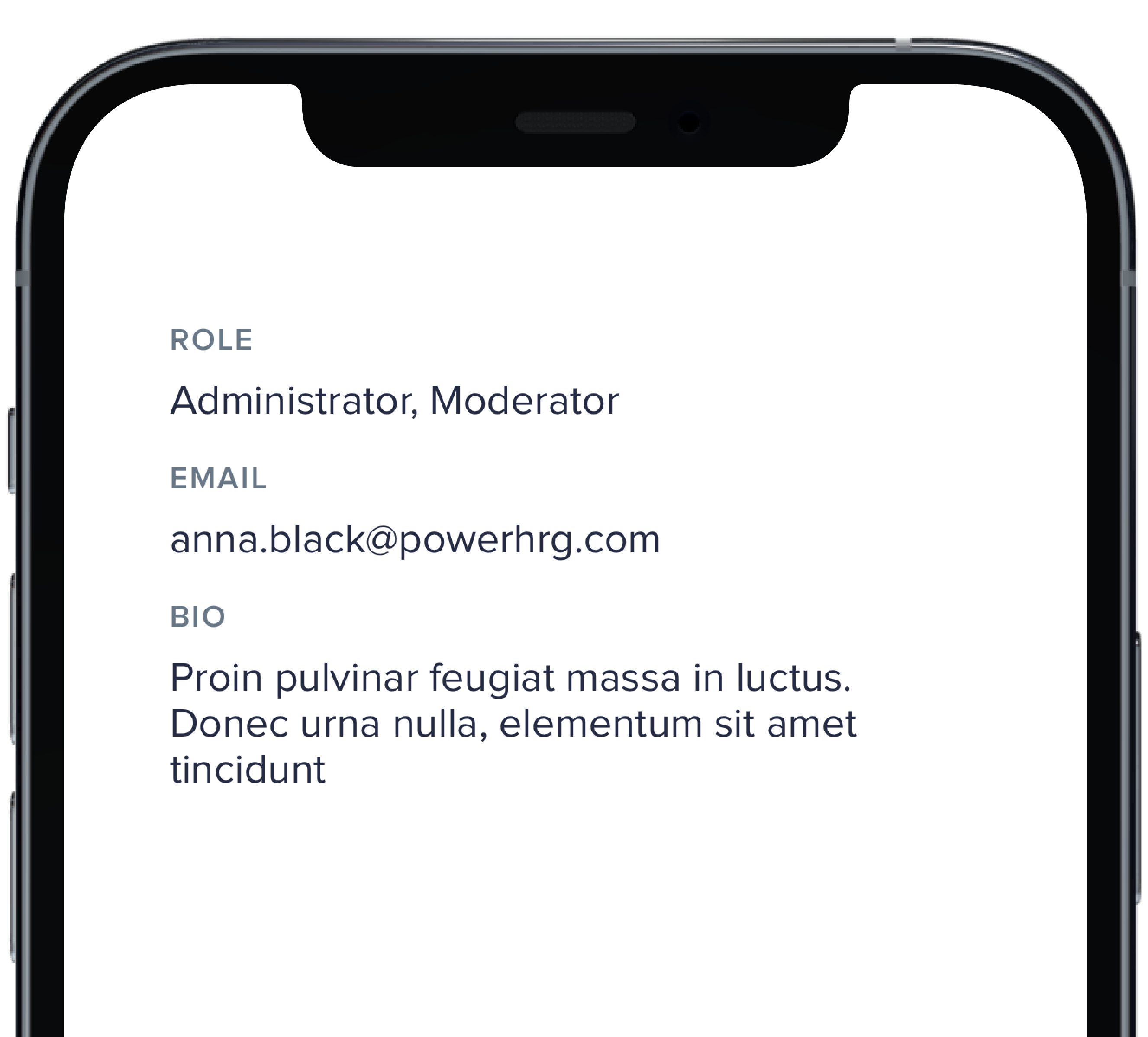
PBLabelValue("Role", "Administrator, Moderator")
|
|
7
|
+
PBLabelValue("Email", "anna.black@powerhrg.com")
|
|
8
|
+
PBLabelValue("Bio", longText)
|
|
9
|
+
}
|
|
10
|
+
|
|
11
|
+
```
|
|
@@ -0,0 +1,72 @@
|
|
|
1
|
+
|
|
2
|
+
|
|
3
|
+
|
|
4
|
+
```swift
|
|
5
|
+
|
|
6
|
+
VStack(alignment: .leading, spacing: Spacing.small) {
|
|
7
|
+
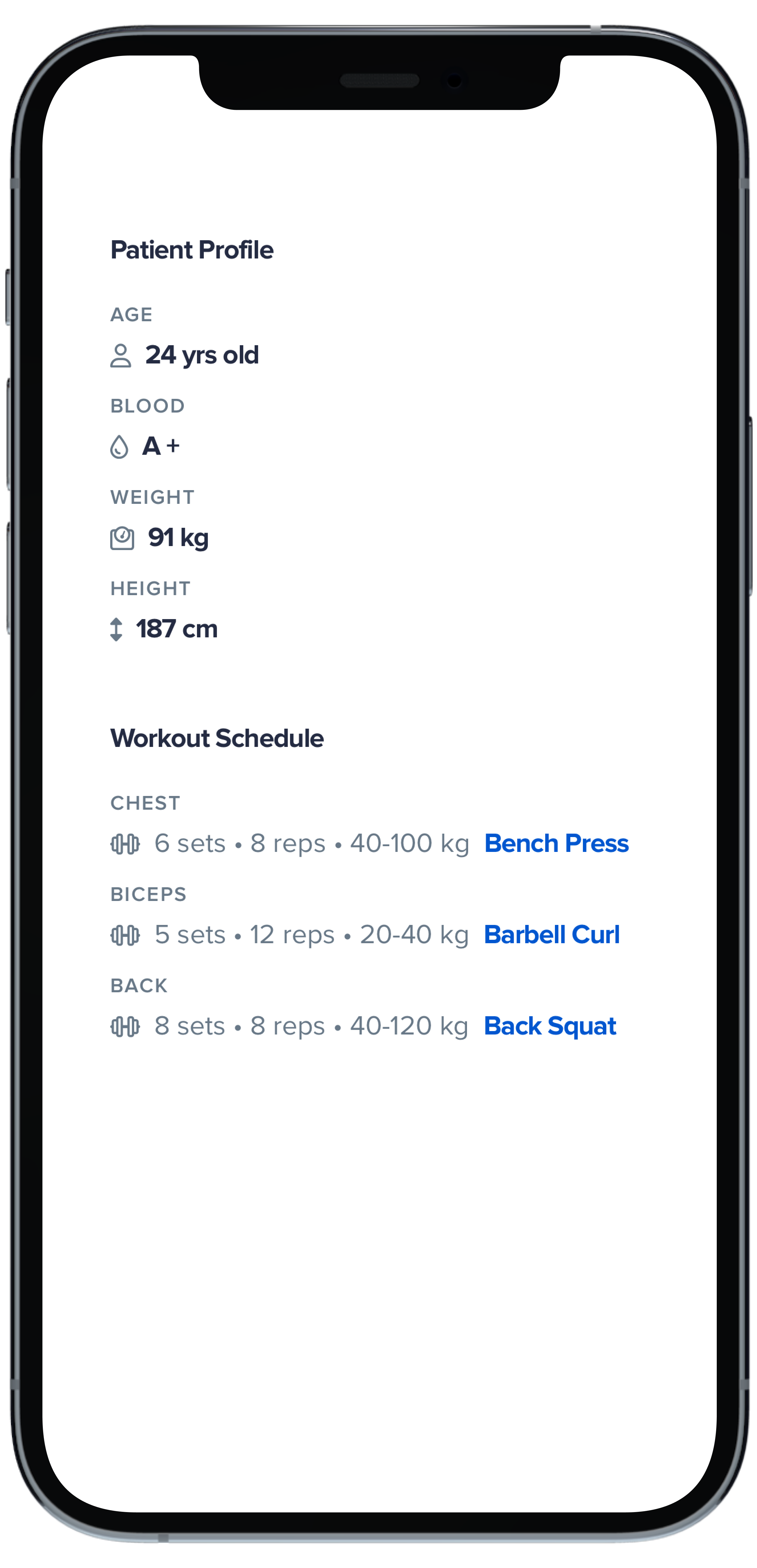
Text("Patient Profile")
|
|
8
|
+
.pbFont(.title4)
|
|
9
|
+
.padding(.bottom, Spacing.xSmall)
|
|
10
|
+
|
|
11
|
+
PBLabelValue(
|
|
12
|
+
"Age",
|
|
13
|
+
variant: .details,
|
|
14
|
+
icon: FontAwesome.user,
|
|
15
|
+
title: "24 yrs old"
|
|
16
|
+
)
|
|
17
|
+
|
|
18
|
+
PBLabelValue(
|
|
19
|
+
"Blood",
|
|
20
|
+
variant: .details,
|
|
21
|
+
icon: FontAwesome.tint,
|
|
22
|
+
title: "A +"
|
|
23
|
+
)
|
|
24
|
+
|
|
25
|
+
PBLabelValue(
|
|
26
|
+
"Weight",
|
|
27
|
+
variant: .details,
|
|
28
|
+
icon: FontAwesome.weight,
|
|
29
|
+
title: "91 kg"
|
|
30
|
+
)
|
|
31
|
+
|
|
32
|
+
PBLabelValue(
|
|
33
|
+
"Height",
|
|
34
|
+
variant: .details,
|
|
35
|
+
icon: FontAwesome.arrowsAltV,
|
|
36
|
+
title: "187 cm"
|
|
37
|
+
)
|
|
38
|
+
|
|
39
|
+
Text("Workout Schedule")
|
|
40
|
+
.pbFont(.title4)
|
|
41
|
+
.padding(.top, Spacing.large)
|
|
42
|
+
.padding(.bottom, Spacing.xSmall)
|
|
43
|
+
|
|
44
|
+
PBLabelValue(
|
|
45
|
+
"Chest",
|
|
46
|
+
variant: .details,
|
|
47
|
+
icon: FontAwesome.dumbbell,
|
|
48
|
+
description: "6 sets • 8 reps • 40-100 kg",
|
|
49
|
+
title: "Bench Press",
|
|
50
|
+
active: true
|
|
51
|
+
)
|
|
52
|
+
|
|
53
|
+
PBLabelValue(
|
|
54
|
+
"Biceps",
|
|
55
|
+
variant: .details,
|
|
56
|
+
icon: FontAwesome.dumbbell,
|
|
57
|
+
description: "5 sets • 12 reps • 20-40 kg",
|
|
58
|
+
title: "Barbell Curl",
|
|
59
|
+
active: true
|
|
60
|
+
)
|
|
61
|
+
|
|
62
|
+
PBLabelValue(
|
|
63
|
+
"Back",
|
|
64
|
+
variant: .details,
|
|
65
|
+
icon: FontAwesome.dumbbell,
|
|
66
|
+
description: "8 sets • 8 reps • 40-120 kg",
|
|
67
|
+
title: "Back Squat",
|
|
68
|
+
active: true
|
|
69
|
+
)
|
|
70
|
+
}
|
|
71
|
+
|
|
72
|
+
```
|
|
@@ -0,0 +1,41 @@
|
|
|
1
|
+

|
|
2
|
+
|
|
3
|
+
```swift
|
|
4
|
+
|
|
5
|
+
VStack(alignment: .leading, spacing: Spacing.small) {
|
|
6
|
+
PBLabelValue(
|
|
7
|
+
"Installer",
|
|
8
|
+
variant: .details,
|
|
9
|
+
icon: FontAwesome.truck,
|
|
10
|
+
title: "JD Installations LLC"
|
|
11
|
+
)
|
|
12
|
+
|
|
13
|
+
PBLabelValue(
|
|
14
|
+
"Project",
|
|
15
|
+
variant: .details,
|
|
16
|
+
icon: FontAwesome.home,
|
|
17
|
+
description: "33-12345",
|
|
18
|
+
title: "Jefferson-Smith"
|
|
19
|
+
)
|
|
20
|
+
|
|
21
|
+
PBLabelValue(
|
|
22
|
+
"Project",
|
|
23
|
+
variant: .details,
|
|
24
|
+
icon: FontAwesome.home,
|
|
25
|
+
description: "33-12345",
|
|
26
|
+
title: "Jefferson-Smith",
|
|
27
|
+
date: Date()
|
|
28
|
+
)
|
|
29
|
+
|
|
30
|
+
PBLabelValue(
|
|
31
|
+
"Project",
|
|
32
|
+
variant: .details,
|
|
33
|
+
icon: FontAwesome.home,
|
|
34
|
+
description: "33-12345",
|
|
35
|
+
title: "Jefferson-Smith",
|
|
36
|
+
date: Date(),
|
|
37
|
+
active: true
|
|
38
|
+
)
|
|
39
|
+
}
|
|
40
|
+
|
|
41
|
+
```
|
|
@@ -0,0 +1,11 @@
|
|
|
1
|
+
### Props
|
|
2
|
+
| Name | Type | Description | Default | Values |
|
|
3
|
+
| --- | ----------- | --------- | --------- | --------- |
|
|
4
|
+
| **Label** | `String` | Sets the label text | | |
|
|
5
|
+
| **Value** | `String` | Sets the value | `nil` | |
|
|
6
|
+
| **Variant** | `Variant` | Changes the style of the Label Value | `.default` | `.default` `.details` |
|
|
7
|
+
| **Icon** | `PlaybookGenericIcon` | Adds an icon next to the title | `nil` | |
|
|
8
|
+
| **Description** | `String` | Sets the description | `nil` | |
|
|
9
|
+
| **Title** | `String` | Sets the title | `nil` | |
|
|
10
|
+
| **Date** | `Date` | Adds a date | `nil` | |
|
|
11
|
+
| **Active** | `Bool` | Changes the style of the Label Value | `false` | `true` `false` |
|
|
@@ -11,3 +11,9 @@ examples:
|
|
|
11
11
|
- label_value_default: Default
|
|
12
12
|
- label_value_details: Details
|
|
13
13
|
- label_value_details_examples: Other Examples
|
|
14
|
+
|
|
15
|
+
swift:
|
|
16
|
+
- label_value_default_swift: Default
|
|
17
|
+
- label_value_details_swift: Details
|
|
18
|
+
- label_value_details_examples_swift: Other Examples
|
|
19
|
+
- label_value_props_swift: ""
|
|
@@ -0,0 +1,57 @@
|
|
|
1
|
+

|
|
2
|
+
|
|
3
|
+
```swift
|
|
4
|
+
|
|
5
|
+
VStack(alignment: .leading, spacing: Spacing.small) {
|
|
6
|
+
PBMessage(
|
|
7
|
+
avatar: AnyView(picAnna),
|
|
8
|
+
label: "Anna Black",
|
|
9
|
+
message: "How can we assist you today?",
|
|
10
|
+
timestamp: Date().addingTimeInterval(-20)
|
|
11
|
+
)
|
|
12
|
+
|
|
13
|
+
PBMessage(
|
|
14
|
+
avatar: AnyView(picPatric),
|
|
15
|
+
label: "Patrick Welch",
|
|
16
|
+
message: "We will escalate this issue to a Senior Support agent.",
|
|
17
|
+
timestamp: Date().addingTimeInterval(-540),
|
|
18
|
+
timestampAlignment: .leading
|
|
19
|
+
)
|
|
20
|
+
|
|
21
|
+
PBMessage(
|
|
22
|
+
avatar: AnyView(picLuccile),
|
|
23
|
+
label: "Lucille Sanchez",
|
|
24
|
+
message: "Application for Kate Smith is waiting for your approval",
|
|
25
|
+
timestamp: Date().addingTimeInterval(-200000)
|
|
26
|
+
)
|
|
27
|
+
|
|
28
|
+
PBMessage(
|
|
29
|
+
avatar: AnyView(PBAvatar(name: "Beverly Reyes", size: .xSmall)),
|
|
30
|
+
label: "Beverly Reyes",
|
|
31
|
+
message: "We are so sorry you had a bad experience!",
|
|
32
|
+
timestamp: Date().addingTimeInterval(-200000)
|
|
33
|
+
)
|
|
34
|
+
|
|
35
|
+
PBMessage(
|
|
36
|
+
label: "Keith Craig",
|
|
37
|
+
message: "Please hold for one moment, I will check with my manager.",
|
|
38
|
+
timestamp: Date().addingTimeInterval(-200000)
|
|
39
|
+
) {}
|
|
40
|
+
|
|
41
|
+
PBMessage(
|
|
42
|
+
label: "Keith Craig",
|
|
43
|
+
timestamp: Date().addingTimeInterval(-200000)
|
|
44
|
+
) {
|
|
45
|
+
Image("Forest", bundle: .module).resizable().frame(width: 240, height: 240)
|
|
46
|
+
}
|
|
47
|
+
|
|
48
|
+
PBMessage(
|
|
49
|
+
label: "Keith Craig",
|
|
50
|
+
message: "Please hold for one moment, I will check with my manager.",
|
|
51
|
+
timestamp: Date().addingTimeInterval(-200000)
|
|
52
|
+
) {
|
|
53
|
+
Image("Forest", bundle: .module).resizable().frame(width: 240, height: 240)
|
|
54
|
+
}
|
|
55
|
+
}
|
|
56
|
+
|
|
57
|
+
```
|
|
@@ -0,0 +1,12 @@
|
|
|
1
|
+
### Props
|
|
2
|
+
| Name | Type | Description | Default | Values |
|
|
3
|
+
| --- | ----------- | --------- | --------- | --------- |
|
|
4
|
+
| **Avatar** | `AnyView` | Sets avatar image | `nil` | |
|
|
5
|
+
| **Label** | `String` | Sets the name of the sender | `""` | |
|
|
6
|
+
| **Message** | `String` | Sets the message text | `nil` | |
|
|
7
|
+
| **Timestamp** | `Date` | Adds a date | | `nil` |
|
|
8
|
+
| **Timestamp Alignment** | `TimestampAlignment` | Changes the style of the timestamp | `.trailing` | `.leading` `.trailing` |
|
|
9
|
+
| **Change TimeStamp On Hover** | `Bool` | Changes the timestamp hover functionality | `false` | `true` `false` |
|
|
10
|
+
| **Vertical Padding** | `CGFloat` | Changes vertical padding | `Spacing.xSmall` | `Spacing.none` `Spacing.xxSmall` `Spacing.xSmall` `Spacing.small` `Spacing.medium` `Spacing.large` `Spacing.xLarge` |
|
|
11
|
+
| **Horizontal Padding** | `CGFloat` | Changes horizontal padding | `Spacing.xSmall` | `Spacing.none` `Spacing.xxSmall` `Spacing.xSmall` `Spacing.small` `Spacing.medium` `Spacing.large` `Spacing.xLarge` |
|
|
12
|
+
| **Timestamp Variant** | `PBTimestamp.Variant` | Changes the style of the Message | `.standard` | `.standard` `.hideUserElapsed` |
|
|
@@ -0,0 +1,11 @@
|
|
|
1
|
+

|
|
2
|
+
|
|
3
|
+
```swift
|
|
4
|
+
|
|
5
|
+
let twoUsers = [andrew, picAndrew]
|
|
6
|
+
|
|
7
|
+
PBDoc(title: "xSmall") {
|
|
8
|
+
PBMultipleUsers(users: twoUsers, size: .xSmall)
|
|
9
|
+
}
|
|
10
|
+
|
|
11
|
+
```
|
|
@@ -0,0 +1,7 @@
|
|
|
1
|
+
### Props
|
|
2
|
+
| Name | Type | Description | Default | Values |
|
|
3
|
+
| --- | ----------- | --------- | --------- | --------- |
|
|
4
|
+
| **Users** | `[PBUser]` | Sets the user's avatars | | |
|
|
5
|
+
| **Size** | `AvatarSize` | Changes the size of the avatars | `.small` | `.xSmall` `.small` |
|
|
6
|
+
| **Reversed** | `Bool` | Changes the order of the avatars | `false` | `true` `false` |
|
|
7
|
+
| **Max Displayed Users** | `Int` | Limits the number of avatars displayed | `4` | |
|
|
@@ -0,0 +1,13 @@
|
|
|
1
|
+

|
|
2
|
+
|
|
3
|
+
```swift
|
|
4
|
+
|
|
5
|
+
let multipleUsers = [andrew, picAndrew, andrew, andrew]
|
|
6
|
+
let twoUsers = [andrew, picAndrew]
|
|
7
|
+
|
|
8
|
+
VStack(alignment: .leading, spacing: Spacing.small) {
|
|
9
|
+
PBMultipleUsers(users: multipleUsers, size: .small, reversed: true)
|
|
10
|
+
PBMultipleUsers(users: twoUsers, size: .small, reversed: true)
|
|
11
|
+
}
|
|
12
|
+
|
|
13
|
+
```
|
|
@@ -0,0 +1,11 @@
|
|
|
1
|
+
|
|
2
|
+
|
|
3
|
+
```swift
|
|
4
|
+
|
|
5
|
+
let multipleUsers = [andrew, picAndrew, andrew, andrew]
|
|
6
|
+
|
|
7
|
+
PBDoc(title: "Small") {
|
|
8
|
+
PBMultipleUsers(users: multipleUsers, size: .small)
|
|
9
|
+
}
|
|
10
|
+
|
|
11
|
+
```
|