playbook_ui 13.10.0.pre.alpha.webpackerregistercomponents1463 → 13.10.0
This diff represents the content of publicly available package versions that have been released to one of the supported registries. The information contained in this diff is provided for informational purposes only and reflects changes between package versions as they appear in their respective public registries.
- checksums.yaml +4 -4
- data/app/pb_kits/playbook/pb_button/docs/example.yml +0 -8
- data/app/pb_kits/playbook/pb_card/docs/example.yml +0 -12
- data/app/pb_kits/playbook/pb_checkbox/docs/example.yml +0 -7
- data/app/pb_kits/playbook/pb_icon_circle/docs/example.yml +0 -7
- data/app/pb_kits/playbook/pb_table/docs/_table_header.html.erb +31 -47
- data/app/pb_kits/playbook/pb_table/docs/_table_header.md +0 -5
- data/app/pb_kits/playbook/pb_table/table_header.html.erb +1 -1
- data/app/pb_kits/playbook/playbook-doc.js +1 -1
- data/lib/playbook/version.rb +2 -2
- metadata +7 -34
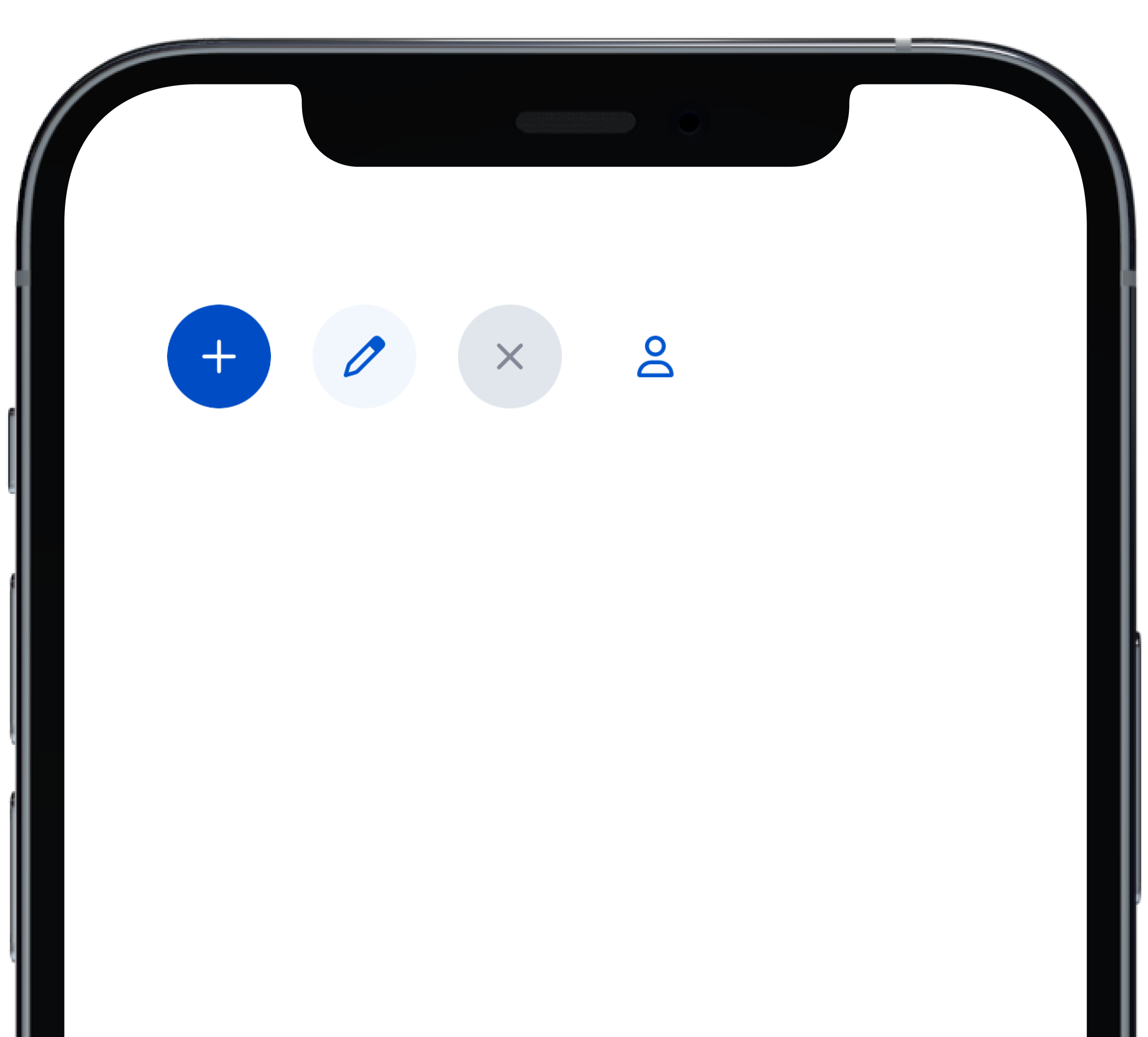
- data/app/pb_kits/playbook/pb_button/docs/_button_circle_swift.md +0 -28
- data/app/pb_kits/playbook/pb_button/docs/_button_default_swift.md +0 -23
- data/app/pb_kits/playbook/pb_button/docs/_button_full_width_swift.md +0 -9
- data/app/pb_kits/playbook/pb_button/docs/_button_icon_options_swift.md +0 -18
- data/app/pb_kits/playbook/pb_button/docs/_button_props_swift.md +0 -11
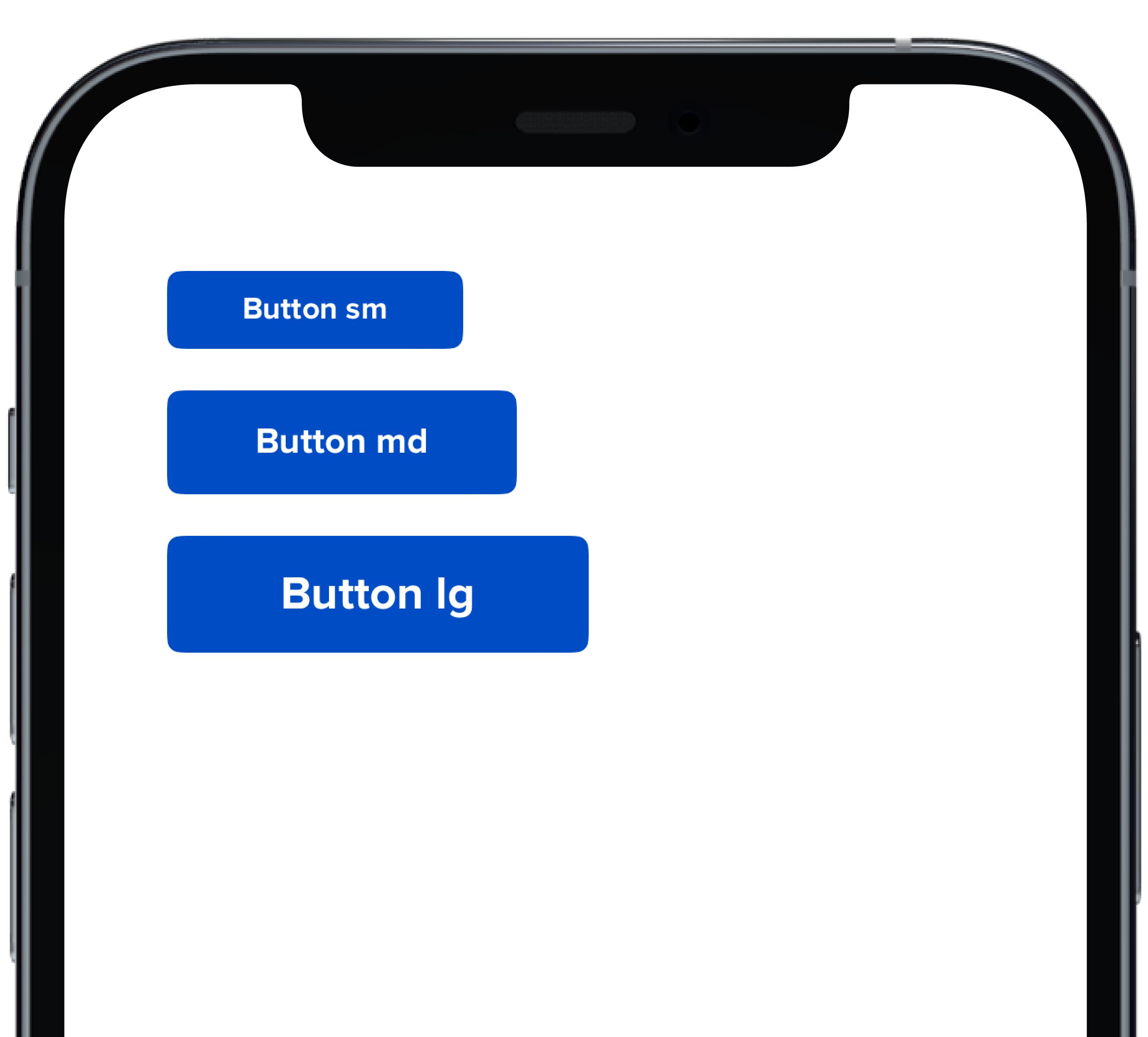
- data/app/pb_kits/playbook/pb_button/docs/_button_size_swift.md +0 -20
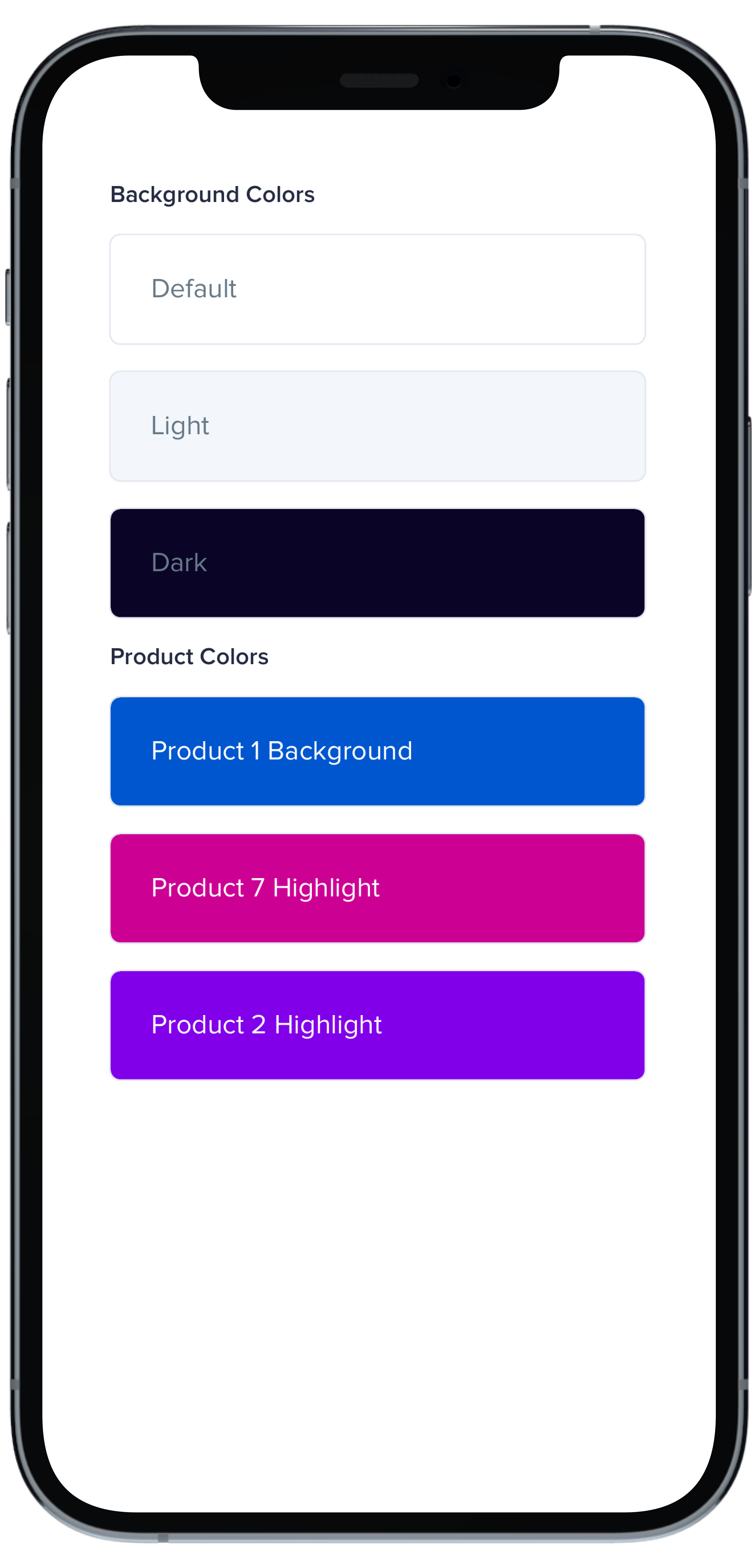
- data/app/pb_kits/playbook/pb_card/docs/_card_background_swift.md +0 -29
- data/app/pb_kits/playbook/pb_card/docs/_card_border_none_swift.md +0 -7
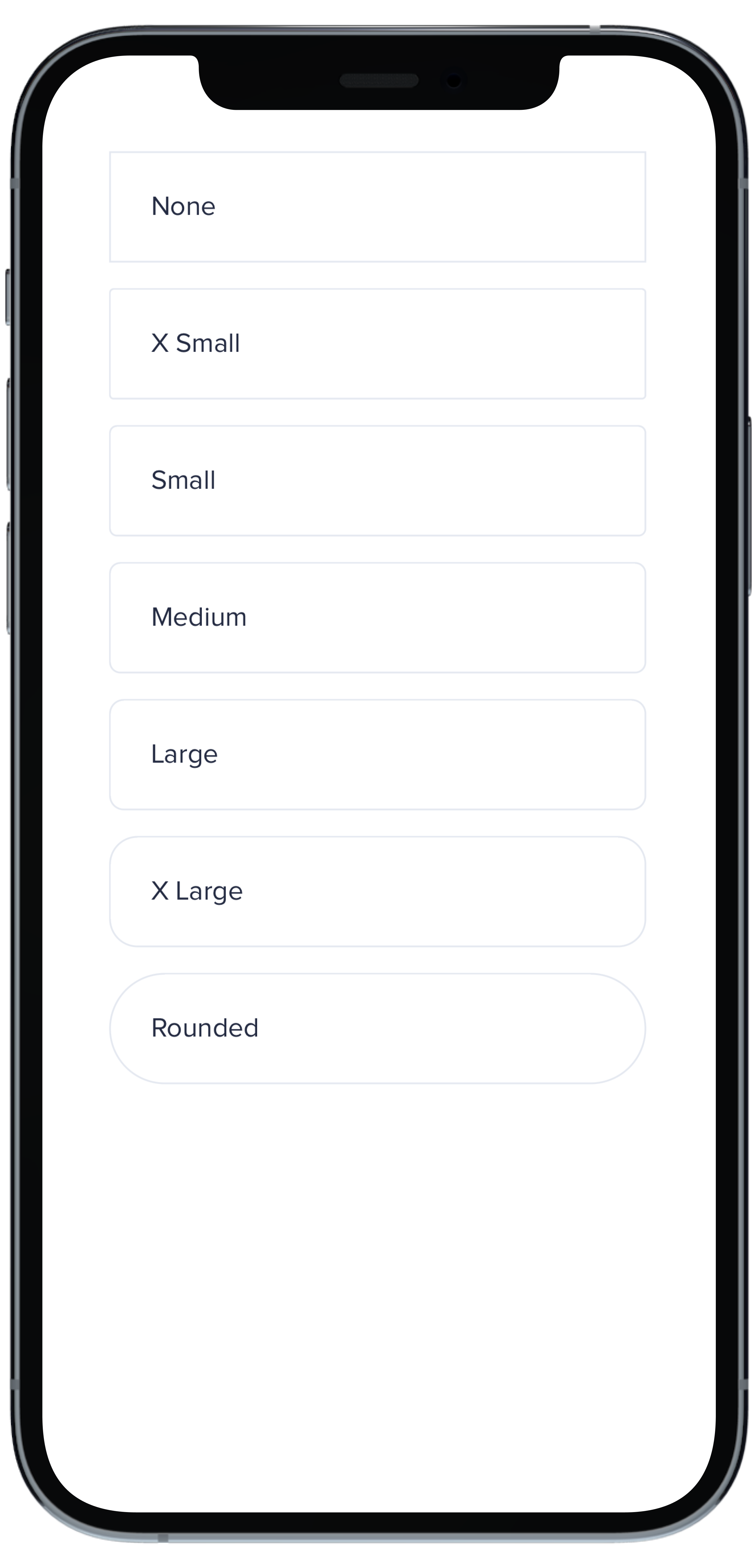
- data/app/pb_kits/playbook/pb_card/docs/_card_border_radius_swift.md +0 -33
- data/app/pb_kits/playbook/pb_card/docs/_card_header_swift.md +0 -33
- data/app/pb_kits/playbook/pb_card/docs/_card_highlight_swift.md +0 -17
- data/app/pb_kits/playbook/pb_card/docs/_card_light_swift.md +0 -7
- data/app/pb_kits/playbook/pb_card/docs/_card_padding_swift.md +0 -33
- data/app/pb_kits/playbook/pb_card/docs/_card_props_swift.md +0 -10
- data/app/pb_kits/playbook/pb_card/docs/_card_selected_swift.md +0 -0
- data/app/pb_kits/playbook/pb_card/docs/_card_separator_swift.md +0 -11
- data/app/pb_kits/playbook/pb_card/docs/_card_shadow_swift.md +0 -21
- data/app/pb_kits/playbook/pb_card/docs/_card_styles_swift.md +0 -17
- data/app/pb_kits/playbook/pb_card/docs/_card_tag_swift.md +0 -0
- data/app/pb_kits/playbook/pb_checkbox/docs/_checkbox_default_swift.md +0 -10
- data/app/pb_kits/playbook/pb_checkbox/docs/_checkbox_error_swift.md +0 -12
- data/app/pb_kits/playbook/pb_checkbox/docs/_checkbox_indeterminate_swift.md +0 -12
- data/app/pb_kits/playbook/pb_checkbox/docs/_checkbox_props_swift.md +0 -7
- data/app/pb_kits/playbook/pb_icon_circle/docs/_icon_circle_color_props.md +0 -6
- data/app/pb_kits/playbook/pb_icon_circle/docs/_icon_circle_color_swift.md +0 -16
- data/app/pb_kits/playbook/pb_icon_circle/docs/_icon_circle_defaul_swift.md +0 -7
- data/app/pb_kits/playbook/pb_icon_circle/docs/_icon_circle_sizes_swift.md +0 -11
checksums.yaml
CHANGED
|
@@ -1,7 +1,7 @@
|
|
|
1
1
|
---
|
|
2
2
|
SHA256:
|
|
3
|
-
metadata.gz:
|
|
4
|
-
data.tar.gz:
|
|
3
|
+
metadata.gz: 23bcba16e8e942308603ef0e6ee1680fb14c5a4bf64dac3614c058e3abd08b8a
|
|
4
|
+
data.tar.gz: f358dc8dfba143cbcd4f3188464d33d251ccb5b69286c69e82d673eb15a6cfbb
|
|
5
5
|
SHA512:
|
|
6
|
-
metadata.gz:
|
|
7
|
-
data.tar.gz:
|
|
6
|
+
metadata.gz: 3c7eb00868a6ef9ae018d54fd6805c67115a0a4b01cdca63af6795d76f9af80c5651a012aa06274a4fcdf96df9a08f3df5bc35355e39ed7cc0ea04fef62525e9
|
|
7
|
+
data.tar.gz: 88aa9a9120c9f999bff2945c13fa7b158988bdbe8842480bd0f6f50e8e12cebafa30e8be617c8d63a96525f8cea7c4f6a16d68dd9ff50a5cc5dee82a4035662a
|
|
@@ -25,11 +25,3 @@ examples:
|
|
|
25
25
|
- button_size: Button Size
|
|
26
26
|
- button_form: Button Form Attribute
|
|
27
27
|
- button_hover: Button Hover
|
|
28
|
-
|
|
29
|
-
swift:
|
|
30
|
-
- button_default_swift: Button Variants
|
|
31
|
-
- button_full_width_swift: Button Full Width
|
|
32
|
-
- button_icon_options_swift: Button Icon Options
|
|
33
|
-
- button_circle_swift: Circle Button
|
|
34
|
-
- button_size_swift: Button Size
|
|
35
|
-
- button_props_swift: ""
|
|
@@ -25,15 +25,3 @@ examples:
|
|
|
25
25
|
- card_separator: Separator Card
|
|
26
26
|
- card_border_none: No Border
|
|
27
27
|
- card_border_radius: Border Radius
|
|
28
|
-
swift:
|
|
29
|
-
- card_light_swift: Default
|
|
30
|
-
- card_background_swift: Card Backgrounds
|
|
31
|
-
- card_highlight_swift: Highlight Cards
|
|
32
|
-
- card_header_swift: Header Cards
|
|
33
|
-
- card_padding_swift: Padding Size
|
|
34
|
-
- card_shadow_swift: Shadow Size
|
|
35
|
-
- card_separator_swift: Separator Card
|
|
36
|
-
- card_border_none_swift: No Border
|
|
37
|
-
- card_border_radius_swift: Border Radius
|
|
38
|
-
- card_styles_swift: Styles
|
|
39
|
-
- card_props_swift: ""
|
|
@@ -13,10 +13,3 @@ examples:
|
|
|
13
13
|
- checkbox_custom: Custom Checkbox
|
|
14
14
|
- checkbox_error: Default w/ Error
|
|
15
15
|
- checkbox_indeterminate: Indeterminate Checkbox
|
|
16
|
-
|
|
17
|
-
swift:
|
|
18
|
-
- checkbox_default_swift: Default
|
|
19
|
-
- checkbox_error_swift: Default w/ Error
|
|
20
|
-
- checkbox_indeterminate_swift: Indeterminate Checkbox
|
|
21
|
-
- checkbox_props_swift: ""
|
|
22
|
-
|
|
@@ -12,10 +12,3 @@ examples:
|
|
|
12
12
|
- icon_circle_sizes: Size
|
|
13
13
|
- icon_circle_color: Color
|
|
14
14
|
- icon_circle_emoji: With Emoji
|
|
15
|
-
|
|
16
|
-
swift:
|
|
17
|
-
- icon_circle_defaul_swift: Default
|
|
18
|
-
- icon_circle_sizes_swift: Size
|
|
19
|
-
- icon_circle_color_swift: Color
|
|
20
|
-
- icon_circle_color_props: ""
|
|
21
|
-
|
|
@@ -1,37 +1,12 @@
|
|
|
1
|
-
|
|
2
|
-
<% data_rows = [
|
|
3
|
-
{ 'territory' => 'North', 'firstname' => 'John', 'lastname' => 'Doe', 'age' => 30, 'job' => 'Engineer' },
|
|
4
|
-
{ 'territory' => 'South', 'firstname' => 'Alice', 'lastname' => 'Smith', 'age' => 28, 'job' => 'Designer' },
|
|
5
|
-
{ 'territory' => 'East', 'firstname' => 'Mike', 'lastname' => 'Johnson', 'age' => 35, 'job' => 'Manager' },
|
|
6
|
-
{ 'territory' => 'West', 'firstname' => 'Sarah', 'lastname' => 'Brown', 'age' => 29, 'job' => 'Developer' },
|
|
7
|
-
{ 'territory' => 'Central', 'firstname' => 'David', 'lastname' => 'Wilson', 'age' => 32, 'job' => 'Analyst' }
|
|
8
|
-
]
|
|
9
|
-
%>
|
|
10
|
-
|
|
11
|
-
<%# Example sort method for demonstration purposes %>
|
|
12
|
-
<% if params["sort"] %>
|
|
13
|
-
<% sort_param = params["sort"].gsub(/_(asc|desc)\z/, "") %>
|
|
14
|
-
<% sort_direction = params["sort"].end_with?("_asc") ? 1 : -1 %>
|
|
15
|
-
<% data_rows.sort! do |a, b|
|
|
16
|
-
value_a = a[sort_param]
|
|
17
|
-
value_b = b[sort_param]
|
|
18
|
-
|
|
19
|
-
value_a = value_a.to_i if value_a.is_a?(String) && value_a.match?(/^\d+$/)
|
|
20
|
-
value_b = value_b.to_i if value_b.is_a?(String) && value_b.match?(/^\d+$/)
|
|
21
|
-
|
|
22
|
-
sort_direction * (value_a <=> value_b)
|
|
23
|
-
end %>
|
|
24
|
-
<% end %>
|
|
25
|
-
|
|
26
|
-
<%= pb_rails("table", props: { data_table: true, vertical_border: true, id: "table-header" } ) do %>
|
|
1
|
+
<%= pb_rails("table", props: { size: "lg"} ) do %>
|
|
27
2
|
<thead>
|
|
28
3
|
<tr>
|
|
29
4
|
<%= pb_rails("table/table_header", props: {
|
|
30
5
|
text: "Territory",
|
|
31
6
|
id: "territory",
|
|
32
7
|
sort_menu: [
|
|
33
|
-
{ item: "Territory", link: "?sort=
|
|
34
|
-
{ item: "Territory", link: "?sort=
|
|
8
|
+
{ item: "Territory", link: "?sort=territory_desc", active: params["sort"] == "territory_desc", direction: "desc" },
|
|
9
|
+
{ item: "Territory", link: "?sort=territory_asc", active: params["sort"] == "territory_asc", direction: "asc" }
|
|
35
10
|
],
|
|
36
11
|
}) %>
|
|
37
12
|
<%= pb_rails("table/table_header", props: {
|
|
@@ -39,36 +14,45 @@
|
|
|
39
14
|
text: "Full Name",
|
|
40
15
|
colspan: 2,
|
|
41
16
|
sort_menu: [
|
|
42
|
-
{ item: "First Name Descending", link: "?sort=firstname_desc
|
|
43
|
-
{ item: "First Name Ascending", link: "?sort=firstname_asc
|
|
44
|
-
{ item: "Last Name Descending", link: "?sort=lastname_desc
|
|
45
|
-
{ item: "Last Name Ascending", link: "?sort=lastname_asc
|
|
17
|
+
{ item: "First Name Descending", link: "?sort=firstname_desc", active: params["sort"] == "firstname_desc", direction: "desc" },
|
|
18
|
+
{ item: "First Name Ascending", link: "?sort=firstname_asc", active: params["sort"] == "firstname_asc", direction: "asc" },
|
|
19
|
+
{ item: "Last Name Descending", link: "?sort=lastname_desc", active: params["sort"] == "lastname_desc", direction: "desc" },
|
|
20
|
+
{ item: "Last Name Ascending", link: "?sort=lastname_asc", active: params["sort"] == "lastname_asc", direction: "asc" }
|
|
46
21
|
],
|
|
47
22
|
}) %>
|
|
48
23
|
<%= pb_rails("table/table_header", props: {
|
|
49
24
|
text: "Age",
|
|
50
25
|
id: "age",
|
|
26
|
+
sort_dropdown: true,
|
|
51
27
|
sort_menu: [
|
|
52
|
-
{ item: "Age Descending", link: "?sort=age_desc
|
|
53
|
-
{ item: "Age Ascending", link: "?sort=age_asc
|
|
28
|
+
{ item: "Age Descending", link: "?sort=age_desc", active: params["sort"] == "age_desc", direction: "desc" },
|
|
29
|
+
{ item: "Age Ascending", link: "?sort=age_asc", active: params["sort"] == "age_asc", direction: "asc" }
|
|
54
30
|
],
|
|
55
31
|
}) %>
|
|
56
32
|
<%= pb_rails("table/table_header", props: { text: "Job Title" }) %>
|
|
57
33
|
</tr>
|
|
58
34
|
</thead>
|
|
59
35
|
<tbody>
|
|
60
|
-
|
|
61
|
-
<
|
|
62
|
-
|
|
63
|
-
|
|
64
|
-
|
|
65
|
-
|
|
66
|
-
|
|
67
|
-
|
|
68
|
-
|
|
69
|
-
|
|
70
|
-
|
|
71
|
-
</
|
|
72
|
-
|
|
36
|
+
<tr>
|
|
37
|
+
<td>Ter 1</td>
|
|
38
|
+
<td>First Name 1</td>
|
|
39
|
+
<td>Last Name 1</td>
|
|
40
|
+
<td>Age 1</td>
|
|
41
|
+
<td>Job 1</td>
|
|
42
|
+
</tr>
|
|
43
|
+
<tr>
|
|
44
|
+
<td>Ter 2</td>
|
|
45
|
+
<td>First Name 2</td>
|
|
46
|
+
<td>Last Name 2</td>
|
|
47
|
+
<td>Age 2</td>
|
|
48
|
+
<td>Job 2</td>
|
|
49
|
+
</tr>
|
|
50
|
+
<tr>
|
|
51
|
+
<td>Ter 3</td>
|
|
52
|
+
<td>First Name 3</td>
|
|
53
|
+
<td>Last Name 3</td>
|
|
54
|
+
<td>Age 3</td>
|
|
55
|
+
<td>Job 3</td>
|
|
56
|
+
</tr>
|
|
73
57
|
</tbody>
|
|
74
58
|
<% end %>
|
|
@@ -6,8 +6,3 @@ presence of `sort_menu` enables the sort link within the header
|
|
|
6
6
|
* `sort_dropdown` (boolean) optionally declares that (true) clicking a header's sort link opens a dropdown of sort options, or (false) each sort link click cycles through available sort_menu items in the order they are passed
|
|
7
7
|
* passing a valid `colspan` will render sort options within a dropdown by default, without requiring `sort_dropdown` explicitly. Alternatively, the default sort dropdown can be prevented on headers with `colspan` by setting `sort_dropdown: false`, which reverts the column to sorting to multi-click default (each click of the sort link cycles through the available sort_menu items in the order they are passed)
|
|
8
8
|
* `id` (string) is required for headers that have a dropdown (for popover reference); otherwise they are optional
|
|
9
|
-
|
|
10
|
-
</br>
|
|
11
|
-
<div class="pb_pill_kit_warning"><div class="pb_title_kit_size_4 pb_pill_text">Disclaimer</div></div>
|
|
12
|
-
|
|
13
|
-
This example uses a custom sort method that may need to be modified or replaced within your project.
|
|
@@ -3,7 +3,7 @@
|
|
|
3
3
|
aria: object.aria,
|
|
4
4
|
class: object.classname,
|
|
5
5
|
data: object.data,
|
|
6
|
-
id: "pb-th#{object.id}"
|
|
6
|
+
id: "pb-th#{object.id}") do %>
|
|
7
7
|
<% unless sorting_style? %>
|
|
8
8
|
<%= pb_rails("flex", props:{ align: object.align_content, justify: object.justify_sort_icon, classname: "pb_th_nolink" }) do %>
|
|
9
9
|
<%= content.presence || object.text %>
|
|
@@ -104,7 +104,7 @@ import * as UserBadge from 'pb_user_badge/docs'
|
|
|
104
104
|
import * as Walkthrough from 'pb_walkthrough/docs'
|
|
105
105
|
import * as WeekdayStacked from 'pb_weekday_stacked/docs'
|
|
106
106
|
|
|
107
|
-
WebpackerReact.
|
|
107
|
+
WebpackerReact.setup({
|
|
108
108
|
...Avatar,
|
|
109
109
|
...AvatarActionButton,
|
|
110
110
|
...Background,
|
data/lib/playbook/version.rb
CHANGED
metadata
CHANGED
|
@@ -1,15 +1,15 @@
|
|
|
1
1
|
--- !ruby/object:Gem::Specification
|
|
2
2
|
name: playbook_ui
|
|
3
3
|
version: !ruby/object:Gem::Version
|
|
4
|
-
version: 13.10.0
|
|
4
|
+
version: 13.10.0
|
|
5
5
|
platform: ruby
|
|
6
6
|
authors:
|
|
7
7
|
- Power UX
|
|
8
8
|
- Power Devs
|
|
9
|
-
autorequire:
|
|
9
|
+
autorequire:
|
|
10
10
|
bindir: bin
|
|
11
11
|
cert_chain: []
|
|
12
|
-
date: 2023-
|
|
12
|
+
date: 2023-10-19 00:00:00.000000000 Z
|
|
13
13
|
dependencies:
|
|
14
14
|
- !ruby/object:Gem::Dependency
|
|
15
15
|
name: actionpack
|
|
@@ -431,23 +431,19 @@ files:
|
|
|
431
431
|
- app/pb_kits/playbook/pb_button/docs/_button_block_content.html.erb
|
|
432
432
|
- app/pb_kits/playbook/pb_button/docs/_button_block_content.jsx
|
|
433
433
|
- app/pb_kits/playbook/pb_button/docs/_button_block_content.md
|
|
434
|
-
- app/pb_kits/playbook/pb_button/docs/_button_circle_swift.md
|
|
435
434
|
- app/pb_kits/playbook/pb_button/docs/_button_default.html.erb
|
|
436
435
|
- app/pb_kits/playbook/pb_button/docs/_button_default.jsx
|
|
437
436
|
- app/pb_kits/playbook/pb_button/docs/_button_default.md
|
|
438
|
-
- app/pb_kits/playbook/pb_button/docs/_button_default_swift.md
|
|
439
437
|
- app/pb_kits/playbook/pb_button/docs/_button_form.html.erb
|
|
440
438
|
- app/pb_kits/playbook/pb_button/docs/_button_form.jsx
|
|
441
439
|
- app/pb_kits/playbook/pb_button/docs/_button_full_width.html.erb
|
|
442
440
|
- app/pb_kits/playbook/pb_button/docs/_button_full_width.jsx
|
|
443
441
|
- app/pb_kits/playbook/pb_button/docs/_button_full_width.md
|
|
444
|
-
- app/pb_kits/playbook/pb_button/docs/_button_full_width_swift.md
|
|
445
442
|
- app/pb_kits/playbook/pb_button/docs/_button_hover.html.erb
|
|
446
443
|
- app/pb_kits/playbook/pb_button/docs/_button_hover.jsx
|
|
447
444
|
- app/pb_kits/playbook/pb_button/docs/_button_icon_options.html.erb
|
|
448
445
|
- app/pb_kits/playbook/pb_button/docs/_button_icon_options.jsx
|
|
449
446
|
- app/pb_kits/playbook/pb_button/docs/_button_icon_options.md
|
|
450
|
-
- app/pb_kits/playbook/pb_button/docs/_button_icon_options_swift.md
|
|
451
447
|
- app/pb_kits/playbook/pb_button/docs/_button_link.html.erb
|
|
452
448
|
- app/pb_kits/playbook/pb_button/docs/_button_link.jsx
|
|
453
449
|
- app/pb_kits/playbook/pb_button/docs/_button_link.md
|
|
@@ -456,14 +452,12 @@ files:
|
|
|
456
452
|
- app/pb_kits/playbook/pb_button/docs/_button_loading.md
|
|
457
453
|
- app/pb_kits/playbook/pb_button/docs/_button_options.html.erb
|
|
458
454
|
- app/pb_kits/playbook/pb_button/docs/_button_options.jsx
|
|
459
|
-
- app/pb_kits/playbook/pb_button/docs/_button_props_swift.md
|
|
460
455
|
- app/pb_kits/playbook/pb_button/docs/_button_reaction.html.erb
|
|
461
456
|
- app/pb_kits/playbook/pb_button/docs/_button_reaction.jsx
|
|
462
457
|
- app/pb_kits/playbook/pb_button/docs/_button_reaction.md
|
|
463
458
|
- app/pb_kits/playbook/pb_button/docs/_button_size.html.erb
|
|
464
459
|
- app/pb_kits/playbook/pb_button/docs/_button_size.jsx
|
|
465
460
|
- app/pb_kits/playbook/pb_button/docs/_button_size.md
|
|
466
|
-
- app/pb_kits/playbook/pb_button/docs/_button_size_swift.md
|
|
467
461
|
- app/pb_kits/playbook/pb_button/docs/_footer.md
|
|
468
462
|
- app/pb_kits/playbook/pb_button/docs/example.yml
|
|
469
463
|
- app/pb_kits/playbook/pb_button/docs/index.js
|
|
@@ -510,46 +504,33 @@ files:
|
|
|
510
504
|
- app/pb_kits/playbook/pb_card/docs/_card_background.html.erb
|
|
511
505
|
- app/pb_kits/playbook/pb_card/docs/_card_background.jsx
|
|
512
506
|
- app/pb_kits/playbook/pb_card/docs/_card_background.md
|
|
513
|
-
- app/pb_kits/playbook/pb_card/docs/_card_background_swift.md
|
|
514
507
|
- app/pb_kits/playbook/pb_card/docs/_card_border_none.html.erb
|
|
515
508
|
- app/pb_kits/playbook/pb_card/docs/_card_border_none.jsx
|
|
516
509
|
- app/pb_kits/playbook/pb_card/docs/_card_border_none.md
|
|
517
|
-
- app/pb_kits/playbook/pb_card/docs/_card_border_none_swift.md
|
|
518
510
|
- app/pb_kits/playbook/pb_card/docs/_card_border_radius.html.erb
|
|
519
511
|
- app/pb_kits/playbook/pb_card/docs/_card_border_radius.jsx
|
|
520
512
|
- app/pb_kits/playbook/pb_card/docs/_card_border_radius.md
|
|
521
|
-
- app/pb_kits/playbook/pb_card/docs/_card_border_radius_swift.md
|
|
522
513
|
- app/pb_kits/playbook/pb_card/docs/_card_content.html.erb
|
|
523
514
|
- app/pb_kits/playbook/pb_card/docs/_card_content.jsx
|
|
524
515
|
- app/pb_kits/playbook/pb_card/docs/_card_header.html.erb
|
|
525
516
|
- app/pb_kits/playbook/pb_card/docs/_card_header.jsx
|
|
526
517
|
- app/pb_kits/playbook/pb_card/docs/_card_header.md
|
|
527
|
-
- app/pb_kits/playbook/pb_card/docs/_card_header_swift.md
|
|
528
518
|
- app/pb_kits/playbook/pb_card/docs/_card_highlight.html.erb
|
|
529
519
|
- app/pb_kits/playbook/pb_card/docs/_card_highlight.jsx
|
|
530
520
|
- app/pb_kits/playbook/pb_card/docs/_card_highlight.md
|
|
531
|
-
- app/pb_kits/playbook/pb_card/docs/_card_highlight_swift.md
|
|
532
521
|
- app/pb_kits/playbook/pb_card/docs/_card_light.html.erb
|
|
533
522
|
- app/pb_kits/playbook/pb_card/docs/_card_light.jsx
|
|
534
523
|
- app/pb_kits/playbook/pb_card/docs/_card_light.md
|
|
535
|
-
- app/pb_kits/playbook/pb_card/docs/_card_light_swift.md
|
|
536
524
|
- app/pb_kits/playbook/pb_card/docs/_card_padding.html.erb
|
|
537
525
|
- app/pb_kits/playbook/pb_card/docs/_card_padding.jsx
|
|
538
|
-
- app/pb_kits/playbook/pb_card/docs/_card_padding_swift.md
|
|
539
|
-
- app/pb_kits/playbook/pb_card/docs/_card_props_swift.md
|
|
540
526
|
- app/pb_kits/playbook/pb_card/docs/_card_selected.html.erb
|
|
541
527
|
- app/pb_kits/playbook/pb_card/docs/_card_selected.jsx
|
|
542
|
-
- app/pb_kits/playbook/pb_card/docs/_card_selected_swift.md
|
|
543
528
|
- app/pb_kits/playbook/pb_card/docs/_card_separator.html.erb
|
|
544
529
|
- app/pb_kits/playbook/pb_card/docs/_card_separator.jsx
|
|
545
|
-
- app/pb_kits/playbook/pb_card/docs/_card_separator_swift.md
|
|
546
530
|
- app/pb_kits/playbook/pb_card/docs/_card_shadow.html.erb
|
|
547
531
|
- app/pb_kits/playbook/pb_card/docs/_card_shadow.jsx
|
|
548
|
-
- app/pb_kits/playbook/pb_card/docs/_card_shadow_swift.md
|
|
549
|
-
- app/pb_kits/playbook/pb_card/docs/_card_styles_swift.md
|
|
550
532
|
- app/pb_kits/playbook/pb_card/docs/_card_tag.html.erb
|
|
551
533
|
- app/pb_kits/playbook/pb_card/docs/_card_tag.jsx
|
|
552
|
-
- app/pb_kits/playbook/pb_card/docs/_card_tag_swift.md
|
|
553
534
|
- app/pb_kits/playbook/pb_card/docs/example.yml
|
|
554
535
|
- app/pb_kits/playbook/pb_card/docs/index.js
|
|
555
536
|
- app/pb_kits/playbook/pb_checkbox/_checkbox.scss
|
|
@@ -563,15 +544,11 @@ files:
|
|
|
563
544
|
- app/pb_kits/playbook/pb_checkbox/docs/_checkbox_custom.jsx
|
|
564
545
|
- app/pb_kits/playbook/pb_checkbox/docs/_checkbox_default.html.erb
|
|
565
546
|
- app/pb_kits/playbook/pb_checkbox/docs/_checkbox_default.jsx
|
|
566
|
-
- app/pb_kits/playbook/pb_checkbox/docs/_checkbox_default_swift.md
|
|
567
547
|
- app/pb_kits/playbook/pb_checkbox/docs/_checkbox_error.html.erb
|
|
568
548
|
- app/pb_kits/playbook/pb_checkbox/docs/_checkbox_error.jsx
|
|
569
|
-
- app/pb_kits/playbook/pb_checkbox/docs/_checkbox_error_swift.md
|
|
570
549
|
- app/pb_kits/playbook/pb_checkbox/docs/_checkbox_indeterminate.html.erb
|
|
571
550
|
- app/pb_kits/playbook/pb_checkbox/docs/_checkbox_indeterminate.jsx
|
|
572
|
-
- app/pb_kits/playbook/pb_checkbox/docs/_checkbox_indeterminate_swift.md
|
|
573
551
|
- app/pb_kits/playbook/pb_checkbox/docs/_checkbox_options.html.erb
|
|
574
|
-
- app/pb_kits/playbook/pb_checkbox/docs/_checkbox_props_swift.md
|
|
575
552
|
- app/pb_kits/playbook/pb_checkbox/docs/_description.md
|
|
576
553
|
- app/pb_kits/playbook/pb_checkbox/docs/example.yml
|
|
577
554
|
- app/pb_kits/playbook/pb_checkbox/docs/index.js
|
|
@@ -1246,9 +1223,6 @@ files:
|
|
|
1246
1223
|
- app/pb_kits/playbook/pb_icon_circle/docs/_icon_circle_color.html.erb
|
|
1247
1224
|
- app/pb_kits/playbook/pb_icon_circle/docs/_icon_circle_color.jsx
|
|
1248
1225
|
- app/pb_kits/playbook/pb_icon_circle/docs/_icon_circle_color.md
|
|
1249
|
-
- app/pb_kits/playbook/pb_icon_circle/docs/_icon_circle_color_props.md
|
|
1250
|
-
- app/pb_kits/playbook/pb_icon_circle/docs/_icon_circle_color_swift.md
|
|
1251
|
-
- app/pb_kits/playbook/pb_icon_circle/docs/_icon_circle_defaul_swift.md
|
|
1252
1226
|
- app/pb_kits/playbook/pb_icon_circle/docs/_icon_circle_default.html.erb
|
|
1253
1227
|
- app/pb_kits/playbook/pb_icon_circle/docs/_icon_circle_default.jsx
|
|
1254
1228
|
- app/pb_kits/playbook/pb_icon_circle/docs/_icon_circle_emoji.html.erb
|
|
@@ -1256,7 +1230,6 @@ files:
|
|
|
1256
1230
|
- app/pb_kits/playbook/pb_icon_circle/docs/_icon_circle_emoji.md
|
|
1257
1231
|
- app/pb_kits/playbook/pb_icon_circle/docs/_icon_circle_sizes.html.erb
|
|
1258
1232
|
- app/pb_kits/playbook/pb_icon_circle/docs/_icon_circle_sizes.jsx
|
|
1259
|
-
- app/pb_kits/playbook/pb_icon_circle/docs/_icon_circle_sizes_swift.md
|
|
1260
1233
|
- app/pb_kits/playbook/pb_icon_circle/docs/example.yml
|
|
1261
1234
|
- app/pb_kits/playbook/pb_icon_circle/docs/index.js
|
|
1262
1235
|
- app/pb_kits/playbook/pb_icon_circle/icon_circle.html.erb
|
|
@@ -2670,7 +2643,7 @@ homepage: https://playbook.powerapp.cloud/
|
|
|
2670
2643
|
licenses:
|
|
2671
2644
|
- ISC
|
|
2672
2645
|
metadata: {}
|
|
2673
|
-
post_install_message:
|
|
2646
|
+
post_install_message:
|
|
2674
2647
|
rdoc_options: []
|
|
2675
2648
|
require_paths:
|
|
2676
2649
|
- lib
|
|
@@ -2681,12 +2654,12 @@ required_ruby_version: !ruby/object:Gem::Requirement
|
|
|
2681
2654
|
version: '0'
|
|
2682
2655
|
required_rubygems_version: !ruby/object:Gem::Requirement
|
|
2683
2656
|
requirements:
|
|
2684
|
-
- - "
|
|
2657
|
+
- - ">="
|
|
2685
2658
|
- !ruby/object:Gem::Version
|
|
2686
|
-
version:
|
|
2659
|
+
version: '0'
|
|
2687
2660
|
requirements: []
|
|
2688
2661
|
rubygems_version: 3.3.7
|
|
2689
|
-
signing_key:
|
|
2662
|
+
signing_key:
|
|
2690
2663
|
specification_version: 4
|
|
2691
2664
|
summary: Playbook Design System
|
|
2692
2665
|
test_files: []
|
|
@@ -1,28 +0,0 @@
|
|
|
1
|
-
|
|
2
|
-
|
|
3
|
-
```swift
|
|
4
|
-
VStack(alignment: .leading, spacing: Spacing.small) {
|
|
5
|
-
PBButton(
|
|
6
|
-
shape: .circle,
|
|
7
|
-
icon: PBIcon.fontAwesome(.plus, size: .x1),
|
|
8
|
-
action: {}
|
|
9
|
-
)
|
|
10
|
-
PBButton(
|
|
11
|
-
variant: .secondary,
|
|
12
|
-
shape: .circle,
|
|
13
|
-
icon: PBIcon.fontAwesome(.pen, size: .x1),
|
|
14
|
-
action: {}
|
|
15
|
-
)
|
|
16
|
-
PBButton(
|
|
17
|
-
variant: .disabled,
|
|
18
|
-
shape: .circle,
|
|
19
|
-
icon: PBIcon.fontAwesome(.times, size: .x1)
|
|
20
|
-
)
|
|
21
|
-
PBButton(
|
|
22
|
-
variant: .link,
|
|
23
|
-
shape: .circle,
|
|
24
|
-
icon: PBIcon.fontAwesome(.user, size: .x1),
|
|
25
|
-
action: {}
|
|
26
|
-
)
|
|
27
|
-
}
|
|
28
|
-
```
|
|
@@ -1,23 +0,0 @@
|
|
|
1
|
-

|
|
2
|
-
|
|
3
|
-
```swift
|
|
4
|
-
VStack(alignment: .leading, spacing: Spacing.small) {
|
|
5
|
-
PBButton(
|
|
6
|
-
title: "Button Primary",
|
|
7
|
-
action: {}
|
|
8
|
-
)
|
|
9
|
-
PBButton(
|
|
10
|
-
variant: .secondary,
|
|
11
|
-
title: "Button Secondary",
|
|
12
|
-
action: {})
|
|
13
|
-
PBButton(
|
|
14
|
-
variant: .link,
|
|
15
|
-
title: "Button Link",
|
|
16
|
-
action: {}
|
|
17
|
-
)
|
|
18
|
-
PBButton(
|
|
19
|
-
variant: .disabled,
|
|
20
|
-
title: "Button Disabled"
|
|
21
|
-
)
|
|
22
|
-
}
|
|
23
|
-
```
|
|
@@ -1,18 +0,0 @@
|
|
|
1
|
-

|
|
2
|
-
|
|
3
|
-
|
|
4
|
-
```swift
|
|
5
|
-
VStack(alignment: .leading, spacing: Spacing.small) {
|
|
6
|
-
PBButton(
|
|
7
|
-
title: "Button with Icon on Left",
|
|
8
|
-
icon: PBIcon.fontAwesome(.user, size: .x1),
|
|
9
|
-
action: {}
|
|
10
|
-
)
|
|
11
|
-
PBButton(
|
|
12
|
-
title: "Button with Icon on Right",
|
|
13
|
-
icon: PBIcon.fontAwesome(.user, size: .x1),
|
|
14
|
-
iconPosition: .right,
|
|
15
|
-
action: {}
|
|
16
|
-
)
|
|
17
|
-
}
|
|
18
|
-
```
|
|
@@ -1,11 +0,0 @@
|
|
|
1
|
-
### Props
|
|
2
|
-
| Name | Type | Description | Default | Values |
|
|
3
|
-
| --- | ----------- | --------- | --------- | --------- |
|
|
4
|
-
| **Full Width** | `Bool` | Sets Button to full width | `false` | `true` `false` |
|
|
5
|
-
| **Variant** | `PBButtonVariant` | Changes the color of the Button | ` .primary` | `.primary` `.secondary` `.link` `.disabled` |
|
|
6
|
-
| **Size** | `Size` | Adjusts Button size | `.medium` | `.small` `.medium` `.large` |
|
|
7
|
-
| **Shape** | `Shape` | Changes the shape of the Button | `.primary` | `.primary` `.circle` |
|
|
8
|
-
| **Title** | `String` | Sets Button text | `nil` | |
|
|
9
|
-
| **Icon** | `PBIcon` | Adds an icon to the Button | `nil` | |
|
|
10
|
-
| **Icon Position** | `IconPosition` | Adjusts the icon's position | `.left` | `.left` `.right` |
|
|
11
|
-
| **Action** | `(() -> Void)` | Adds an action for the Button to perform | `{}` | |
|
|
@@ -1,20 +0,0 @@
|
|
|
1
|
-
|
|
2
|
-
|
|
3
|
-
```swift
|
|
4
|
-
VStack(alignment: .leading, spacing: Spacing.small) {
|
|
5
|
-
PBButton(
|
|
6
|
-
size: .small,
|
|
7
|
-
title: "Button sm",
|
|
8
|
-
action: {}
|
|
9
|
-
)
|
|
10
|
-
PBButton(
|
|
11
|
-
title: "Button md",
|
|
12
|
-
action: {}
|
|
13
|
-
)
|
|
14
|
-
PBButton(
|
|
15
|
-
size: .large,
|
|
16
|
-
title: "Button lg",
|
|
17
|
-
action: {}
|
|
18
|
-
)
|
|
19
|
-
}
|
|
20
|
-
```
|
|
@@ -1,29 +0,0 @@
|
|
|
1
|
-
|
|
2
|
-
|
|
3
|
-
```swift
|
|
4
|
-
VStack(alignment: .leading, spacing: Spacing.small) {
|
|
5
|
-
PBCard {
|
|
6
|
-
Text(text).pbFont(.body)
|
|
7
|
-
}
|
|
8
|
-
|
|
9
|
-
PBCard(backgroundColor: .background(.light)) {
|
|
10
|
-
Text("Light").pbFont(.body, color: .text(.light))
|
|
11
|
-
}
|
|
12
|
-
|
|
13
|
-
PBCard(backgroundColor: .background(.dark)) {
|
|
14
|
-
Text("Dark").pbFont(.body, color: .text(.light))
|
|
15
|
-
}
|
|
16
|
-
|
|
17
|
-
PBCard(backgroundColor: .product(.product1, category: .background)) {
|
|
18
|
-
Text("Product 1 Background").pbFont(.body, color: .white)
|
|
19
|
-
}
|
|
20
|
-
|
|
21
|
-
PBCard(backgroundColor: .product(.product7, category: .highlight)) {
|
|
22
|
-
Text("Product 7 Highlight").pbFont(.body, color: .white)
|
|
23
|
-
}
|
|
24
|
-
|
|
25
|
-
PBCard(backgroundColor: .product(.product2, category: .highlight)) {
|
|
26
|
-
Text("Product 2 Highlight").pbFont(.body, color: .white)
|
|
27
|
-
}
|
|
28
|
-
}
|
|
29
|
-
```
|
|
@@ -1,33 +0,0 @@
|
|
|
1
|
-
|
|
2
|
-
|
|
3
|
-
```swift
|
|
4
|
-
VStack(spacing: Spacing.small) {
|
|
5
|
-
PBCard(borderRadius: BorderRadius.none) {
|
|
6
|
-
Text("None").pbFont(.body)
|
|
7
|
-
}
|
|
8
|
-
|
|
9
|
-
PBCard(borderRadius: BorderRadius.xSmall) {
|
|
10
|
-
Text("X Small").pbFont(.body)
|
|
11
|
-
}
|
|
12
|
-
|
|
13
|
-
PBCard(borderRadius: BorderRadius.small) {
|
|
14
|
-
Text("Small").pbFont(.body)
|
|
15
|
-
}
|
|
16
|
-
|
|
17
|
-
PBCard(borderRadius: BorderRadius.medium) {
|
|
18
|
-
Text("Medium").pbFont(.body)
|
|
19
|
-
}
|
|
20
|
-
|
|
21
|
-
PBCard(borderRadius: BorderRadius.large) {
|
|
22
|
-
Text("Large").pbFont(.body)
|
|
23
|
-
}
|
|
24
|
-
|
|
25
|
-
PBCard(borderRadius: BorderRadius.xLarge) {
|
|
26
|
-
Text("X Large").pbFont(.body)
|
|
27
|
-
}
|
|
28
|
-
|
|
29
|
-
PBCard(borderRadius: BorderRadius.rounded) {
|
|
30
|
-
Text("Rounded").pbFont(.body)
|
|
31
|
-
}
|
|
32
|
-
}
|
|
33
|
-
``````
|
|
@@ -1,33 +0,0 @@
|
|
|
1
|
-
|
|
2
|
-
|
|
3
|
-
```swift
|
|
4
|
-
Stack(spacing: Spacing.small) {
|
|
5
|
-
PBCard(padding: Spacing.none) {
|
|
6
|
-
PBCardHeader(color: .category(.category1)) {
|
|
7
|
-
Text("Category 1").pbFont(.body, color: .white).padding(Spacing.small)
|
|
8
|
-
}
|
|
9
|
-
Text("Body").pbFont(.body, color: .text(.default)).padding(Spacing.small)
|
|
10
|
-
}
|
|
11
|
-
|
|
12
|
-
PBCard(padding: Spacing.none) {
|
|
13
|
-
PBCardHeader(color: .category(.category3)) {
|
|
14
|
-
Text("Category 3").pbFont(.body, color: .black).padding(Spacing.small)
|
|
15
|
-
}
|
|
16
|
-
Text("Body").pbFont(.body, color: .text(.default)).padding(Spacing.small)
|
|
17
|
-
}
|
|
18
|
-
|
|
19
|
-
PBCard(padding: Spacing.none) {
|
|
20
|
-
PBCardHeader(color: .product(.product2, category: .background)) {
|
|
21
|
-
Text("Product 2 Background").pbFont(.body, color: .white).padding(Spacing.small)
|
|
22
|
-
}
|
|
23
|
-
Text("Body").pbFont(.body, color: .text(.default)).padding(Spacing.small)
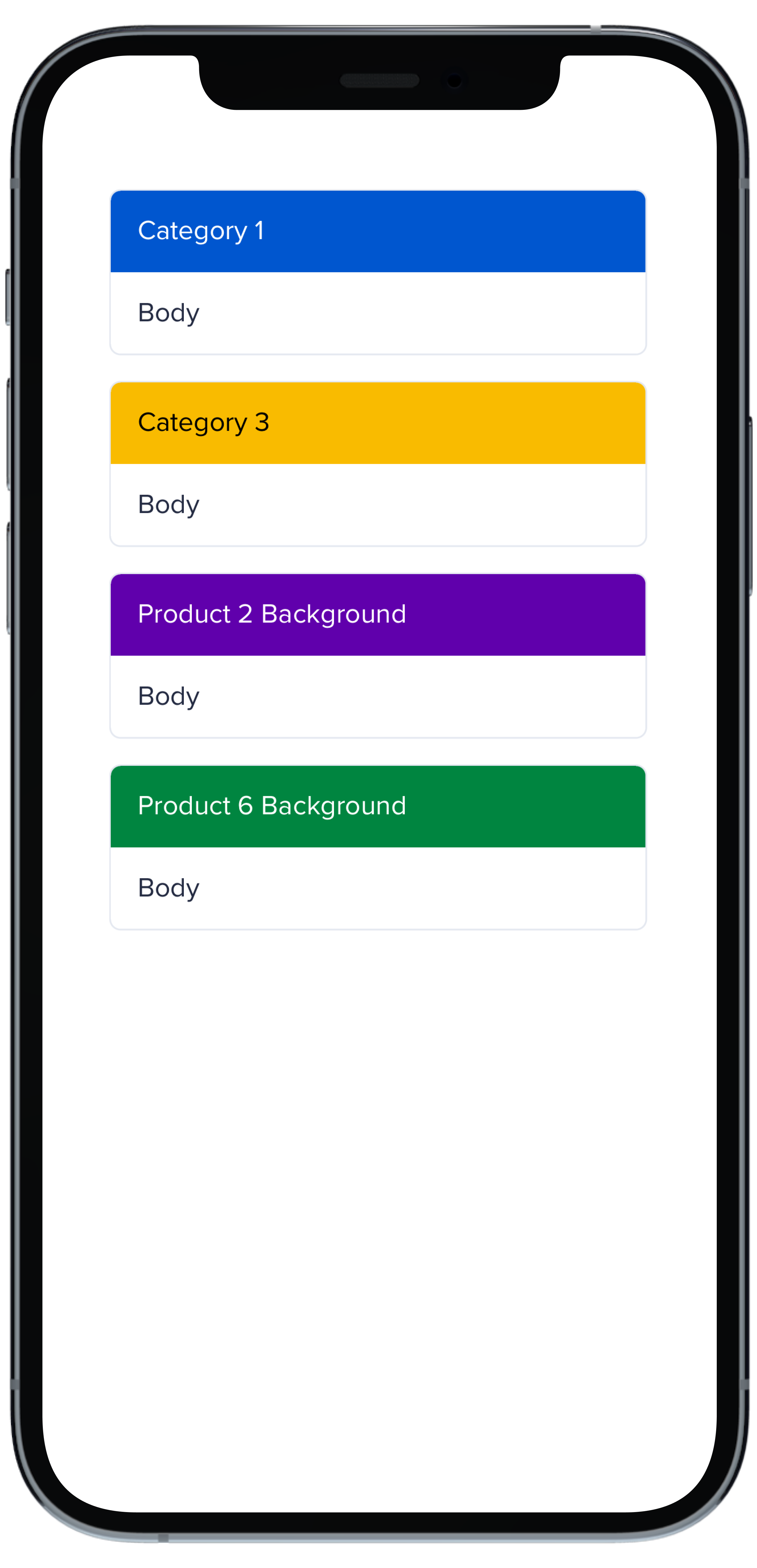
|
|
24
|
-
}
|
|
25
|
-
|
|
26
|
-
PBCard(padding: Spacing.none) {
|
|
27
|
-
PBCardHeader(color: .product(.product6, category: .background)) {
|
|
28
|
-
Text("Product 6 Background").pbFont(.body, color: .white).padding(Spacing.small)
|
|
29
|
-
}
|
|
30
|
-
Text("Body").pbFont(.body, color: .text(.default)).padding(Spacing.small)
|
|
31
|
-
}
|
|
32
|
-
}
|
|
33
|
-
```
|
|
@@ -1,17 +0,0 @@
|
|
|
1
|
-
|
|
2
|
-
|
|
3
|
-
```swift
|
|
4
|
-
VStack(spacing: Spacing.small) {
|
|
5
|
-
PBCard(highlight: .side(.product(.product6, category: .highlight))) {
|
|
6
|
-
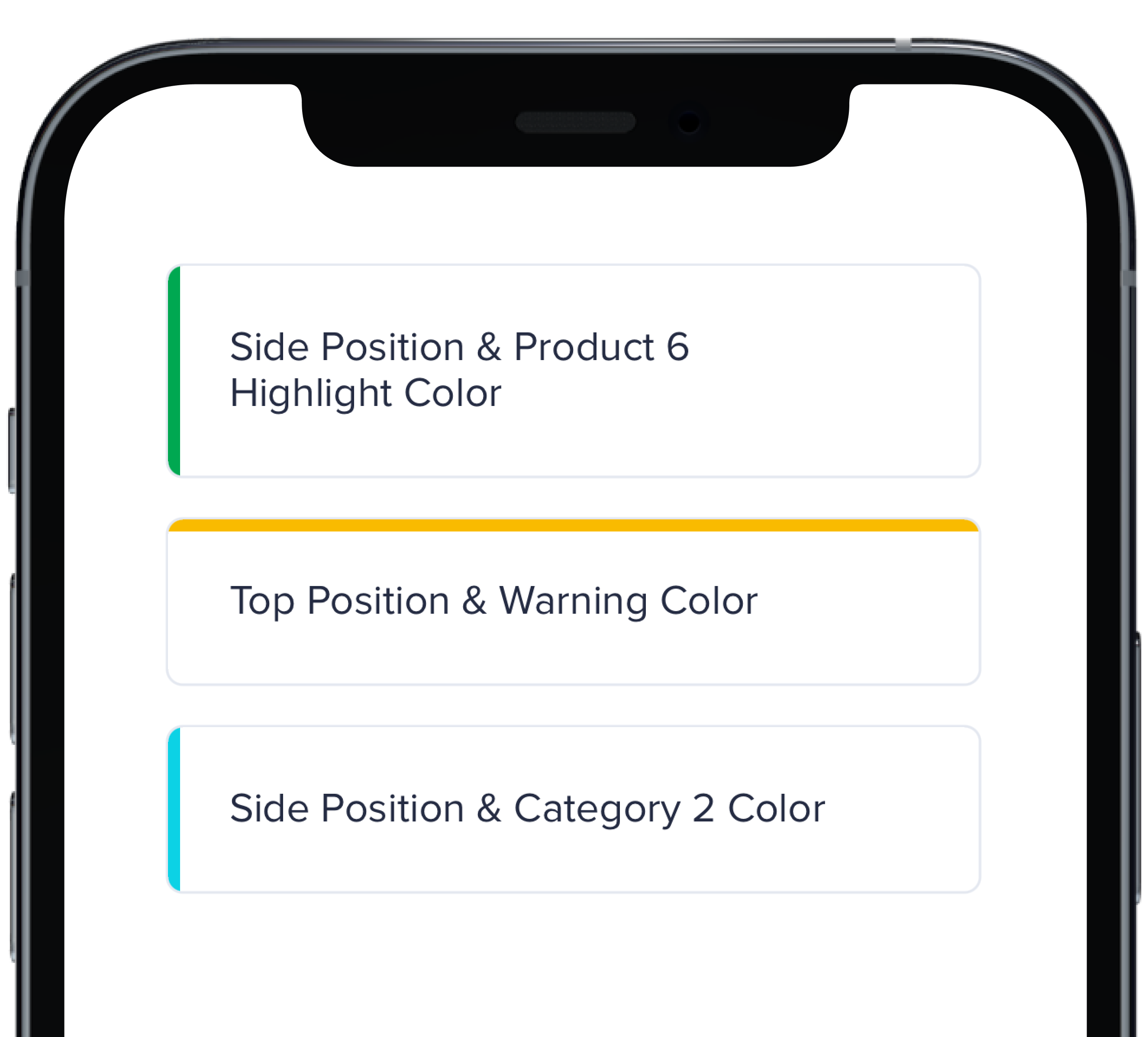
Text("Side Position & Product 6 Highlight Color").pbFont(.body)
|
|
7
|
-
}
|
|
8
|
-
|
|
9
|
-
PBCard(highlight: .top(.status(.warning))) {
|
|
10
|
-
Text("Top Position & Warning Color").pbFont(.body)
|
|
11
|
-
}
|
|
12
|
-
|
|
13
|
-
PBCard(highlight: .side(.category(.category2))) {
|
|
14
|
-
Text("Side Position & Category 2 Color").pbFont(.body)
|
|
15
|
-
}
|
|
16
|
-
}
|
|
17
|
-
```
|
|
@@ -1,33 +0,0 @@
|
|
|
1
|
-
|
|
2
|
-
|
|
3
|
-
```swift
|
|
4
|
-
VStack(spacing: Spacing.small) {
|
|
5
|
-
PBCard(padding: Spacing.none) {
|
|
6
|
-
Text("None").pbFont(.body)
|
|
7
|
-
}
|
|
8
|
-
|
|
9
|
-
PBCard(padding: Spacing.xxSmall) {
|
|
10
|
-
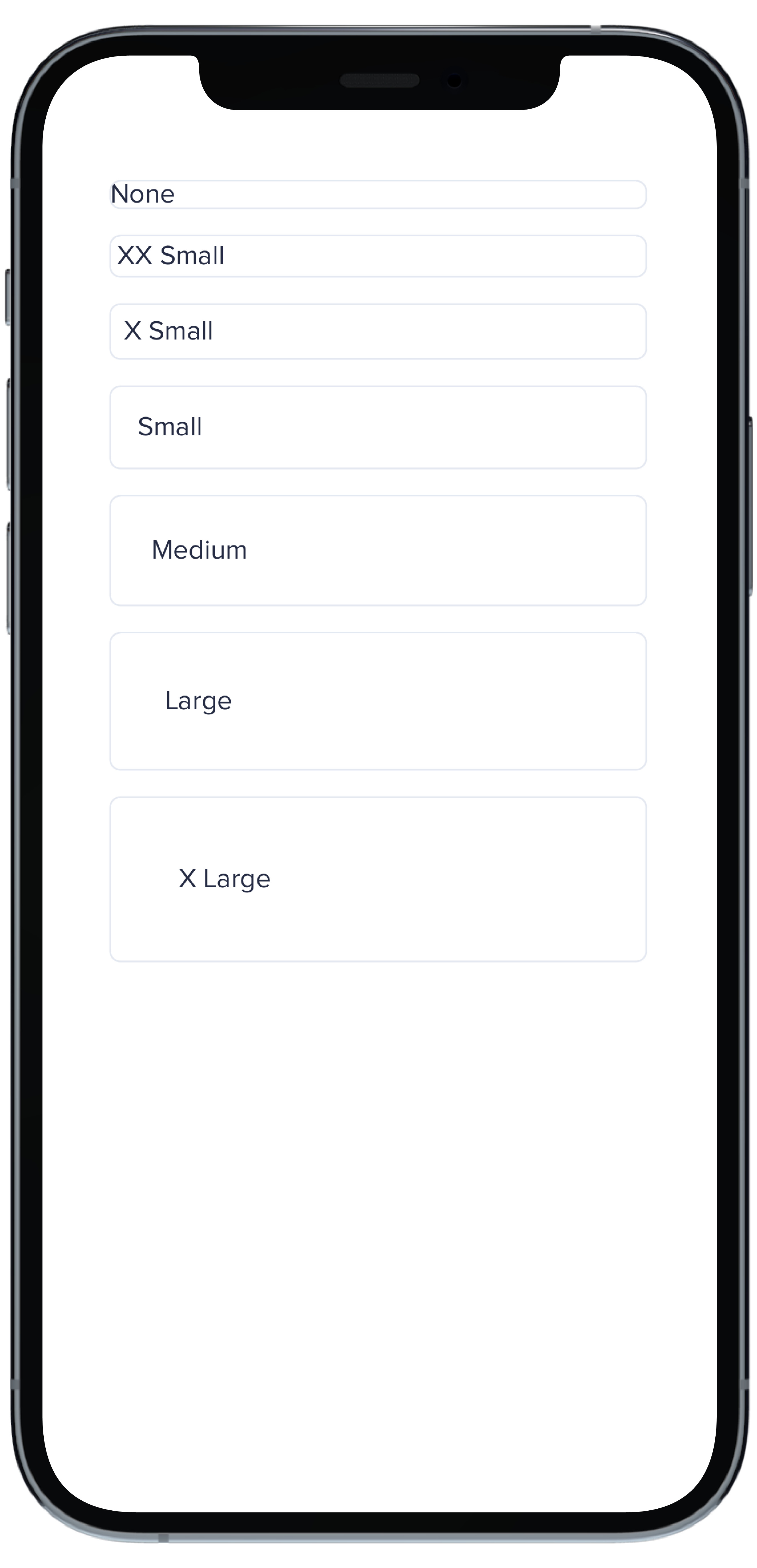
Text("XX Small").pbFont(.body)
|
|
11
|
-
}
|
|
12
|
-
|
|
13
|
-
PBCard(padding: Spacing.xSmall) {
|
|
14
|
-
Text("X Small").pbFont(.body)
|
|
15
|
-
}
|
|
16
|
-
|
|
17
|
-
PBCard(padding: Spacing.small) {
|
|
18
|
-
Text("Small").pbFont(.body)
|
|
19
|
-
}
|
|
20
|
-
|
|
21
|
-
PBCard(padding: Spacing.medium) {
|
|
22
|
-
Text("Medium").pbFont(.body)
|
|
23
|
-
}
|
|
24
|
-
|
|
25
|
-
PBCard(padding: Spacing.large) {
|
|
26
|
-
Text("Large").pbFont(.body)
|
|
27
|
-
}
|
|
28
|
-
|
|
29
|
-
PBCard(padding: Spacing.xLarge) {
|
|
30
|
-
Text("X Large").pbFont(.body)
|
|
31
|
-
}
|
|
32
|
-
}
|
|
33
|
-
```
|
|
@@ -1,10 +0,0 @@
|
|
|
1
|
-
### Props
|
|
2
|
-
| Name | Type | Description | Default | Values |
|
|
3
|
-
| --- | ----------- | --------- | --------- | --------- |
|
|
4
|
-
| **Background Color** | `Color` | Changes background color | `.card` | `Color` |
|
|
5
|
-
| **Border** | `Bool` | Adds border around the Card | `true` | `true` `false` |
|
|
6
|
-
| **Border Radius** | `CGFloat` | Specifies the roundness of the Card | `BorderRadius.medium` | `BorderRadius.none` `BorderRadius.xSmall` `BorderRadius.small` `BorderRadius.medium` `BorderRadius.large` `BorderRadius.xLarge` `BorderRadius.rounded` |
|
|
7
|
-
| **Highlight** | `Highlight` | Adds a border accent color | `.none` | `Color` |
|
|
8
|
-
| **Padding** | `CGFloat` | Applies padding between text and border | `Spacing.medium` | `Spacing.none` `Spacing.xxSmall` `Spacing.xSmall` `Spacing.small` `Spacing.medium` `Spacing.large` `Spacing.xLarge` |
|
|
9
|
-
| **Style** | `PBCardStyle` | Specifies the color of the border | `.default` | `.default` `.selected` `.error` `.inline` |
|
|
10
|
-
| **Shadow** | `Shadow` | Applies shadow | `nil` | `Shadow.deep` `Shadow.deeper` `Shadow.deepest` `Shadow.none` |
|
|
File without changes
|
|
@@ -1,11 +0,0 @@
|
|
|
1
|
-
|
|
2
|
-
|
|
3
|
-
```swift
|
|
4
|
-
PBCard(padding: Spacing.none) {
|
|
5
|
-
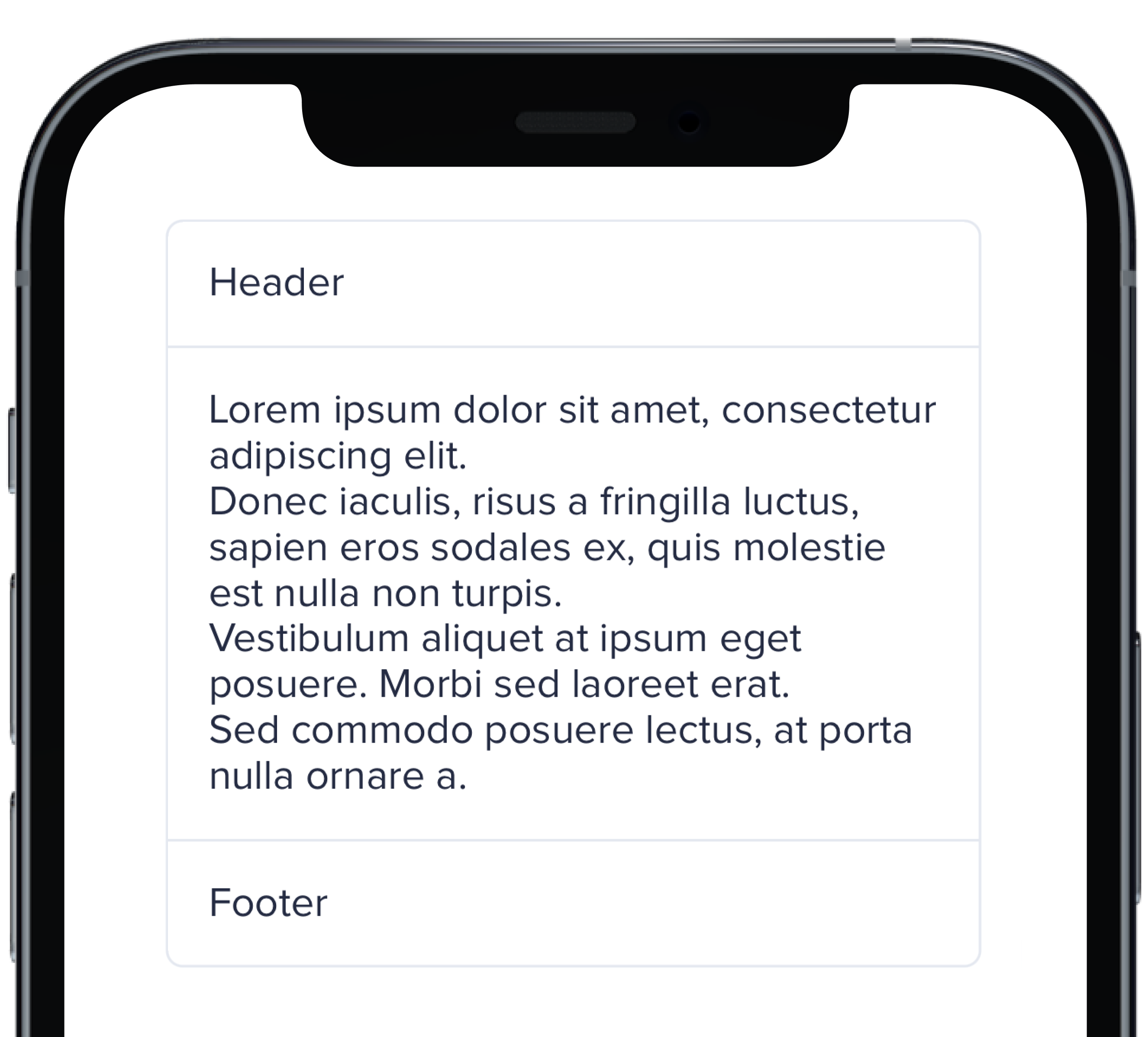
Text("Header").pbFont(.body).padding(Spacing.small)
|
|
6
|
-
PBSectionSeparator()
|
|
7
|
-
Text(loremIpsum).pbFont(.body).padding(Spacing.small)
|
|
8
|
-
PBSectionSeparator()
|
|
9
|
-
Text("Footer").pbFont(.body).padding(Spacing.small)
|
|
10
|
-
}
|
|
11
|
-
```
|
|
@@ -1,21 +0,0 @@
|
|
|
1
|
-

|
|
2
|
-
|
|
3
|
-
```swift
|
|
4
|
-
VStack(spacing: Spacing.small) {
|
|
5
|
-
PBCard(shadow: Shadow.deep) {
|
|
6
|
-
Text("Deep").pbFont(.body)
|
|
7
|
-
}
|
|
8
|
-
|
|
9
|
-
PBCard(shadow: Shadow.deeper) {
|
|
10
|
-
Text("Deeper").pbFont(.body)
|
|
11
|
-
}
|
|
12
|
-
|
|
13
|
-
PBCard(shadow: Shadow.deepest) {
|
|
14
|
-
Text("Deepest").pbFont(.body)
|
|
15
|
-
}
|
|
16
|
-
|
|
17
|
-
PBCard(shadow: Shadow.none) {
|
|
18
|
-
Text("None").pbFont(.body)
|
|
19
|
-
}
|
|
20
|
-
}
|
|
21
|
-
```
|
|
@@ -1,17 +0,0 @@
|
|
|
1
|
-
|
|
2
|
-
|
|
3
|
-
```swift
|
|
4
|
-
VStack(alignment: .leading, spacing: Spacing.small) {
|
|
5
|
-
PBCard {
|
|
6
|
-
Text("Card Context").pbFont(.body)
|
|
7
|
-
}
|
|
8
|
-
|
|
9
|
-
PBCard(style: .selected()) {
|
|
10
|
-
Text("Card Context").pbFont(.body)
|
|
11
|
-
}
|
|
12
|
-
|
|
13
|
-
PBCard(style: .error) {
|
|
14
|
-
Text("Card Context").pbFont(.body)
|
|
15
|
-
}
|
|
16
|
-
}
|
|
17
|
-
```
|
|
File without changes
|
|
@@ -1,10 +0,0 @@
|
|
|
1
|
-

|
|
2
|
-
|
|
3
|
-
```swift
|
|
4
|
-
|
|
5
|
-
PBCheckbox(checked: false, text: "Unchecked", action: {})
|
|
6
|
-
.padding(.bottom, Spacing.small)
|
|
7
|
-
|
|
8
|
-
PBCheckbox(checked: true, text: "Checked", action: {})
|
|
9
|
-
|
|
10
|
-
```
|
|
@@ -1,7 +0,0 @@
|
|
|
1
|
-
### Props
|
|
2
|
-
| Name | Type | Description | Default | Values |
|
|
3
|
-
| --- | ----------- | --------- | --------- | --------- |
|
|
4
|
-
| **Checked** | `Bool` | Adds a check to the Checkbox | `false` | `true` `false` |
|
|
5
|
-
| **Checkbox Type** | `CheckboxType` | Changes the style of the Checkbox | `default` | `default` `error` `indeterminate` |
|
|
6
|
-
| **Text** | `String` | Adds a text label | `nil` | |
|
|
7
|
-
| **Action** | `(() -> Void)` | Adds an action | `{}` | |
|
|
@@ -1,6 +0,0 @@
|
|
|
1
|
-
### Props
|
|
2
|
-
| Name | Type | Description | Default | Values |
|
|
3
|
-
| --- | ----------- | --------- | --------- | --------- |
|
|
4
|
-
| **Icon** | `PlaybookGenericIcon` | Sets the kit's Icon | | |
|
|
5
|
-
| **Size** | `PBIcon.IconSize` | Changes the size of the Circle Icon | `.x1` | `xSmall` `small` `large` `x1` `x2` `x3` `x4` `x5` `x6` `x7` `x8` `x9` `x10` |
|
|
6
|
-
| **Color** | `Color` | Changes color of the Icon and background | `.status(.neutral)` | `Color` |
|
|
@@ -1,16 +0,0 @@
|
|
|
1
|
-

|
|
2
|
-
|
|
3
|
-
```swift
|
|
4
|
-
|
|
5
|
-
VStack(spacing: Spacing.small) {
|
|
6
|
-
PBIconCircle(FontAwesome.rocket, size: .small, color: Color.data(.data1))
|
|
7
|
-
PBIconCircle(FontAwesome.rocket, size: .small, color: Color.data(.data2))
|
|
8
|
-
PBIconCircle(FontAwesome.rocket, size: .small, color: Color.data(.data3))
|
|
9
|
-
PBIconCircle(FontAwesome.rocket, size: .small, color: Color.data(.data4))
|
|
10
|
-
PBIconCircle(FontAwesome.rocket, size: .small, color: Color.data(.data5))
|
|
11
|
-
PBIconCircle(FontAwesome.rocket, size: .small, color: Color.data(.data6))
|
|
12
|
-
PBIconCircle(FontAwesome.rocket, size: .small, color: Color.data(.data7))
|
|
13
|
-
PBIconCircle(FontAwesome.rocket, size: .small, color: Color.data(.data8))
|
|
14
|
-
}
|
|
15
|
-
|
|
16
|
-
```
|
|
@@ -1,11 +0,0 @@
|
|
|
1
|
-

|
|
2
|
-
|
|
3
|
-
```swift
|
|
4
|
-
|
|
5
|
-
VStack(alignment: .leading, spacing: Spacing.small) {
|
|
6
|
-
PBIconCircle(FontAwesome.rocket, size: .small)
|
|
7
|
-
PBIconCircle(FontAwesome.rocket, size: .x1)
|
|
8
|
-
PBIconCircle(FontAwesome.rocket, size: .large)
|
|
9
|
-
}
|
|
10
|
-
|
|
11
|
-
```
|